Table of Contents
There’s something quietly powerful about off-white. Not the stark brilliance of pure white, but the softer, warmer cousin that wraps a room in calm. In Japandi design, off-white isn’t just a backdrop—it’s the foundation of a philosophy that marries Japanese minimalism with Scandinavian coziness.
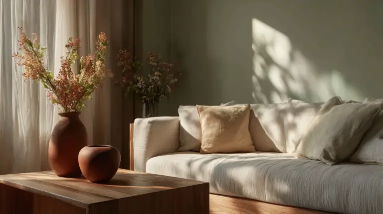
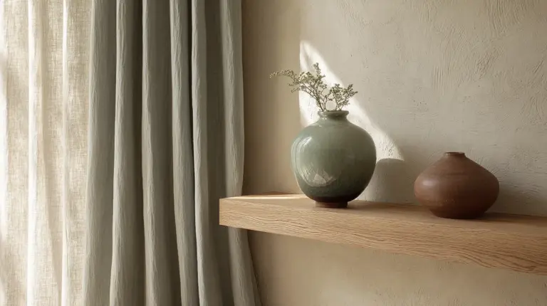
Picture morning light filtering through sheer linen curtains, touching walls painted in creamy warmth. The color doesn’t shout; it whispers. It invites you to slow down, breathe deeper, notice the grain of oak furniture and the shadow cast by a ceramic vase.
Off-whites in Japandi style are about balance. They honor the Japanese concept of ma—the beauty of empty space—while embracing hygge, that Danish word for contentment and comfort. These aren’t cold, clinical whites. They’re alive with undertones of beige, cream, and the faintest hint of gray.
Whether you’re in a sun-drenched apartment in Calabarzon or a cozy home elsewhere, choosing the right off-white shade transforms more than walls. It transforms how you feel when you step inside.
Understanding Japandi Off-White: More Than Just Paint
The Philosophy Behind the Palette
Japandi off-whites embody wabi-sabi—the acceptance of imperfection and transience. These shades celebrate natural variations, the way light changes throughout the day, how a creamy wall might appear warmer at sunset and cooler at dawn. Unlike bright whites that can feel sterile, off-whites carry warmth in their DNA.
The best Japandi off-whites have LRV (Light Reflectance Value) between 82-88. This range means they reflect plenty of light without the harsh glare of pure white. Think of shades like Sherwin Williams Shoji White (LRV 87) or Benjamin Moore Swiss Coffee (LRV 83.93)—both carry subtle warmth perfect for tropical climates.
Why Off-White Works in Humid Climates
For homes in the Philippines, particularly in Calabarzon’s humid environment, off-whites are practical magic. They hide minor wall imperfections better than stark white. They don’t amplify the yellowing that can occur in high-humidity areas. Local brands like Boysen’s Whisper White are formulated specifically for these conditions, maintaining their creamy warmth even as moisture levels fluctuate.
Off-whites also reduce eye strain by up to 20% compared to bright whites, creating spaces that genuinely support wellness. Studies show that soft, neutral environments lower cortisol levels, making your home a true sanctuary.
Essential Japandi Off-White Shades and Their Hex Codes
| Shade Name | Hex Code | Undertone | Best For |
|---|---|---|---|
| Warm Off-White | #F5F5F0 | Creamy beige | Living rooms, bedrooms |
| Soft Cream | #F0E5D0 | Butter yellow | Kitchens, dining areas |
| Ivory Mist | #FFFFF0 | Subtle yellow | Small spaces, hallways |
| Warm Beige-White | #F5F5DC | Beige | Multi-functional rooms |
| Stone White | #FAF9F6 | Cool gray | Bathrooms, modern spaces |
| Linen White | #F8F6F0 | Neutral warm | Bedrooms, reading nooks |
Reading Undertones Like a Pro
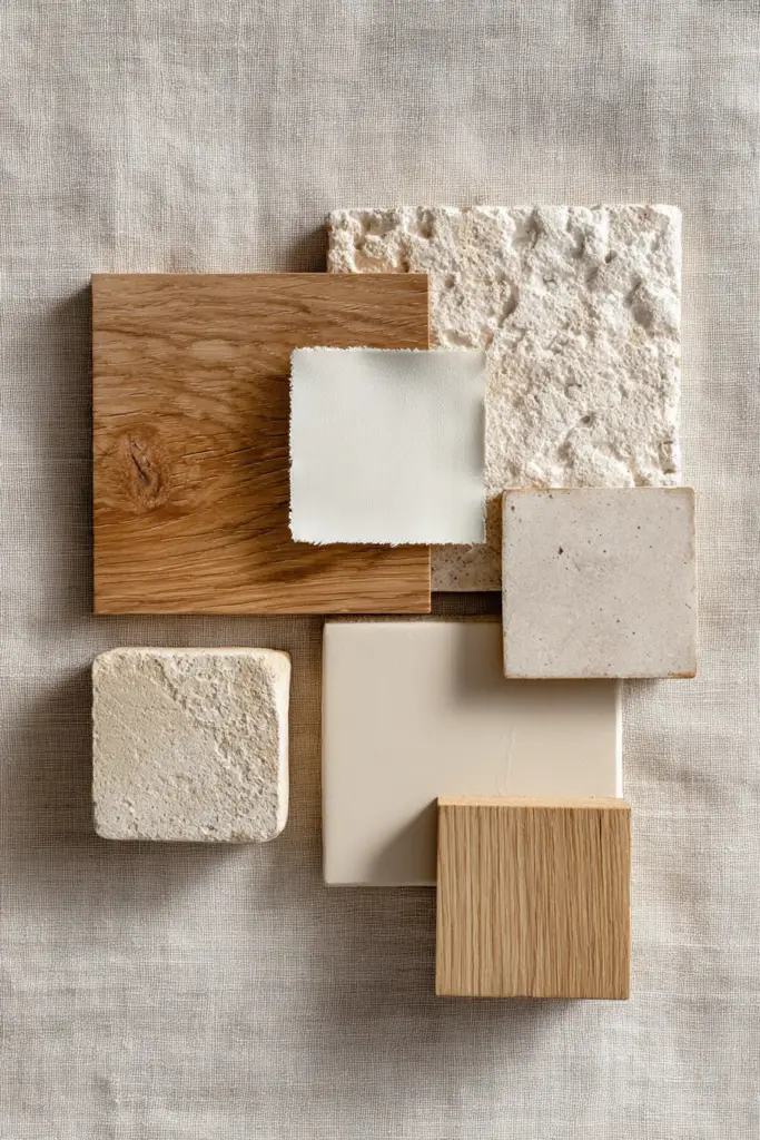
Hold paint swatches against white paper in natural light. Warm off-whites lean toward beige, cream, or soft yellow—perfect for north-facing rooms that need coziness. Cool off-whites carry gray or blue undertones, ideal for sun-drenched spaces that already receive abundant warmth.
Test samples on all four walls. Paint behaves differently depending on light direction. An off-white that looks perfect on your west wall might feel too yellow on the east wall at sunrise.
What Colors Pair Beautifully with Japandi Off-Whites
Natural Earth Tones
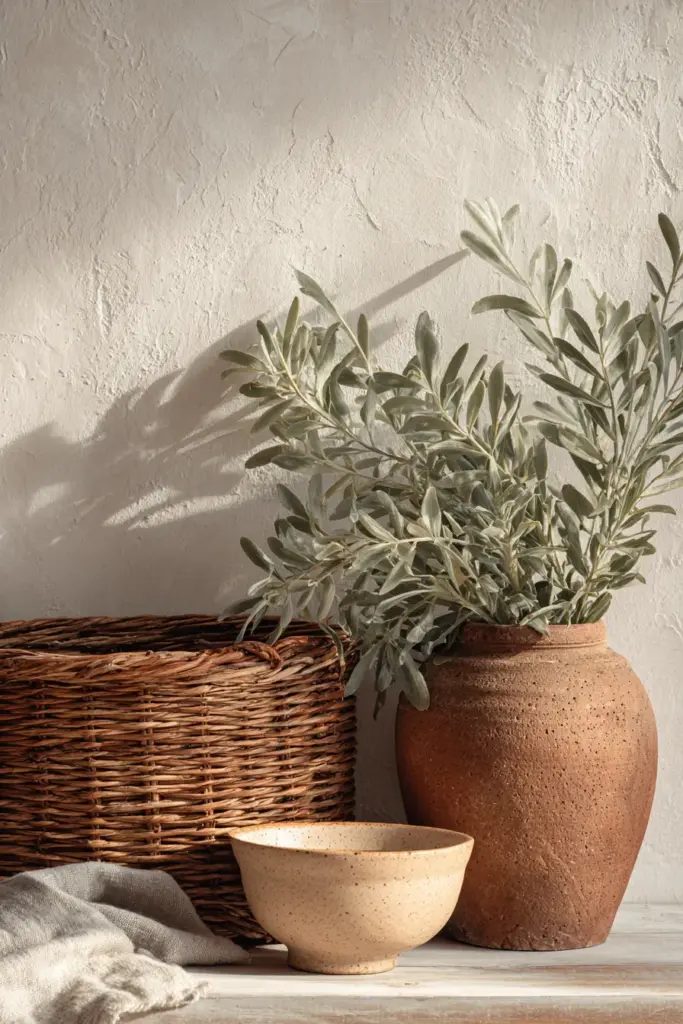
Warm browns and tans create layered depth against off-white walls. Think walnut furniture, rattan baskets, terracotta planters. The contrast is gentle, never jarring—like sand meeting driftwood on a quiet beach.
Muted greens bring life without overwhelming. Soft sage (#C8D5B9), olive (#808000), and dusty eucalyptus complement off-whites by grounding them in nature. Add a single fiddle leaf fig in a cream ceramic pot, and suddenly your space breathes.
Sophisticated Neutrals
Warm grays (#C0C0C0 to #808080) and taupes (#8B8589) add architectural interest. Use them for accent pillows, throws, or a feature wall. Against creamy off-white, they read as elegant shadows rather than stark contrasts.
Blacks and deep browns provide punctuation. A black metal frame mirror, deep walnut shelving, or charcoal linen curtains give off-white rooms definition and sophistication. The rule: use dark accents sparingly—10-15% maximum.
Accent Colors That Elevate
- Terracotta (#E07856): Warm, earthy, perfect for textiles and pottery
- Warm ochre (#CC7722): Adds subtle richness through art or cushions
- Muted blue-gray (#A4B8C4): Cool balance in bedding or ceramics
- Soft charcoal (#36454F): Grounding element in lighting or furniture legs
Room-by-Room Off-White Application
Living Rooms: Where Comfort Meets Style
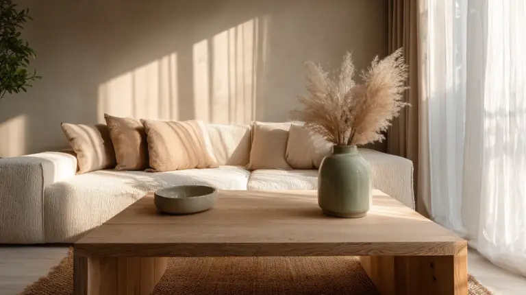
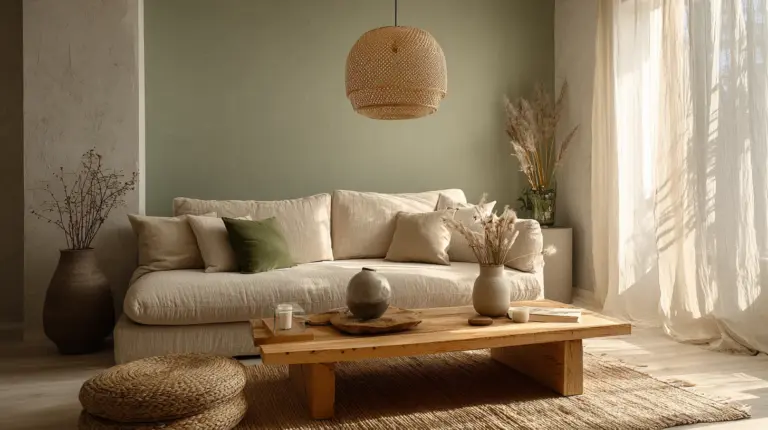
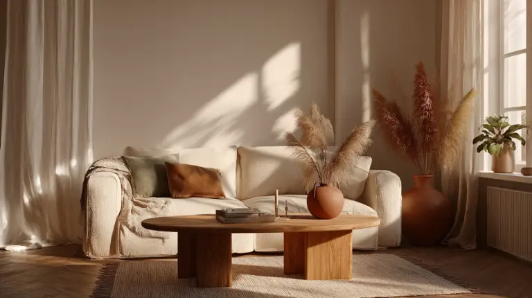
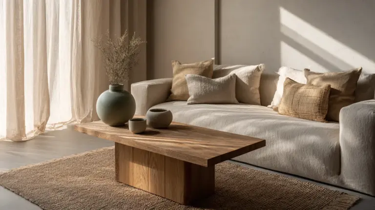
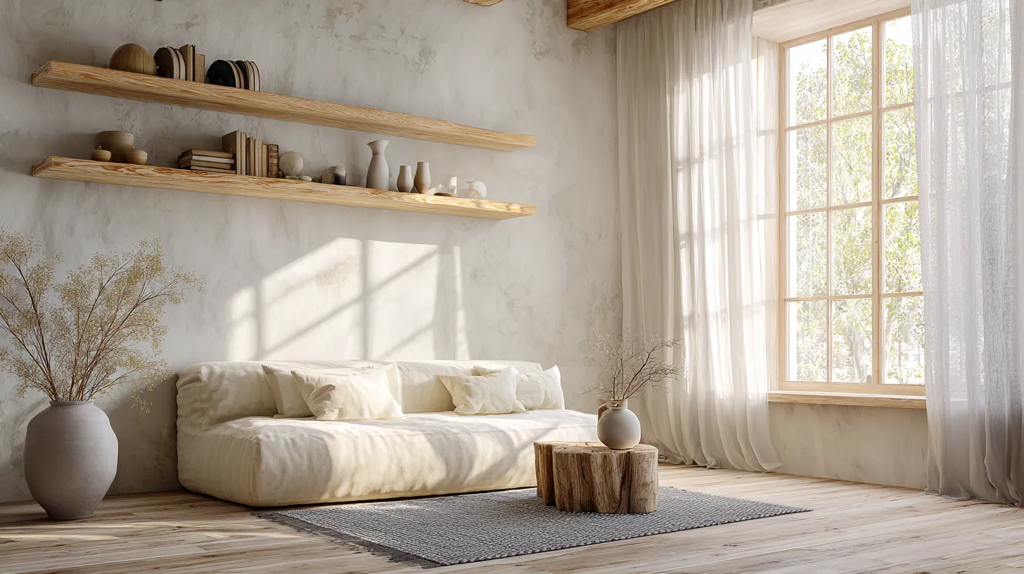
Start with walls in #F5F5F0 (warm off-white). This shade creates a canvas that makes natural wood furniture sing. Pair with a cream linen sofa, warm gray wool rug, and light oak coffee table. Layer in texture through jute poufs, ceramic vases, and woven wall hangings.
For small living rooms, off-whites expand visual space by reflecting light softly. Avoid heavy patterns—let the play of light and shadow across off-white walls become your artwork.
Bedrooms: Sanctuaries of Serenity
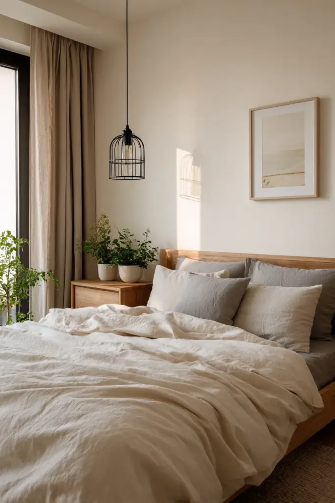
Choose #F0E5D0 (soft cream) for bedroom walls. This slightly warmer off-white promotes relaxation, especially under warm LED lighting (2700-3000K). Layer with organic cotton bedding in ivory and stone gray, blackout curtains in taupe, and minimalist pendant lights in matte black.
The golden rule: keep 70% of the room in off-white tones, 20% in warm neutrals, and 10% in accent colors like soft sage or terracotta through throw pillows.
Kitchens and Dining Areas: Warmth and Function
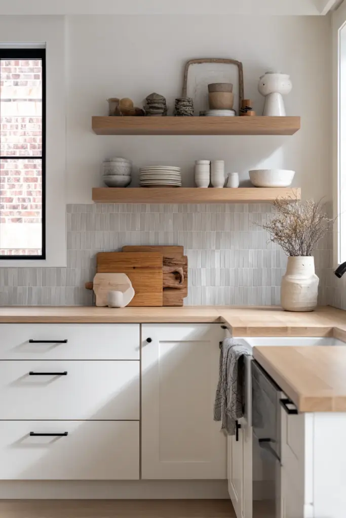
Linen white (#F8F6F0) cabinets paired with light wood countertops create the quintessential Japandi kitchen. Add open shelving in natural oak, matte black hardware, and stone-gray backsplash tiles. The off-white keeps the space bright while wood tones add necessary warmth.
For dining areas, consider an off-white accent wall behind a minimalist table. Pair with rattan chairs, a simple ceramic centerpiece, and pendant lighting with paper shades—very Japanese, very cozy.
Bathrooms: Spa-Like Simplicity
Stone white (#FAF9F6) works beautifully in bathrooms, especially with natural stone tiles in warm gray or beige. Add wooden bath accessories, cream towels, and plants like bamboo or pothos. The slightly cooler off-white feels fresh and clean while maintaining warmth through natural materials.
In humid Philippine bathrooms, ensure proper ventilation to keep off-white paint looking pristine. Anti-mold primers are essential before painting.
Lighting’s Impact on Off-White Japandi Spaces
Natural Light Considerations
Off-whites transform under natural light. Morning light (5000-6500K) makes warm off-whites appear cleaner and more neutral. Afternoon sun intensifies any yellow undertones—what looked creamy at 10 AM might seem golden at 4 PM.
North-facing rooms benefit from warmer off-whites like #F5F5DC (warm beige-white) to counteract cooler natural light. South-facing rooms can handle slightly cooler off-whites like #FAF9F6 (stone white) without feeling sterile.
Artificial Lighting Strategies
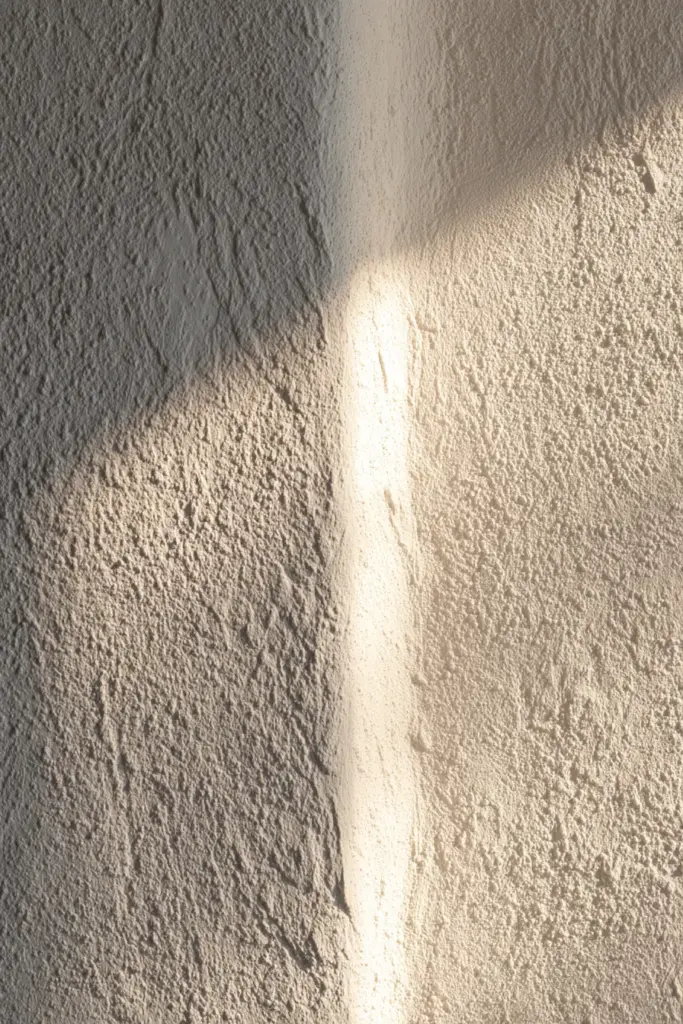
LED bulbs (2700-3000K) preserve the warmth of off-whites. Avoid cool white LEDs (4000K+)—they make off-whites appear dingy or gray. Position lighting to create soft shadows that highlight texture in fabrics, wood grain, and wall surfaces.
Layer your lighting: ambient (ceiling fixtures), task (reading lamps), and accent (highlighting art or plants). Each layer should complement your off-white base without washing it out.
DIY Paint Mixing for Custom Off-White Shades
Creating Your Perfect Tone
Start with a true white base (LRV 90+). Add universal tints drop by drop:
- For warm cream: 2 drops yellow oxide + 1 drop raw umber per quart
- For beige-white: 3 drops raw sienna + 1 drop burnt umber per quart
- For gray-white: 2 drops lamp black + 1 drop raw umber per quart
Mix thoroughly and test on poster board. Let dry completely—wet paint looks 30-40% darker than the final color.
Local Philippine Paint Options
Boysen Whisper White: Perfect warm off-white for humid climates, excellent coverage, anti-mold properties.
Davies Pure White with custom tints: Request 25% beige tint for a beautiful Japandi-appropriate off-white.
Nippon Paint Momento colors: Their “Natural White” series offers several off-white options designed for tropical climates.
Furniture and Materials That Complement Off-Whites
Wood Tones and Finishes
Light oak and ash furniture pop beautifully against off-white walls. The pale wood creates subtle contrast without disrupting the serene palette. For more definition, incorporate walnut or teak in dining tables or media consoles—the rich brown provides grounding warmth.
Maintain natural, matte finishes. High-gloss furniture fights with the understated elegance of Japandi off-whites. Hand-rubbed oils or natural waxes on wood enhance grain patterns while keeping the aesthetic authentic.
Textiles and Soft Furnishings
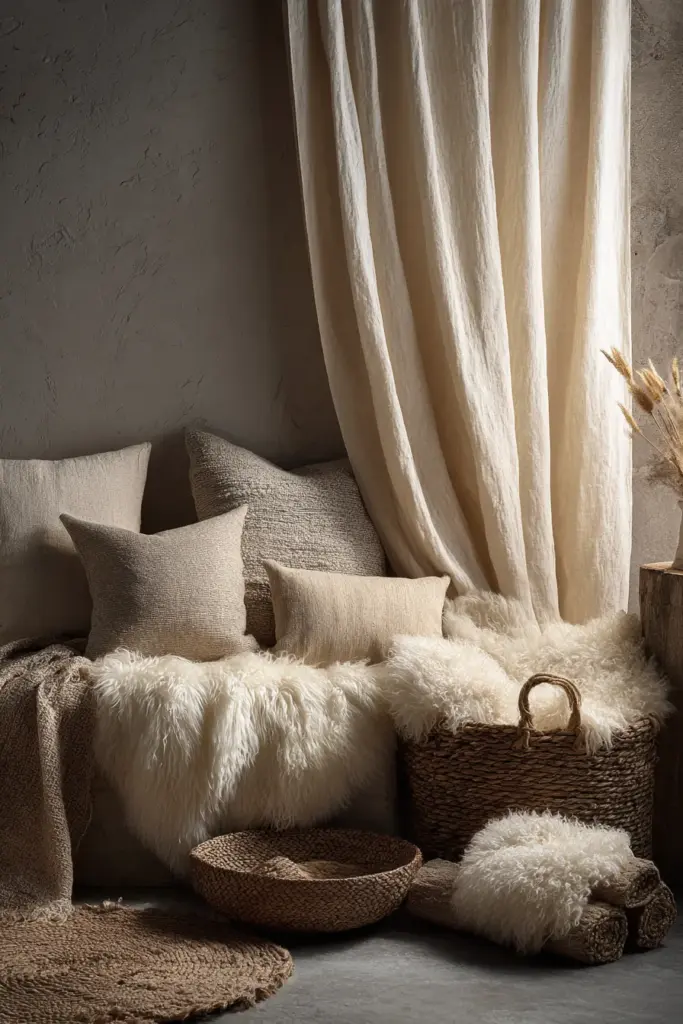
Layer textures in similar tones: cream linen curtains, off-white wool throws, beige cotton cushions, ivory sheepskin rugs. The monochromatic approach creates depth through texture rather than color contrast—very Japandi.
Choose natural fibers exclusively—linen, cotton, wool, jute, rattan. Synthetic materials disrupt the organic feel essential to this design philosophy.
Ceramics and Accessories
Handmade ceramics in cream, stone gray, and soft beige work perfectly. Look for pieces with visible imperfections—the irregular glaze, the asymmetrical rim. These embody wabi-sabi while coordinating with your off-white palette.
Limit accessories to meaningful pieces. One beautiful ceramic vase outweighs five mediocre ones. Quality and intention matter more than quantity.
The Psychology and Wellness Benefits of Off-White Spaces
Creating Calm Through Color
Research shows that living in spaces dominated by soft neutrals reduces stress hormones by up to 20%. Off-whites specifically promote:
- Mental clarity and focus
- Reduced visual overstimulation
- Better sleep quality in bedrooms
- Increased feelings of spaciousness
The lack of strong color demands allows your mind to rest. In our overstimulated world, an off-white Japandi space becomes a reset button.
Sustainability and Longevity
Off-white Japandi interiors age gracefully. Unlike trendy colors that date quickly, these timeless shades adapt as your life changes. Swap accent pieces—a new sage green throw, terracotta planters—to refresh the space without repainting.
This longevity is inherently sustainable. Fewer renovations mean less waste, lower costs, and reduced environmental impact.
Quick Reference: Your Japandi Off-White Checklist
- Choose off-whites with LRV 82-88 for optimal light reflection without glare
- Test paint samples on all walls at different times of day
- Pair with natural materials: wood, linen, cotton, stone, ceramics
- Use warm LED lighting (2700-3000K) to maintain undertones
- Layer textures in similar tones for depth without color contrast
- Incorporate muted accents: sage green, terracotta, warm gray, soft charcoal
- Follow the 70-20-10 rule: 70% off-white, 20% neutrals, 10% accents
- Select anti-mold primers for humid climates before painting
- Embrace imperfection in accessories and finishes (wabi-sabi)
- Keep spaces uncluttered to honor ma (meaningful emptiness)
Common Mistakes to Avoid
Going Too Cool
Pure white or gray-whites feel sterile in Japandi spaces. Always choose off-whites with warm undertones—beige, cream, or soft yellow. These maintain the cozy (hygge) element essential to the style.
Over-Accessorizing
More isn’t more in Japandi design. Each piece should serve a purpose or bring genuine joy. Three beautiful objects beat twenty mediocre ones.
Ignoring Lighting Temperature
Cool LED bulbs (4000K+) ruin warm off-whites, making them appear dingy. Always use warm white bulbs (2700-3000K) to preserve the intended color.
Mixing Too Many Off-White Shades
Stick to one or two off-white shades throughout your space. Too many variations create visual confusion rather than cohesion.
Bringing It All Together
Japandi off-whites are more than paint choices—they’re invitations to live more intentionally. These shades create backgrounds that let life unfold: morning coffee in a sun-filled kitchen, evening conversations in a softly lit living room, restful sleep in a cocoon of cream and warmth.
The beauty lies in restraint. By choosing off-white as your foundation, you make space for what truly matters: quality materials, meaningful objects, the people you love, and the quiet moments that fill a well-designed home.
Start small if you’re unsure. Paint one room in #F5F5F0. Add cream linen curtains and a warm gray throw. Notice how you feel when you enter that space. That feeling—of calm, of coming home, of breathing easier—that’s what Japandi off-white creates.
Your home should be a sanctuary, not a showroom. Let these gentle, sophisticated shades wrap you in comfort while maintaining the elegance you crave. That’s the true promise of Japandi design.
Frequently Asked Questions
What type of white paint is best for Japandi style?
Off-white paints with warm undertones work best—think cream, beige, or soft yellow bases rather than pure or cool whites. Popular choices include Sherwin Williams Shoji White (LRV 87) and Benjamin Moore Swiss Coffee (LRV 83.93). For Philippine homes, Boysen Whisper White offers excellent humidity resistance with ideal warmth.
What colors pair well with Japandi off-white walls?
Natural earth tones create the most harmonious combinations: warm browns, taupes, soft grays, muted greens (sage, olive), and terracotta. Keep 70% of your space in off-white tones, 20% in warm neutrals, and 10% in accent colors. Wood furniture in light oak, walnut, or teak complements off-whites beautifully.
How do I choose between warm and cool off-whites?
Consider your room’s natural light. North-facing rooms benefit from warmer off-whites (#F5F5DC, #F0E5D0) with beige or cream undertones. South-facing and sun-drenched spaces can handle slightly cooler off-whites (#FAF9F6) with gray undertones. Always test samples on each wall before committing.
Can I use multiple off-white shades in one space?
Stick to one or two off-white shades maximum per room for cohesion. You might use a warmer off-white (#F5F5F0) on walls and a slightly cooler shade (#F8F6F0) for trim or ceiling. Too many variations create visual confusion rather than the serene unity Japandi design celebrates.
What’s the best lighting for off-white Japandi rooms?
Use warm LED bulbs (2700-3000K) exclusively to preserve the creamy warmth of off-whites. Cool white bulbs (4000K+) make off-whites appear gray or dingy. Layer your lighting with ambient ceiling fixtures, task lamps, and accent lighting to create depth and highlight textures in wood, fabric, and ceramics.