Table of Contents
There’s something deeply calming about a room that breathes. Where soft sage walls meet weathered wood, and every imperfection tells a quiet story. This is the heart of Wabi Sabi Japandi living room colors—a palette that honors both the minimalist grace of Scandinavia and the weathered beauty of Japanese tradition.
In 2025, this design philosophy has grown beyond trend into timeless refuge. It’s not about perfection. It’s about creating spaces that feel lived-in, warm, and soul-restoring. The colors you choose will set the stage for mornings bathed in soft light and evenings wrapped in gentle calm.
Let ERYLIN guide you through this landscape of muted elegance. We’ll explore the shades that transform living rooms into sanctuaries, the psychology behind each hue, and practical ways to bring these colors home—especially for those of us creating beauty on a budget in the Philippines.
Understanding Wabi Sabi Japandi: Where Two Philosophies Meet
Japandi marries Scandinavian hygge—that cozy, candlelit warmth—with Japanese wabi-sabi, which celebrates the imperfect and impermanent. The result? A living room that feels both serene and soulful.
While pure Scandinavian design leans toward bright whites and cool grays, and traditional Japanese interiors embrace deeper, earthier tones, Japandi finds the middle ground. It’s the color of morning mist, sun-warmed clay, and moss after rain.
Wabi-sabi brings texture and story. Think weathered surfaces, asymmetrical shapes, and colors that age beautifully. When blended with Japandi’s clean lines, you get spaces that feel curated yet effortless—never sterile, always inviting.
The Core Wabi Sabi Japandi Color Palette
Neutral Foundations: Your Canvas
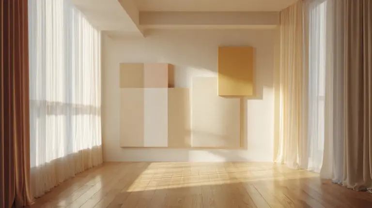
Warm whites and off-whites form the backbone of any Japandi living room. These aren’t stark hospital whites. They’re cream-kissed, slightly grayed, with undertones of beige that catch afternoon light like linen.
Beige and taupe anchor the space without heaviness. In humid Philippine climates, these shades feel breathable and practical. They hide the gentle dust of daily life while maintaining that coveted minimalist aesthetic.
For walls, consider these foundation shades:
- Soft ivory with gray undertones
- Warm beige (think raw cotton)
- Gentle taupe that shifts throughout the day
- Off-white with subtle yellow warmth
Earthy Mid-Tones: The Heart of Hygge
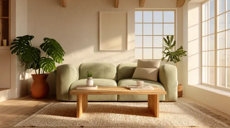
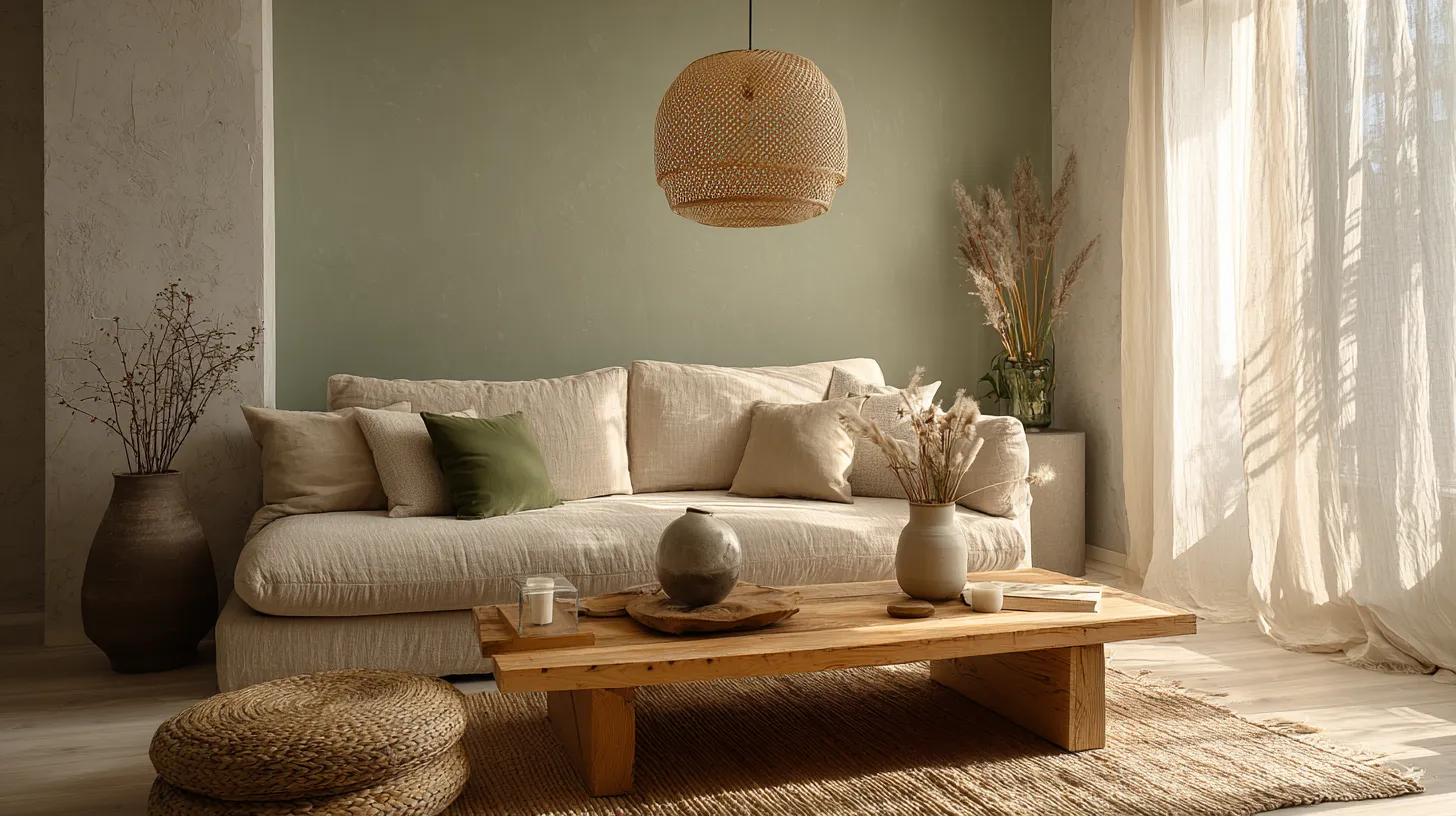
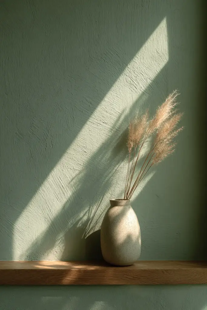
Sage green has become the signature accent of Japandi 2025. It’s nature distilled—neither too bright nor too muted. This shade brings the garden indoors without overwhelming your senses.
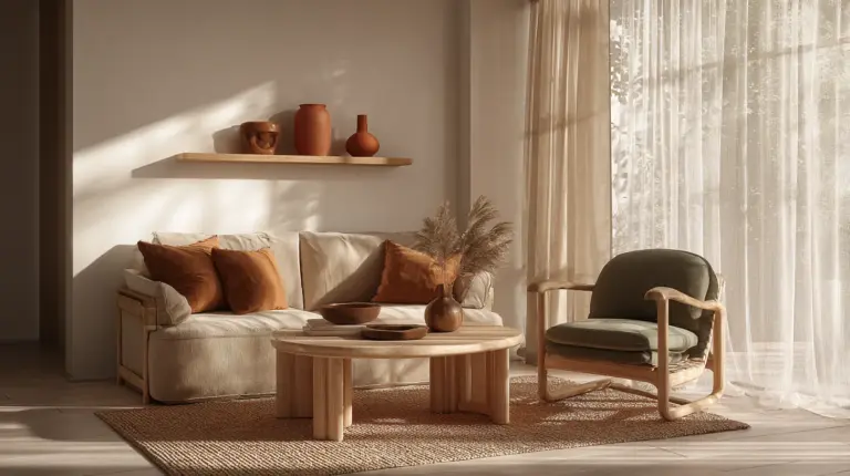
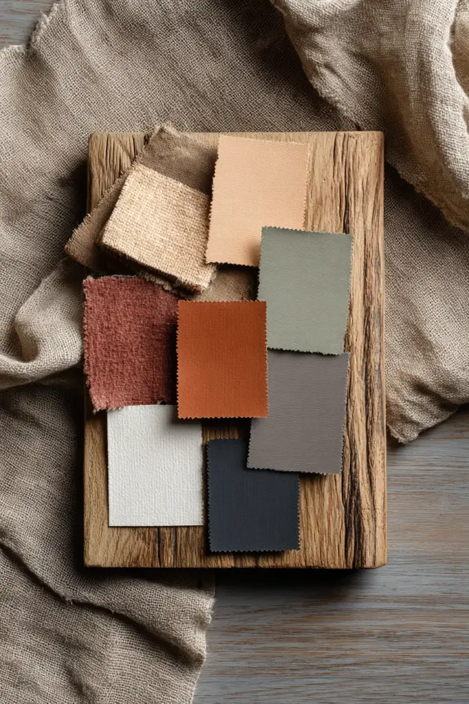
Warm browns in walnut and clay tones ground the palette. These colors reference natural wood, pottery, and earth itself. They’re especially powerful in furniture choices: a terracotta cushion against a beige sofa, or narra wood shelving against sage walls.
Olive and moss greens add depth without darkness. These are the colors of resilience—shades that thrive in both Japanese gardens and Scandinavian forests. In Calabarzon’s monsoon climate, these greens feel particularly apt, echoing the lush landscape outside your windows.
Mid-tone palette essentials:
- Muted sage (soft, never neon)
- Clay terracotta for 2025 warmth
- Warm walnut brown
- Dusty olive green
- Soft mushroom gray
Deeper Accents: Grounding Touches
Charcoal and deep brown provide visual weight. Use them sparingly—in picture frames, throw pillows, or a single statement chair. These darker shades create rhythm and prevent the space from floating away into vagueness.
Muted blues occasionally appear in Japandi schemes. Choose slate or dusty navy over bright azure. These blues should whisper, not shout.
Color Psychology: Why These Shades Heal
Research suggests that neutral earthy palettes reduce stress by 20-30%. When your living room wraps you in beige, sage, and warm brown, your nervous system responds. Heart rates slow. Breathing deepens.
Biophilic design—bringing nature’s colors indoors—triggers this calming effect. Sage green activates the same neural pathways as a walk through the forest. Warm browns connect us to earth and stability.
In our screen-saturated world, these colors offer visual rest. No bright pings or harsh contrasts. Just gentle gradations that let your eyes soften and your mind settle.
Room-by-Room Color Application
Walls: The Foundation Layer
For small living rooms, stick with warm white or soft beige. These shades expand space visually while maintaining coziness. If you’re brave, try sage green on a single accent wall—it adds personality without closing in the room.
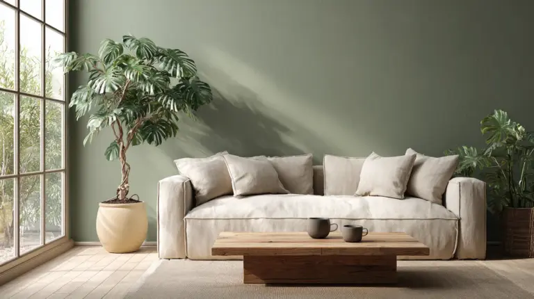
For larger spaces, you have more freedom. Consider warm taupe throughout, or create subtle contrast with beige walls and one charcoal feature wall behind your sofa.
Philippine paint recommendations: Boysen offers excellent neutrals suited to humid climates. Look for their “Muted Tones” collection with low-VOC formulas that withstand moisture while keeping indoor air clean.
Furniture: Where Texture Meets Tone
Your sofa should anchor the palette. A warm beige linen sofa becomes the perfect canvas for sage and terracotta throw pillows. Or choose a charcoal upholstered piece against light walls for subtle drama.
Wood furniture in natural finishes is non-negotiable. Narra, acacia, or light oak all work beautifully. The grain and imperfections embody wabi-sabi perfectly—no two pieces identical, each beautiful in its uniqueness.
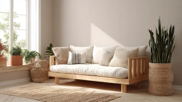
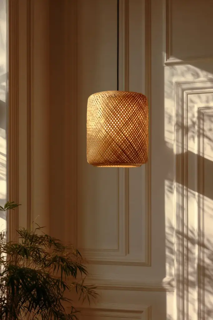
Rattan and woven materials add texture in neutral tones. A rattan coffee table or woven pendant light brings that perfect blend of Japanese and Scandinavian craftsmanship.
Textiles: Layering Warmth
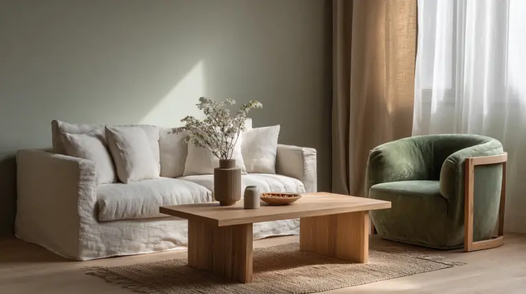
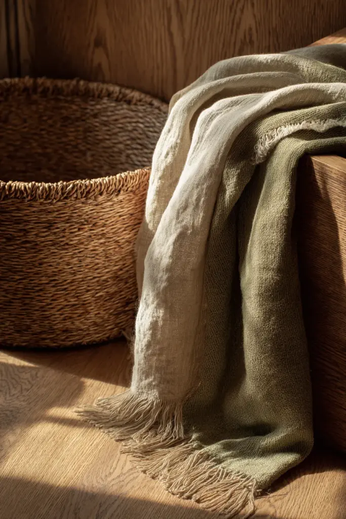
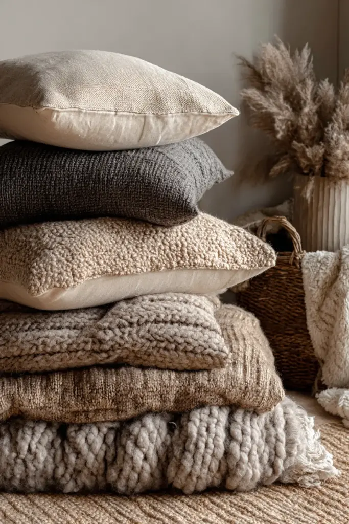
Linens in oatmeal, natural, and soft gray create hygge instantly. Drape a chunky knit throw in warm taupe over your sofa. Layer sage green cushions with mushroom gray.
Cotton and linen curtains in off-white filter light beautifully. They should feel lived-in, slightly wrinkled—perfectly imperfect.
For rugs, choose natural jute or wool in cream, beige, or soft charcoal. Avoid patterns; let texture provide the visual interest.
Budget-Friendly DIY Color Ideas for PH Homes
Custom Paint Mixing
Create your own perfect taupe: Mix 70% beige base + 20% gray + 10% warm brown. Test on cardboard first. This DIY approach saves money and lets you customize undertones for your specific lighting.
For muted sage, start with white, add drops of green and tiny amounts of gray and yellow until you reach that perfect, neither-too-bright nor too-dull shade.
Upcycling Furniture
Transform old wooden pieces with natural stains. For wabi-sabi texture, try:
- Lightly sand edges for weathered effect
- Apply diluted coffee or tea for aged brown tones
- Use milk paint in mushroom gray for matte, chalky finish
- Embrace wood grain variations—they’re features, not flaws
Sustainable Material Swaps
Rattan over imported bamboo: The Philippines produces gorgeous rattan. Source locally for chairs, baskets, and light fixtures. It’s cheaper and supports local artisans.
Eco-friendly paints: Look for low-VOC brands available in PH markets. Davies Paints and Boysen both offer environmentally conscious lines that perform well in tropical humidity.
Repurposed textiles: Visit Divisoria or local markets for natural fabric remnants. Create cushion covers in beige linen or sage cotton at a fraction of retail prices.
Color Combinations That Work
| Primary Wall Color | Accent Colors | Wood Tone | Result |
|---|---|---|---|
| Warm White | Sage + Terracotta | Medium Oak | Fresh, grounded |
| Soft Beige | Olive + Mushroom Gray | Narra (warm) | Cozy, earthy |
| Light Taupe | Charcoal + Warm Brown | Walnut (dark) | Sophisticated, calm |
| Off-White | Muted Blue + Beige | Light Ash | Airy, serene |
| Sage Green (accent wall) | Cream + Clay | Natural Rattan | Organic, balanced |
Lighting: How It Transforms Color
Natural light is your best friend. In Silang’s bright climate, sheer curtains in cream soften harsh midday sun while keeping spaces luminous.
Warm LED bulbs (2700-3000K) make beiges glow golden and sage greens appear richer. Avoid cool white bulbs—they’ll make your carefully chosen palette feel sterile.
Layered lighting creates hygge magic. Combine overhead fixtures with floor lamps in natural materials. Rattan pendant lights cast beautiful shadows that add depth to neutral walls.
Common Mistakes to Avoid
Too much gray can feel cold, especially in already-minimal spaces. Balance cool grays with warm browns and beiges.
Ignoring undertones leads to clashing. Test paint samples in your actual room lighting—morning, noon, and evening. That “perfect beige” might reveal pink or green undertones you didn’t expect.
Forgetting texture makes monochrome palettes flat. Even if everything is beige, vary the textures: smooth walls, nubby linen, rough pottery, soft wool.
Skipping plants misses an opportunity. Real greenery brings the most authentic sage and olive tones into your space. They’re living, breathing accent colors.
Philippine-Specific Considerations
Climate Adaptations
Monsoon-resilient colors: Muted greens and warm browns mask humidity stains better than pure whites. They also harmonize with the lush greenery visible through windows during rainy season.
Heat reflection: Lighter neutrals like warm white and soft beige help rooms stay cooler in tropical heat while maintaining the Japandi aesthetic.
Local Materials
Narra wood brings authentic warmth with its reddish-brown tones. It’s a Philippine treasure that embodies wabi-sabi’s appreciation for natural beauty and impermanence.
Abaca and piña textiles in natural tones add local craftsmanship to your Japandi space. These sustainable materials connect your living room to Filipino heritage.
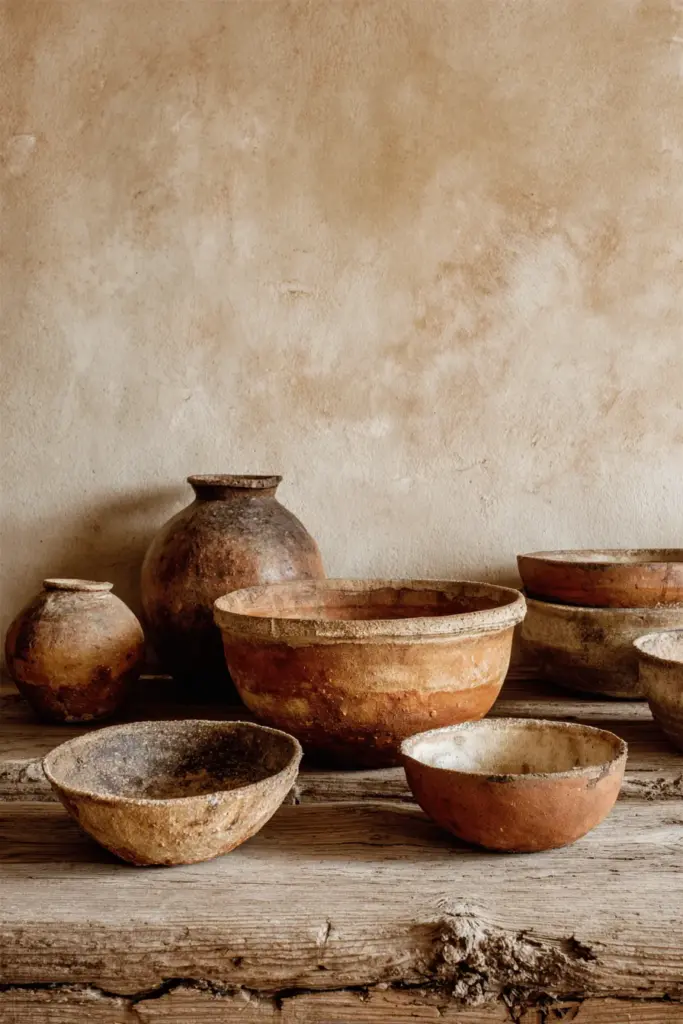
Terracotta and clay pottery from local artisans provide perfect accent pieces in clay red and warm brown—supporting sustainable, community-based production.
Key Takeaways Checklist
- Foundation: Warm whites, beiges, and taupes for walls and large furniture
- Accents: Sage green, olive, terracotta, and warm browns in textiles and décor
- Grounding: Charcoal and deep brown used sparingly for depth
- Wood tones: Natural, medium to warm finishes (narra, oak, acacia)
- Texture: Layer linens, cottons, wool, rattan, and natural fibers
- Lighting: Warm-toned bulbs (2700-3000K) to enhance earthy palette
- Balance: Mix cool and warm neutrals; avoid all-gray schemes
- Sustainability: Choose low-VOC paints and locally sourced materials
- Imperfection: Embrace weathered wood, asymmetry, and natural variations
- Plants: Add living greenery for authentic color and biophilic benefits
Creating Your Personal Palette Journey
Start small if the full transformation feels overwhelming. Paint one accent wall in sage. Replace bright cushions with warm taupe and terracotta versions. Introduce a narra wood side table.
Watch how the light moves through your space at different times of day. Notice which colors make you exhale. Which shades invite you to sit down, stay awhile, breathe deeply.
Japandi isn’t about following rules. It’s about creating harmony between opposites—perfection and imperfection, minimalism and warmth, Japanese restraint and Scandinavian coziness.
Your living room should feel like coming home to yourself. The colors you choose become the background music of your daily life—subtle, sustaining, always there when you need them.
Conclusion: The Poetry of Imperfect Color
There’s a reason Wabi Sabi Japandi living room colors resonate so deeply in 2025. We’re tired. We’re overstimulated. We crave spaces that don’t demand anything from us—that simply hold us gently.
These earthy neutrals, these soft greens and warm browns, they’re more than trends. They’re a return to what has always calmed the human spirit: nature, simplicity, authenticity. They remind us that beauty doesn’t require perfection. Sometimes the most beautiful things are slightly faded, gently worn, perfectly imperfect.
As you transform your living room, remember: every brush stroke is a meditation, every color choice a small act of self-care. You’re not just decorating. You’re creating a refuge from the noise. A place where you can finally, fully rest.
Let the colors breathe. Let them age. Let them tell your story.
Welcome home.
Frequently Asked Questions
What colors are in a Japandi color palette?
The Japandi color palette centers on warm neutrals like beige, taupe, and off-white, complemented by earthy accents including sage green, olive, warm browns, muted terracotta, and soft charcoal. Natural wood tones in medium to warm finishes complete the scheme. These colors create a serene, nature-inspired atmosphere that balances Scandinavian minimalism with Japanese wabi-sabi warmth.
What is the difference between Japandi and wabi-sabi?
Wabi-sabi is a Japanese philosophy celebrating imperfection, impermanence, and natural aging—think weathered wood and asymmetrical pottery. Japandi is a design style that blends wabi-sabi’s embrace of imperfection with Scandinavian minimalism’s clean lines and hygge coziness. While wabi-sabi focuses on rustic, aged textures, Japandi balances this with more polished, functional elements, creating spaces that feel both lived-in and refined.
How do I use Japandi colors in a small living room?
Start with warm white or soft beige walls to maximize light and space. Add sage green through accent pillows, throws, or a single piece of artwork. Choose natural wood furniture in light to medium tones. Layer neutral textiles like linen curtains and jute rugs. Use warm lighting (2700K bulbs) to enhance the cozy atmosphere. Keep décor minimal—each piece should serve both function and beauty.
What paint brands offer Japandi colors in the Philippines?
Boysen Paints offers an excellent u0022Muted Tonesu0022 collection with warm neutrals and earthy shades ideal for Japandi interiors, formulated for Philippine humidity. Davies Paints also provides low-VOC options in beiges, taupes, and sage greens. For custom colors, start with their neutral bases and ask store staff to tint toward warmer or earthier undertones. Both brands perform well in tropical climates.
Can I mix Japandi colors with bold accents?
While traditional Japandi emphasizes muted tones, you can add subtle warmth through terracotta or clay red accents—both trending in 2025. These should feel earthy, not bright. Think handmade pottery, woven textiles, or a single rust-colored cushion. Avoid neon or primary colors, which disrupt the calming palette. If you love color, incorporate it through natural elements like plants or sunset-toned artwork in warm, muted hues.