Table of Contents
The living room is where life unfolds — where morning light touches the edge of a sofa, where quiet conversations linger over tea, where the weight of the day finally softens. It deserves colors that breathe with you.
Sustainable Japandi design marries the warm minimalism of Scandinavian hygge with the contemplative beauty of Japanese wabi-sabi. The result? A palette rooted in nature, drawn from clay and moss, linen and stone.
These aren’t just colors. They’re invitations to slow down, to feel textures beneath your fingertips, to notice how shadows move across walls. And when chosen sustainably — through low-VOC paints, natural pigments, and mindful sourcing — they honor both your home and the earth.
Let’s explore how to build a living room that feels like exhaling.
What Makes a Color Palette “Sustainable Japandi”?
Sustainable Japandi color palettes prioritize earth-derived tones that age gracefully and reduce environmental impact. Think soft whites that mimic rice paper, sage greens pulled from forest floors, warm taupes reminiscent of unglazed pottery.
The sustainability lies in material choices: low-VOC paints that release fewer toxins, natural pigments from clays and minerals, and finishes that work with humid climates rather than against them. In places like Calabarzon, Philippines, where tropical moisture lingers, mold-resistant formulations become part of the palette itself.
These colors also embrace wabi-sabi — the Japanese art of finding beauty in imperfection. A wall that weathers gently over time, showing subtle shifts in tone, becomes part of your home’s story rather than something to constantly repaint.
The Core Japandi Color Palette: 10 Essential Hues
Soft Whites and Creamy Ivories (#F5F5F0 to #FFFEF7)
Soft whites form the breathing room in Japandi spaces. Unlike stark clinical whites, these carry whispers of warmth — ivory undertones, faint hints of beige. They reflect natural light beautifully without glare, creating an expansive feeling even in smaller living rooms.
Pair creamy whites with oak or pine furniture to let the wood grain sing. Consider low-VOC brands that use titanium dioxide from sustainable sources. In humid climates, choose formulations with anti-microbial additives to prevent yellowing.
Warm Beiges and Taupes (#D4C5B0 to #9B8B7E)
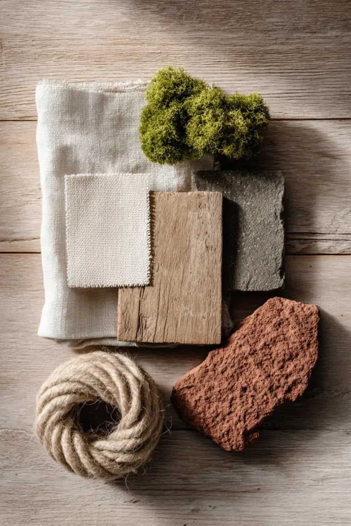
Beige is the anchor of Japandi design — grounding without heaviness. Taupe, its cooler cousin, adds sophistication when layered on accent walls or woven into linen curtains. These neutrals work particularly well in living rooms that transition between day and night lighting.
Source these tones through clay-based paints when possible. Natural earth pigments create depth that synthetic colors can’t match. They also shift subtly throughout the day as sunlight changes angle, making your space feel alive.
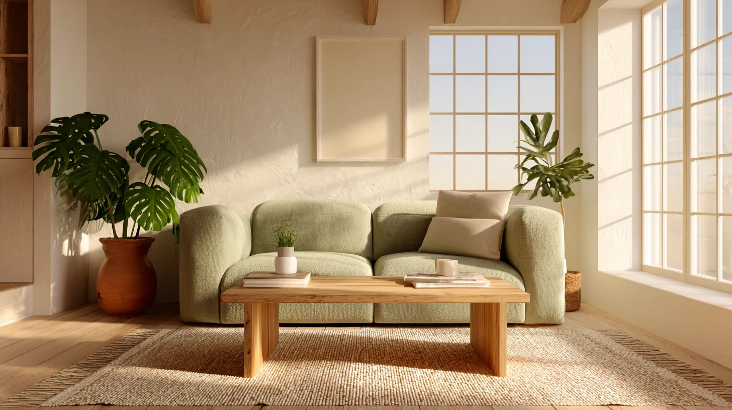
Sage Green and Olive Moss (#B2AC88 to #A8B99D)
Muted greens bring biophilic design into your living room, connecting indoor spaces to nature outside your windows. Sage green (#A8B99D) reduces stress by up to 20% in living environments, according to environmental psychology studies. It’s especially powerful in rooms where you want to encourage conversation and calm.
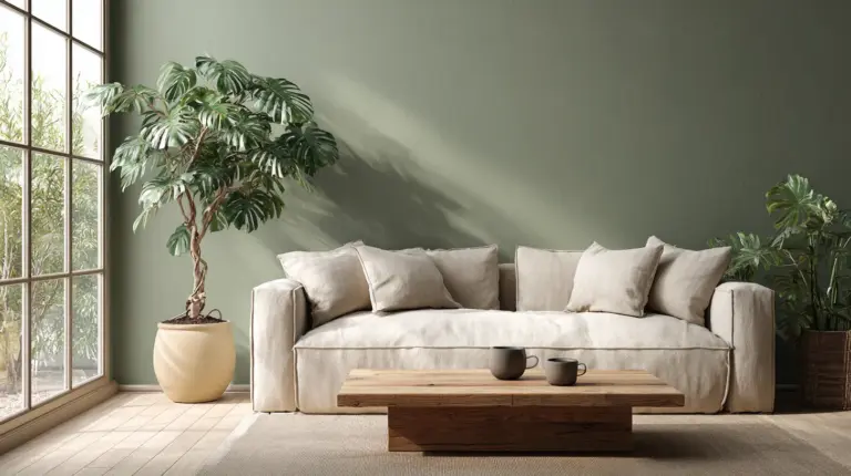
Olive moss tones work beautifully on feature walls behind low-profile sofas or as ceiling colors in spaces with strong natural light. Pair with warm LED bulbs (2700K-3000K) to prevent the green from reading too cool or clinical.
Warm Browns and Terracotta (#B87333 to #CD853F)
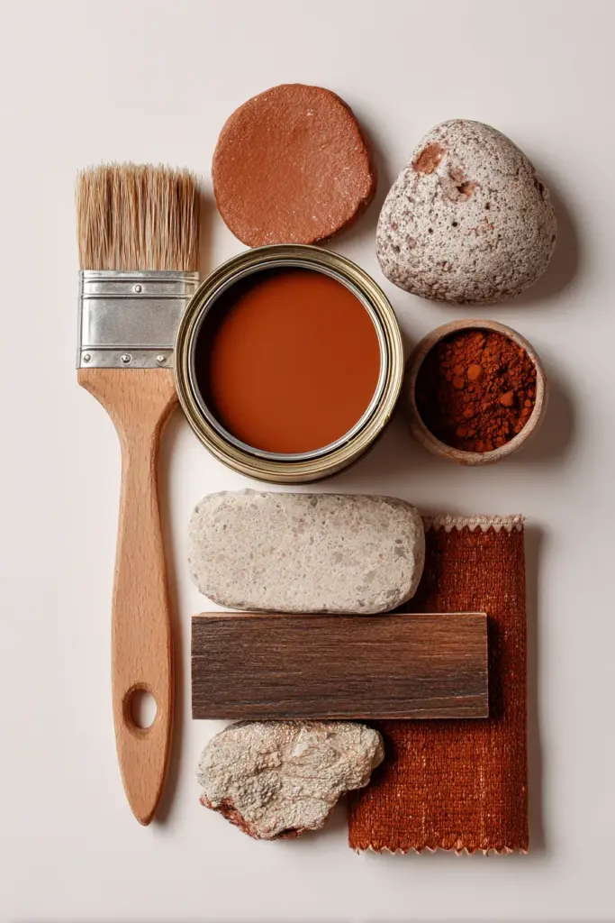
Terracotta introduces warmth without overwhelming minimalist sensibilities. Use it sparingly — on handmade pottery displayed on floating shelves, through clay pots holding indoor palms, or as an accent stripe on neutral walls. It grounds lighter tones while maintaining earthy authenticity.
In the Philippines, consider sourcing terracotta from local artisans working with traditional methods. Upcycled clay pieces add both color and ethical sourcing to your sustainable palette.
Charcoal and Soft Grays (#4A4A4A to #8B8680)
Charcoal provides visual weight in Japandi spaces without the harshness of pure black. Use it on window frames, door trims, or as grout between natural stone tiles. Soft gray works as a transitional tone between whites and darker furniture pieces.
Graphite-based natural pigments offer deeper, more nuanced grays than synthetic options. They also photograph beautifully, important if you’re documenting your sustainable design journey.
Room-by-Room Color Applications
Walls: Creating Your Canvas
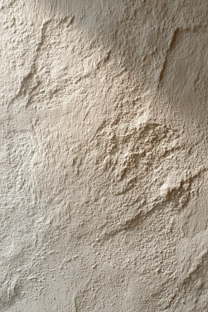
Primary walls should embrace soft whites or warm beiges to maximize light reflection. In tropical climates, choose humidity-resistant formulations with fungicidal properties. Apply two coats minimum for even coverage that ages gracefully.
Accent walls can handle deeper tones like sage green or warm taupe. Position these behind seating areas or opposite windows where natural light will interact with the color throughout the day. Avoid placing dark colors on walls that receive harsh afternoon sun — they’ll absorb heat unnecessarily.
Ceiling considerations matter more than most designers admit. A soft ivory ceiling reflects light downward, making rooms feel taller. For uniquely cozy spaces, try a pale sage ceiling paired with warm white walls — unexpected but deeply calming.
Furniture and Textiles: Layering Tone
Natural wood furniture in oak, pine, or bamboo brings inherent color to Japandi living rooms. Leave wood unsealed or use plant-based oils to preserve authentic tones. The grain becomes part of your palette.
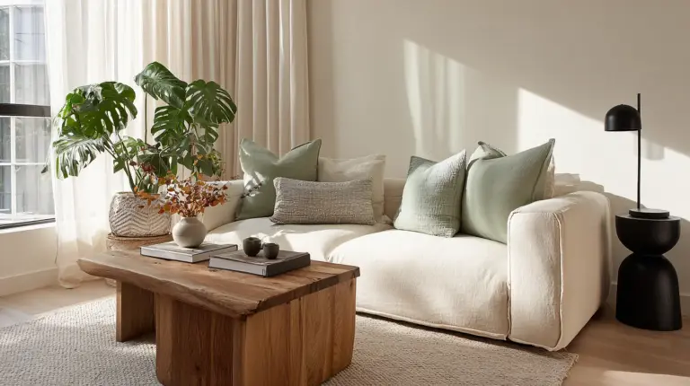
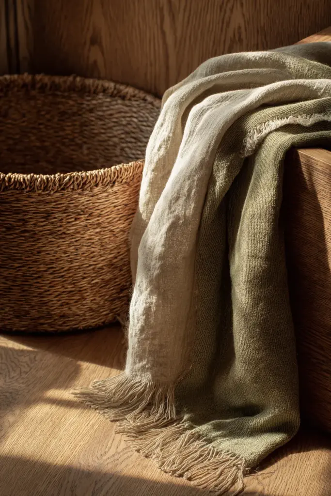
Linen sofas in oatmeal or flax tones provide textural color that shifts with draping and wear. Cotton throws in muted olive or terracotta add warmth without pattern overwhelm. Choose organic, undyed fabrics when possible — their natural variations create subtle interest.
Rattan and bamboo accent pieces introduce honey-brown tones while supporting sustainable forestry. Look for pieces certified by the Forest Stewardship Council, especially when sourcing from Southeast Asian makers.
Flooring: Grounding Your Palette
Light oak or ash flooring provides the ideal foundation for Japandi color schemes. Natural variations in wood grain add organic pattern without competing with intentional color choices. Finish with water-based polyurethane to avoid VOC off-gassing.
If replacing flooring isn’t feasible, large jute or wool area rugs in cream or beige create similar grounding. They also soften acoustics in minimalist spaces where sound can echo.
Sustainable Sourcing Strategies for Philippine Homes
Budget-Friendly DIY Color Solutions
Upcycled local woods offer free or low-cost palette additions. Narra wood scraps from carpentry shops can become floating shelves that introduce warm reddish-brown tones. Sand them smooth and finish with coconut oil for natural sheen.
Natural dye experiments using avocado pits (soft pink-beige), onion skins (warm yellow-tan), or turmeric (golden earth tone) can color cotton textiles at home. Boil materials in water, strain, and soak pre-washed fabric for 1-2 hours. These won’t match commercial durability but add authentic handmade character.
Thrift market finds in Silang or surrounding areas often yield terracotta pots, wooden crates, and linen pieces in perfect Japandi tones. Clean thoroughly and repurpose as storage, planters, or side tables that layer color naturally.
Climate-Adapted Paint Choices
Humidity-resistant formulations prevent the mold and mildew that plague tropical homes. Look for paints labeled “tropical grade” or those containing zinc oxide, which naturally resists fungal growth. Boysen and Davies brands offer Philippine-specific low-VOC options.
Breathable finishes allow moisture to escape rather than trapping it behind paint layers. Lime wash and clay plasters work beautifully for Japandi aesthetics while managing tropical humidity. They require reapplication every 3-5 years but improve air quality.
Heat-reflective properties matter in warm climates. Lighter Japandi tones naturally reflect solar heat, reducing cooling costs. For maximum efficiency, choose paints with heat-reflective additives on west-facing walls.
Color Psychology Meets Biophilic Design
Colors affect mood through both cultural association and biological response. Muted greens trigger the same parasympathetic nervous system activation as being in nature — lowered heart rate, reduced cortisol, deeper breathing. This makes sage and olive ideal for living rooms meant for relaxation.
Warm neutrals like beige and taupe create psychological safety, which is why they dominate hospitable spaces across cultures. They signal stability without stimulation, perfect for environments where diverse activities occur — from morning coffee to evening reading.
Lighting amplifies color psychology. Pair your Japandi palette with warm LED bulbs (2700K) rather than cool ones. Cool lighting makes earthy tones appear dull or gray. Warm lighting enhances the amber, pink, and green undertones that make these colors feel alive.
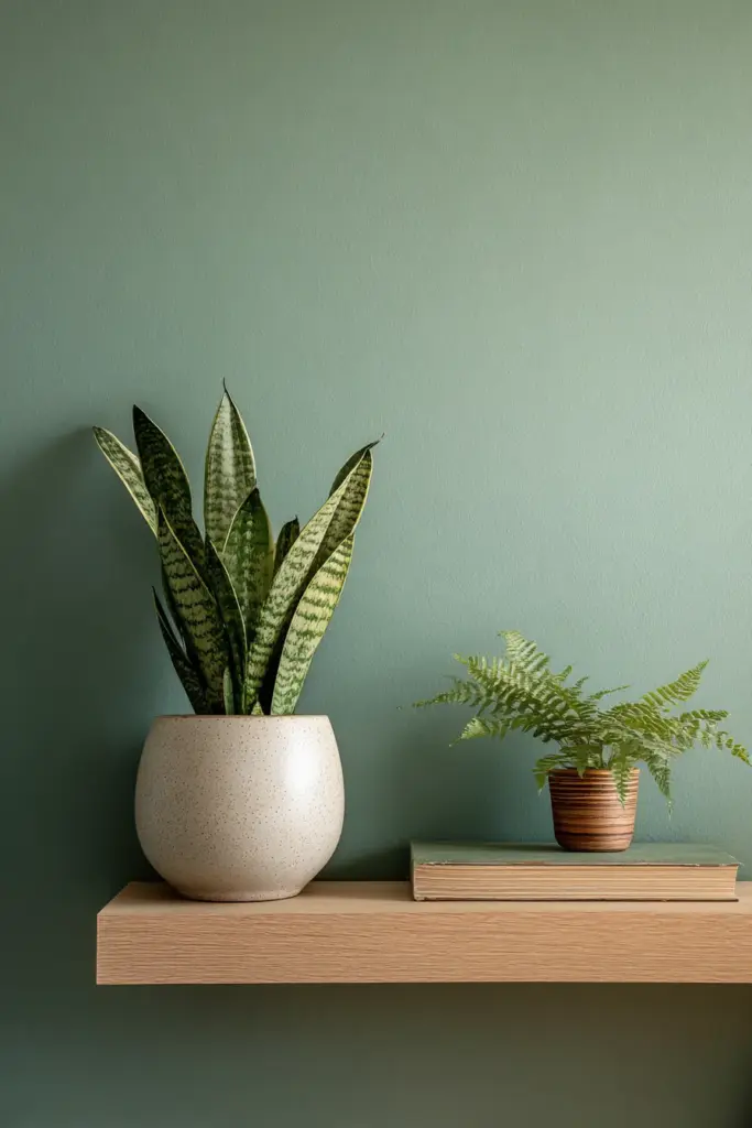
Biophilic pairings strengthen the nature connection. Place potted ferns or snake plants near sage green walls. Their living green will create slight color harmony shifts throughout seasons, keeping your space dynamic.
Multifunctional Color Zoning for Small Living Rooms
Small spaces benefit from strategic color use that defines areas without physical dividers. Paint the sleeping nook area in a slightly deeper taupe while keeping main seating zones in soft white. The tone shift creates visual separation while maintaining openness.
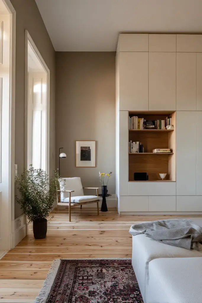
Storage-integrated color tricks maximize small Japandi living rooms. Paint built-in cabinets the same color as walls so they recede visually, making rooms feel larger. When open, the stored items provide color contrast. When closed, the space feels uncluttered.
Vertical color gradients — transitioning from darker taupe at floor level to lighter ivory at ceiling height — can make low-ceilinged rooms feel taller. This technique works especially well in older Philippine homes with 8-foot ceilings.
Emerging Trends: Japandi Colors for 2026
Design forecasts point toward “deep forest” accents — richer teals, charcoal browns, and mossy darks paired with traditional Japandi neutrals. These add sophistication without abandoning earth-tone roots. Use them in 10-20% ratios as pillow covers or artwork frames.
Recycled and reclaimed color sources are growing. Paints made from construction waste pigments, textiles from ocean plastics dyed with algae-based colors. These aren’t widely available yet but watch for them in eco-design retailers.
Warmer undertones overall as climate consciousness grows. Cooler grays are shifting toward warmer taupes; bright whites becoming creamier ivories. The trend reflects desire for psychological warmth in uncertain times.
Your Sustainable Japandi Checklist
Before selecting colors for your living room, consider:
- Light assessment: Note which walls receive morning vs. afternoon sun and how existing furniture will interact with wall colors
- Climate needs: Choose mold-resistant, humidity-appropriate formulations for tropical or coastal locations
- VOC levels: Prioritize low-VOC or zero-VOC paints to improve indoor air quality
- Material authenticity: Select natural wood tones, undyed textiles, and earth-pigment paints when budget allows
- Color ratios: Follow 60-30-10 rule — 60% primary neutral, 30% secondary earth tone, 10% accent color
- Existing elements: Work with flooring and fixed elements rather than fighting them with mismatched new colors
- Lighting temperature: Install warm LED bulbs (2700K-3000K) to complement earth tones properly
- Texture variety: Ensure color palette includes matte, satin, and natural textures to prevent flatness
- Local sourcing: Investigate Philippine artisans for terracotta, bamboo, and reclaimed wood in authentic tones
- Long-term vision: Choose colors that will age gracefully and won’t require frequent repainting
Bringing It All Together
Building a sustainable Japandi living room is less about perfection and more about presence. It’s choosing the sage green that reminds you of morning walks. It’s touching linen that softens with every wash. It’s watching afternoon light turn your ivory walls golden.
These colors aren’t trends to chase — they’re constants borrowed from earth and sky, forest and stone. They’ll still feel right in five years, in ten. They honor traditional craftsmanship while embracing modern environmental responsibility.
Your living room can hold beauty and ethics in the same breath. It can be both sanctuary and statement. And it starts with colors that know where they came from.
Let your space become what it wants to be: calm, grounded, alive.
Frequently Asked Questions
What colors are best for small Japandi living rooms in humid climates?
Soft whites (#F5F5F0) and warm beiges (#D4C5B0) work best in small, humid spaces. They reflect light to make rooms feel larger while humidity-resistant formulations with anti-fungal additives prevent mold growth common in tropical areas. Pair with natural ventilation and dehumidifying plants like peace lilies.
How do I source low-VOC Japandi paints in the Philippines?
Boysen and Davies both offer low-VOC lines suitable for Japandi palettes. Look for their u0022Healthy Homeu0022 or u0022EcoSeriesu0022 formulations in soft whites, beiges, and muted greens. Local hardware stores in Silang and Tagaytay increasingly stock these options. Alternative: Clay-based plasters from artisan suppliers.
Can I mix sustainable Japandi colors with existing colorful furniture?
Yes, but strategically. Use Japandi neutrals (beige, white, sage) as your 80% base, letting existing colorful pieces become intentional accents. A bright blue sofa becomes striking against warm taupe walls rather than competing with multiple hues. The neutral palette creates calm that highlights, rather than clashes with, existing color.
What’s the difference between Japandi sage green and regular green paint?
Japandi sage green (#A8B99D) has gray and brown undertones that mute its vibrancy, creating an earthy, aged appearance rather than a fresh spring green. It reads more neutral than colorful, blending with other earth tones. Regular greens often appear more saturated and can overwhelm minimalist spaces. Test samples in your actual lighting before committing.
How often do sustainable Japandi colors need repainting?
Quality low-VOC paints last 5-7 years in tropical climates with proper prep and application. Clay plasters and lime washes may need touch-ups every 3-5 years but improve rather than degrade in appearance over time. The key is embracing u003cemu003ewabi-sabiu003c/emu003e — slight patina and color shifts add character rather than requiring immediate correction.