Table of Contents
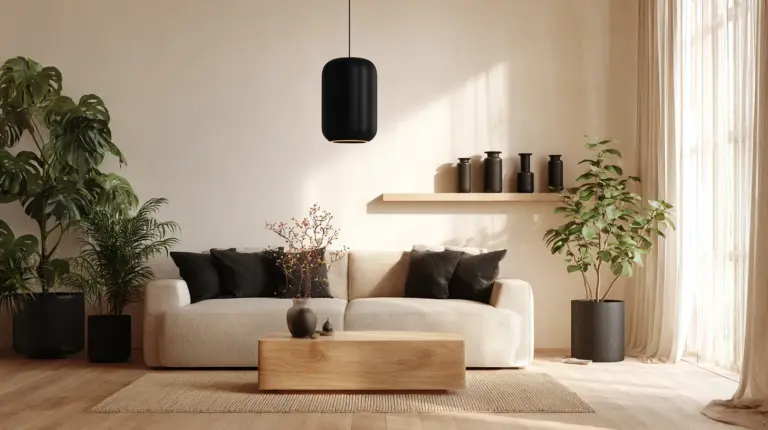
There’s something deeply calming about a living room that breathes with natural wood. The grain catches afternoon light. The warmth settles into your bones before you’ve even sat down.
When Japanese minimalism meets Scandinavian hygge, you get Japandi—a design philosophy that celebrates the beauty of imperfection and the comfort of simplicity. Wood tones become the heart of this style, grounding every color choice in organic elegance.
In this guide, we’re exploring how to layer wood tones with soft neutrals, earthy accents, and thoughtful color palettes. Whether you’re working with light ash or deep walnut, you’ll discover how to create a living room that feels both serene and soulful.
Let’s bring warmth home.
Understanding Japandi Wood Tones and Their Colors
Japandi design doesn’t ask you to choose between light and dark. It invites you to balance them with intention.
The style draws from Scandinavian pine and birch—those pale, honey-toned woods that make rooms feel airy. Then it introduces Japanese walnut, cedar, and darker oak for depth and grounding. The magic happens when these contrasts coexist without competing.
Wood tones in Japandi aren’t just furniture finishes. They’re the foundation of your color story, dictating which neutrals feel right, which greens will sing, and how much black you can introduce before the space loses its softness.
Light Wood Tones: Oak, Ash, and Pine
Light woods bring brightness without the starkness of white. Think blonde oak with its subtle grain, ash with its silvery undertones, or pine with warm peachy hints.
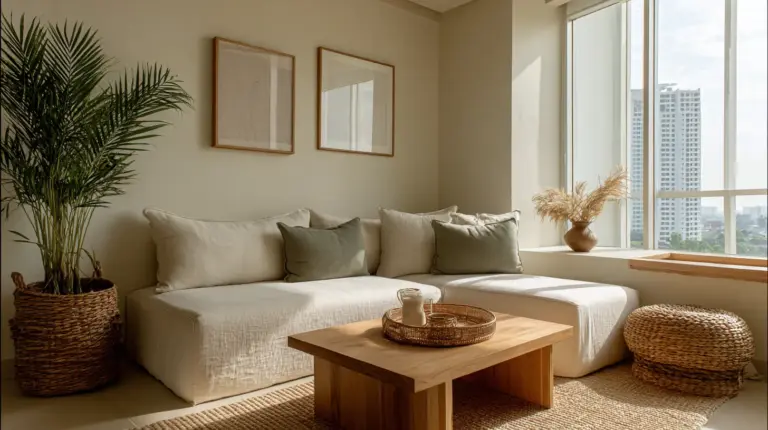
These woods pair beautifully with off-white walls (hex #F5F5F0), soft beige upholstery, and creamy linens. They create the illusion of space—perfect for smaller living rooms where you need every inch to feel open. Layer in sage green (#A8BBA3) cushions or a terracotta (#D4735E) throw for gentle contrast.
In Philippine homes, light-toned furniture alternatives like sustainably sourced pine or bamboo blends offer budget-friendly Japandi options under PHP 20,000.
Medium Wood Tones: Teak and Natural Oak
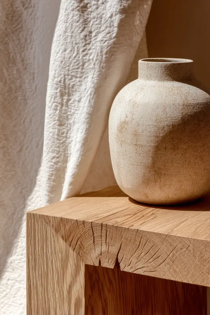
Medium woods sit in that sweet spot—not too light to disappear, not too dark to dominate. Teak brings warmth with its golden-brown richness. Natural oak adds character through pronounced grain patterns.
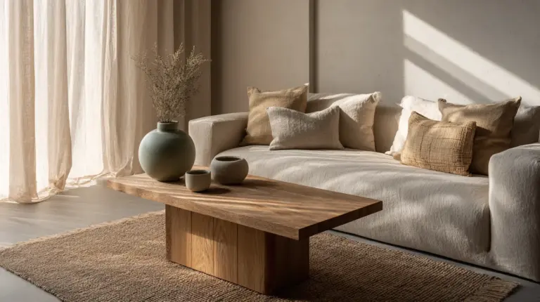
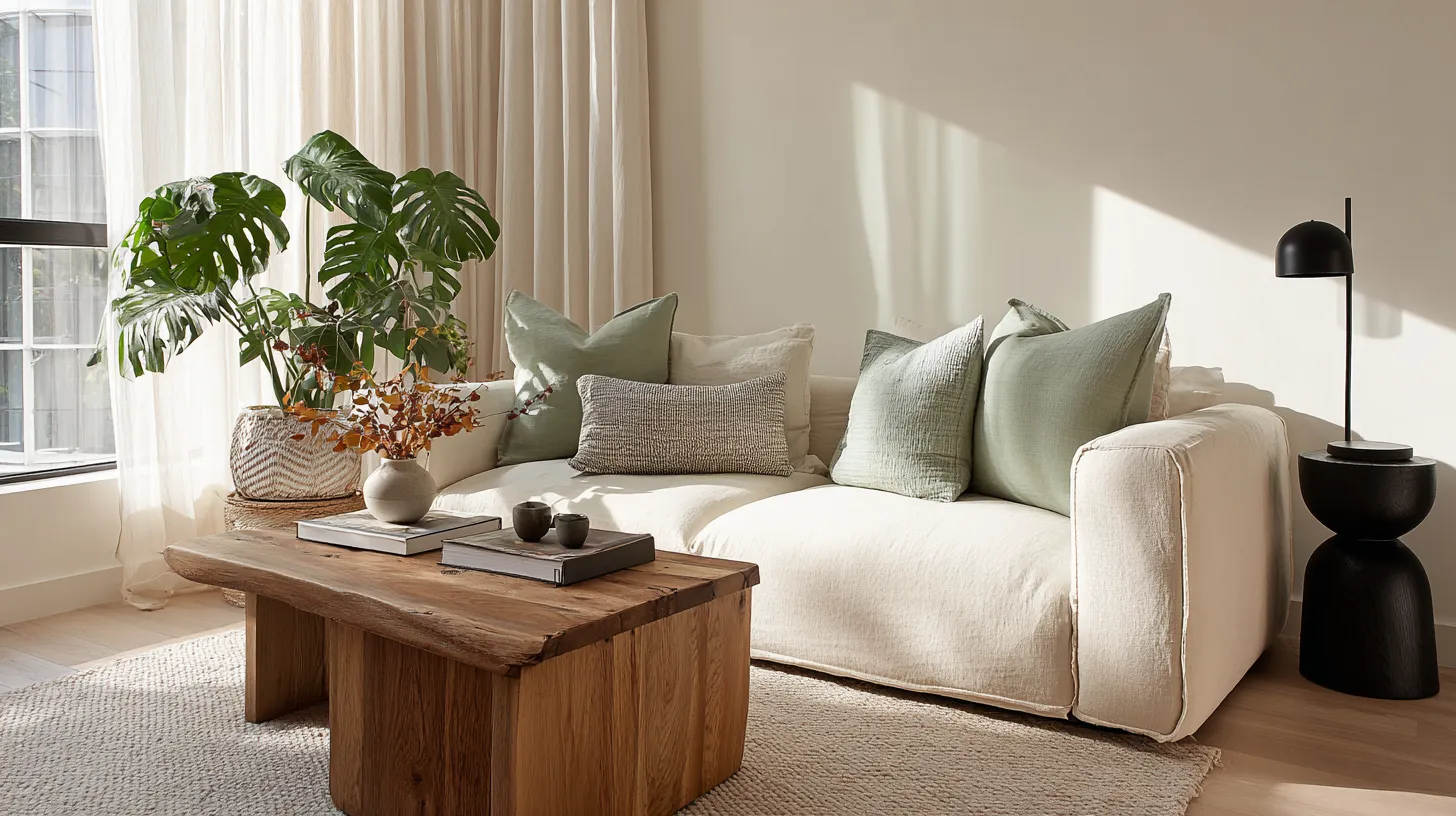
These tones harmonize with taupe walls (#BBA896), charcoal accents (#3C3C3C), and mossy greens. They’re versatile enough to anchor a room without demanding all the attention. Pair a medium-toned oak coffee table with linen sofas and matte black lighting fixtures for balanced visual weight.
Medium wood tones also play well with mixed materials. Think woven rattan, ceramic vases, and textured wool—elements that add sensory depth while maintaining the Japandi ethos of functional beauty.
Dark Wood Tones: Walnut, Dark Oak, and Wenge
Dark woods are Japandi’s grounding force. Walnut brings chocolate-brown elegance with subtle purple undertones. Dark oak adds gravitas. Wenge offers near-black sophistication for those who crave drama without losing warmth.
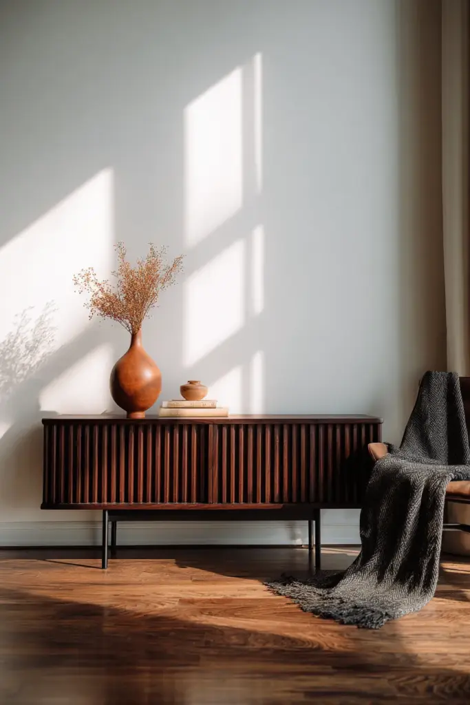
These darker tones pair exquisitely with cloud-white walls (#FAFAF8), cream textiles, and occasional pops of burnt sienna (#E97451). The contrast creates visual tension that feels intentional, not accidental. A dark walnut media console against a soft gray wall becomes sculpture.
Use dark wood sparingly in smaller spaces, focusing on statement pieces like dining tables or accent shelving. Balance is key—too much darkness can shrink a room, but just enough creates a cozy, embracing atmosphere.
The Japandi Color Palette: Beyond the Wood
Wood sets the stage, but color brings the story to life. Japandi palettes are quiet but never boring.
The foundational neutrals—beige, taupe, greige (#D7CCC8), and soft whites—create a canvas that lets wood tones shine. These aren’t sterile grays or cold whites. They’re warm, lived-in shades that change with the light, revealing subtle undertones throughout the day.
Then come the earthy accents: sage green for freshness, terracotta for warmth, charcoal for definition, and muted blues (#8FA6B2) for calm. These colors echo nature—stone, clay, leaves, sky—without shouting for attention.
Neutral Base Colors That Complement Wood
Start with walls in warm white (#F7F5F2) or light greige. These shades have enough warmth to support light woods and enough lightness to balance dark woods.
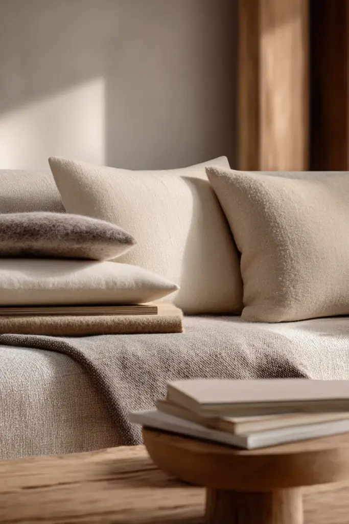
For larger furniture pieces, consider beige linen sofas or taupe upholstered chairs. These fabrics age beautifully, developing a patina that feels earned. Add cream-colored wool throws or oat-toned cushions for textural layering without color complexity.
Avoid stark whites—they can make warm woods look yellow and disrupt the harmonious flow Japandi requires. Instead, opt for whites with beige or gray undertones that create seamless transitions between wood and fabric.
Earthy Accent Colors for Warmth and Depth
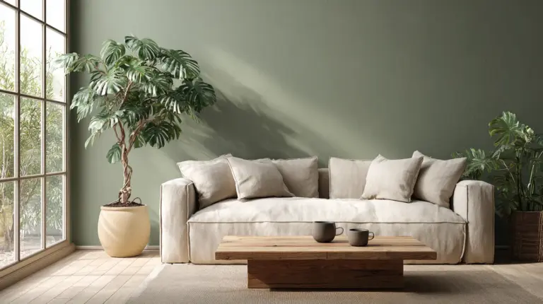
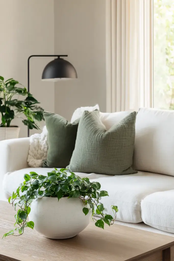
Sage green is Japandi’s secret weapon. It’s fresh without being bright, natural without being literal. Use it in cushions, planters, or a single accent wall behind floating shelves.
Terracotta and rust tones (#C8826D) add warmth that feels both modern and ancient. A single terracotta vase on a light oak console can transform the entire corner. Pair these warm tones with charcoal or black accents—perhaps a matte black picture frame or steel planter—to prevent the palette from feeling too soft.
Mossy greens, dusty blues, and even muted mustards can work if used sparingly. The rule: one or two accent colors maximum, repeated thoughtfully throughout the space.
Black and Charcoal: The Grounding Elements
Black isn’t harsh in Japandi—it’s essential. But we’re talking matte blacks, soft charcoals, and graphite grays, not glossy lacquer.
Introduce black through lighting fixtures, slim-profile furniture legs, or minimal picture frames. These elements create visual anchors that prevent the space from floating away in a sea of neutrals. A matte black floor lamp next to a cream sofa and medium oak side table creates the perfect tension.
Charcoal gray (#4A4A4A) works as a softer alternative, especially in textiles. A charcoal linen throw pillow or a dark gray ceramic bowl adds depth without the starkness of pure black.
How to Mix Wood Tones in Japandi Living Rooms
The fear of mixing woods keeps many people playing it safe. But Japandi celebrates thoughtful contrast.
The key is working with a dominant wood tone and one or two supporting tones. Maybe your flooring is light oak, your coffee table is medium teak, and your shelving is dark walnut. This creates visual rhythm—the eye travels from light to medium to dark, finding rest at each stop.
Avoid perfectly matching wood tones. That showroom uniformity feels sterile, not lived-in. Instead, look for woods with similar undertones: warm woods together (oak, teak, walnut) or cool woods together (ash, maple, wenge).
Light Base with Dark Accents
Start with light wood flooring or a blonde oak entertainment unit. This brightens the room and creates an airy foundation.
Then introduce dark accents: a walnut-stained bookshelf, a black-stained accent chair, or dark wood picture ledges. The contrast adds dimension without overwhelming the space. Keep your dark wood pieces under 30% of the total wood presence for balance.
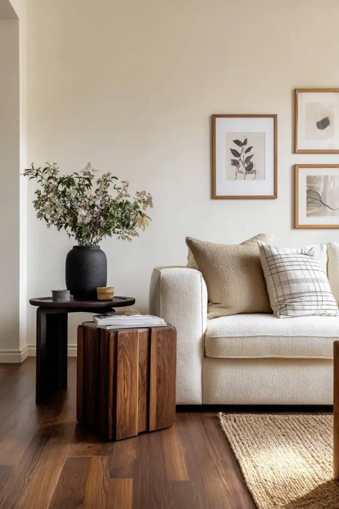
Pair this combination with cream walls and soft gray textiles. Add a jute rug for textural warmth and a few green plants to bridge the light-dark transition naturally.
Dark Base with Light Accents
If your living room features dark wood flooring or built-in cabinetry, lighten the space with pale furniture. A light oak coffee table or ash wood side chairs prevent the room from feeling cave-like.
Layer in plenty of white and cream textiles—think linen curtains, ivory cushions, and a cloud-white throw. These soft elements diffuse the weight of dark wood, creating breathing room. Add brass or warm gold accents through lighting or hardware to enhance the warmth.
This approach works beautifully in larger living rooms where dark wood can create an intimate, cocooning effect without making the space feel cramped.
The 60-30-10 Wood Tone Rule
Apply the classic design rule to wood tones: 60% dominant tone, 30% secondary tone, 10% accent tone.
Perhaps 60% of your wood presence is light oak (flooring, large furniture), 30% is medium teak (coffee table, side tables), and 10% is dark walnut (decorative objects, picture frames). This creates hierarchy and prevents visual chaos.
Don’t forget to count wood tones in decorative items—wooden bowls, cutting boards, trays. These small elements contribute to the overall balance.
Color Schemes for Japandi Living Rooms with Wood Tones
Let’s get specific. Here are five complete color schemes that work beautifully with different wood tones.
Each scheme includes wall colors, textile colors, and accent colors—everything you need to build a cohesive palette.
Scheme 1: Light Oak + Sage + Cream
Wood: Light oak furniture and flooring
Walls: Warm white (#F7F5F2)
Primary Textiles: Cream linen sofa, oat-colored cushions
Accent Color: Sage green (#A8BBA3) in planters, throws, artwork
Grounding Element: Matte black lighting fixtures
This scheme feels fresh and airy—perfect for morning light. The sage green brings life without overwhelming, while cream keeps everything soft and approachable.
Scheme 2: Walnut + Charcoal + Beige
Wood: Dark walnut coffee table and shelving
Walls: Light greige (#E5E0DB)
Primary Textiles: Beige linen sofa, charcoal wool throw
Accent Color: Terracotta (#D4735E) in vases and small accents
Grounding Element: Black steel furniture legs
This scheme grounds the room with dark wood while keeping walls light. The charcoal-terracotta combination adds warmth and sophistication.
Scheme 3: Mixed Tones + Neutral Monochrome
Wood: Light ash flooring, medium oak coffee table, dark picture frames
Walls: Soft white (#FAFAF8)
Primary Textiles: Taupe sofa, ivory cushions, gray linen curtains
Accent Color: Minimal—perhaps one muted blue vase
Grounding Element: Natural jute rug
This is Japandi at its most serene. The mixed wood tones create interest, while the monochrome palette keeps everything calm and cohesive.
Scheme 4: Pine + Earthy Greens + Warm Neutrals
Wood: Pine furniture with honey undertones
Walls: Warm beige (#E8DFD6)
Primary Textiles: Cream sofa, olive green cushions
Accent Color: Mossy green (#7A8B6F) and rust (#B85839)
Grounding Element: Dark brown leather accent chair
This scheme embraces warmth fully. It’s cozy without being heavy, natural without being rustic. Perfect for creating hygge in tropical climates.
Scheme 5: Dark Oak + Cloud White + Minimal Black
Wood: Dark oak entertainment unit and side tables
Walls: Cloud white (#FDFCFB)
Primary Textiles: White linen sofa, cream throw blanket
Accent Color: None—pure minimalism
Grounding Element: Matte black artwork frames and one black floor lamp
This scheme is for purists. The stark contrast between dark wood and white creates drama, while the absence of color accents keeps the focus on form and texture.
Wood Tone Psychology and the Japandi Living Room
Wood does more than look beautiful. It affects how we feel in a space.
Studies suggest that warm wood tones can increase feelings of comfort and relaxation by up to 20%. Light woods energize and open spaces psychologically. Dark woods create intimacy and focus, making rooms feel more enclosed and private.
In Japandi design, this psychological impact is intentional. Light woods in conversation areas promote openness and connection. Dark woods in reading nooks or media areas create focused, contemplative spaces.
Budget-Friendly Japandi Wood Tone Tips
You don’t need expensive furniture to achieve this look. Start with what you have and build thoughtfully.
Upcycling and DIY Wood Staining
Transform IKEA pine furniture with walnut or espresso wood stain. A simple staining project can turn a PHP 3,000 shelf into something that looks custom and sophisticated.
Sand lightly, apply stain with a clean cloth, let dry, and seal with matte polyurethane. The entire process takes a weekend and costs under PHP 1,500 for supplies. Focus on one statement piece first—perhaps a coffee table or bookshelf.
Multifunctional Furniture Under PHP 20,000
Look for pieces that serve multiple purposes: storage ottomans in light wood, extendable dining tables that can function as work surfaces, or media consoles with hidden compartments.
Local Philippine furniture makers often offer beautiful teak alternatives or bamboo pieces at accessible price points. Search for “Japandi furniture Philippines” or visit local craftspeople who work with sustainable wood sources.
Narra Wood Alternatives for Philippine Homes
Narra is gorgeous but expensive and increasingly regulated. Consider sustainably sourced mahogany, pine stained darker, or bamboo composite furniture instead.
These alternatives offer similar warmth and grain patterns at a fraction of the cost. Many Filipino furniture makers now specialize in eco-friendly options that align perfectly with Japandi’s sustainability ethos.
Pairing Wood Tones with Plants and Natural Elements
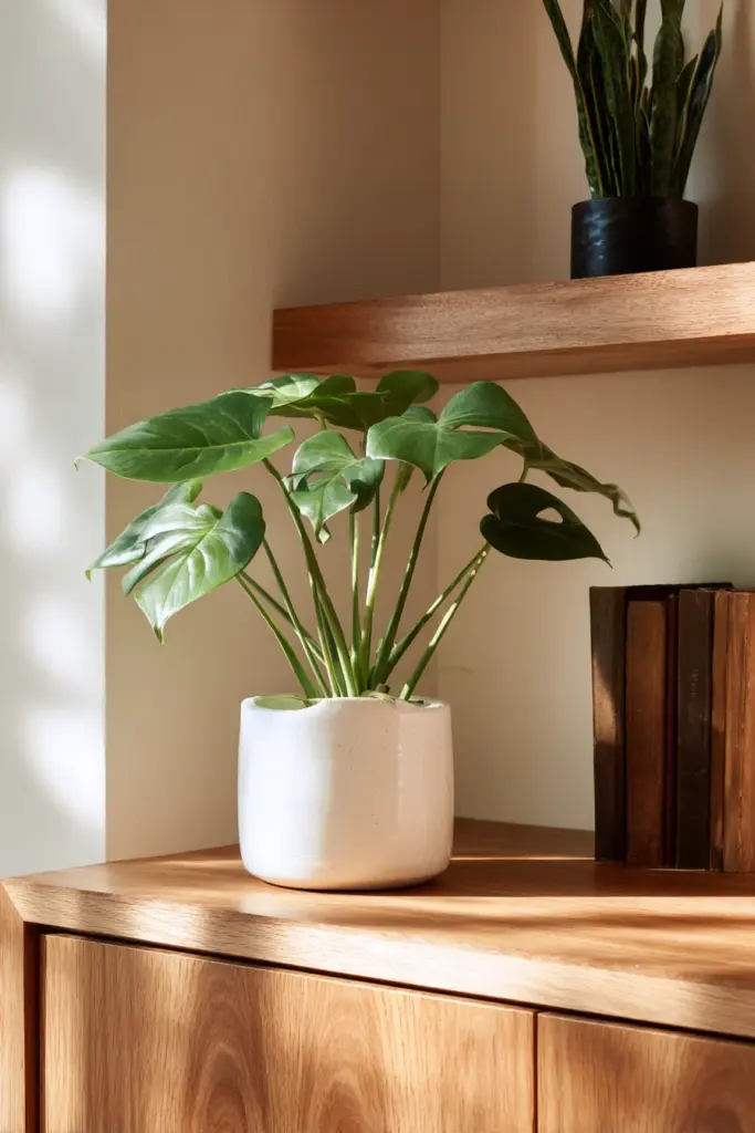
Plants are non-negotiable in Japandi spaces. They bridge wood tones and neutral colors naturally.
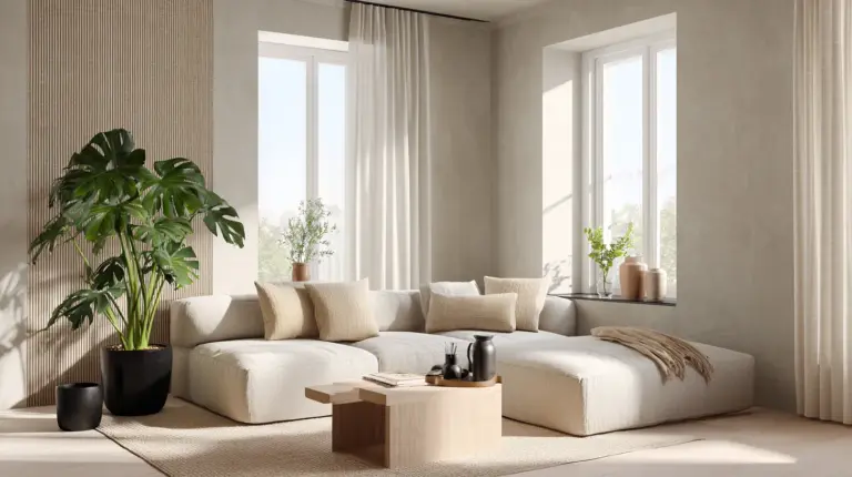
Monstera leaves look stunning against light oak walls. Snake plants add vertical interest next to dark walnut consoles. Pothos trailing from medium-toned shelves creates organic movement.
Choose planters that complement your wood tones: white ceramic for light woods, matte black for dark woods, terracotta for warm-toned pieces. Keep plantings simple—Japandi prefers a few statement plants over cluttered collections.
Lighting Design for Wood-Toned Japandi Living Rooms
Light transforms wood. Morning sun makes light oak glow honey-gold. Evening lamps deepen walnut to near-chocolate.
Use warm white LED bulbs (2700K-3000K) to enhance wood’s natural warmth. Avoid cool white—it makes wood look gray and lifeless. Layer your lighting: ambient ceiling lights, task lamps for reading, and accent lights to highlight wood grain.
Consider smart LED wood-grain lighting strips behind floating shelves or under coffee tables. These subtle glows add depth without disrupting the minimalist aesthetic.
2025 Japandi Trends: Biophilic Black and Reclaimed Wood
Japandi continues evolving. Current trends embrace sustainability and bolder contrasts.
Biophilic black—deep charcoal and soft blacks inspired by volcanic stone—is gaining popularity. When paired with reclaimed wood pieces, it creates a look that’s both ancient and contemporary. Think century-old barn wood shelves against matte black feature walls.
Reclaimed wood brings character and sustainability together. Each piece tells a story through weathered grain and natural imperfections. Look for local salvage yards or upcycled furniture makers who can source reclaimed teak or mahogany.
Checklist: Creating Your Japandi Wood-Toned Living Room
- Choose your dominant wood tone (light, medium, or dark)
- Select 1-2 complementary wood tones for contrast
- Paint walls in warm white, beige, or light greige
- Invest in one statement wood furniture piece (coffee table or shelving)
- Add neutral textiles: linen, wool, cotton in cream, beige, or taupe
- Introduce 1-2 accent colors: sage green, terracotta, or charcoal
- Incorporate matte black elements for grounding
- Add 3-5 plants in appropriate planters
- Install warm white LED lighting (2700K-3000K)
- Layer textures: jute rugs, woven baskets, ceramic accents
- Remove clutter—Japandi thrives on breathing room
- Consider DIY staining for budget-friendly transformations
Conclusion
A Japandi living room built on thoughtful wood tones becomes more than decoration. It becomes a refuge—a place where natural materials ground you and neutral colors calm your mind.
The beauty lies in the balance: light and dark, rough and smooth, minimal and warm. Each wood tone you choose contributes to this harmony, creating spaces that feel both elevated and deeply comfortable.
Start with one piece—maybe a light oak coffee table or a dark walnut shelf. Let that guide your color choices, your textiles, your accents. Trust the process of building slowly, choosing intentionally, and living in spaces that reflect the quiet beauty of nature itself.
Welcome home to warmth.
Frequently Asked Questions
What types of wood are best for Japandi living rooms?
Light woods like oak, ash, and pine create airy foundations, while medium tones like teak add warmth. Dark woods like walnut and wenge provide grounding contrast. Mix 2-3 tones with similar undertones (warm or cool) for balanced harmony. Consider locally sourced or sustainable options like bamboo or reclaimed wood.
How do I mix dark Japanese wood with light Scandinavian tones?
Use one tone as your dominant (60%), another as secondary (30%), and the third as accent (10%). For example, light oak flooring with medium teak furniture and dark walnut accessories. Keep connecting elements like neutral textiles and consistent undertones to ensure the woods feel cohesive rather than chaotic.
What colors pair best with wood tones in Japandi design?
Warm whites (#F7F5F2), beige, taupe, and light greige form your neutral base. Add earthy accents like sage green (#A8BBA3), terracotta (#D4735E), or charcoal (#3C3C3C) sparingly. Matte black grounds the palette. Avoid bright colors or stark whites that clash with wood’s natural warmth.
Can I achieve Japandi style on a budget in the Philippines?
Absolutely. Start with DIY wood staining projects on affordable pine furniture (under PHP 1,500 for supplies). Explore local craftspeople for sustainable teak alternatives or bamboo pieces under PHP 20,000. Focus on one quality statement piece and build around it with secondhand finds and upcycled items.
What’s the difference between light, medium, and dark wood tones in Japandi?
Light woods (oak, ash, pine) brighten spaces and create openness—ideal for small rooms. Medium woods (teak, natural oak) offer versatility and warmth without dominating. Dark woods (walnut, wenge) add drama and intimacy, best used as accents. Your choice depends on room size, natural light, and desired atmosphere.