Table of Contents
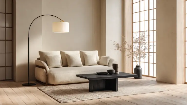
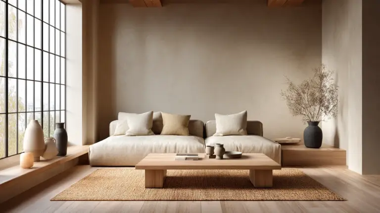
There’s something deeply calming about a room that breathes—where walls whisper rather than shout, and every surface feels intentional yet effortless. The Japandi aesthetic achieves this rare balance, blending Scandinavian warmth with Japanese minimalism into spaces that feel both grounded and graceful.
When it comes to transforming your living room, paint and wallpaper become more than decorative choices. They set the emotional temperature of your space, creating a backdrop for quiet mornings and cozy evenings alike.
In this guide, we’ll explore how to pair muted paint colors with textured wallpapers to achieve that signature Japandi harmony. Whether you’re working with a compact apartment or a generous family room, these ideas will help you create a sanctuary that honors both beauty and function.
Understanding the Japandi Aesthetic
Japandi living rooms embody wabi-sabi—the Japanese philosophy of finding beauty in imperfection—alongside Scandinavian hygge, which celebrates comfort and coziness. This fusion creates interiors that feel lived-in yet refined, minimal yet warm.
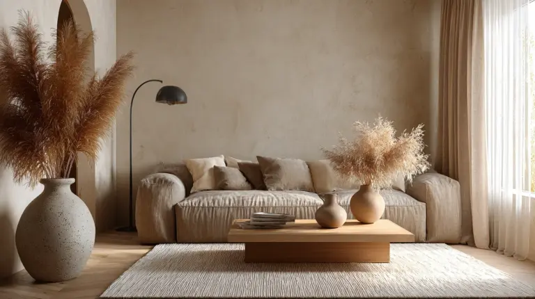
The color palette gravitates toward neutrals: soft beiges, warm taupes, gentle greys, and earthy greens. These hues mirror natural materials like raw linen, unfinished wood, and smooth stone. Light plays a crucial role, filtering through sheer curtains to illuminate textured surfaces without harshness.
Unlike stark minimalism, Japandi embraces subtle pattern and organic texture. A feature wall with delicate botanical motifs or geometric linework adds visual interest without overwhelming the senses.
Choosing Your Japandi Paint Colors
The Foundation: Neutral Walls
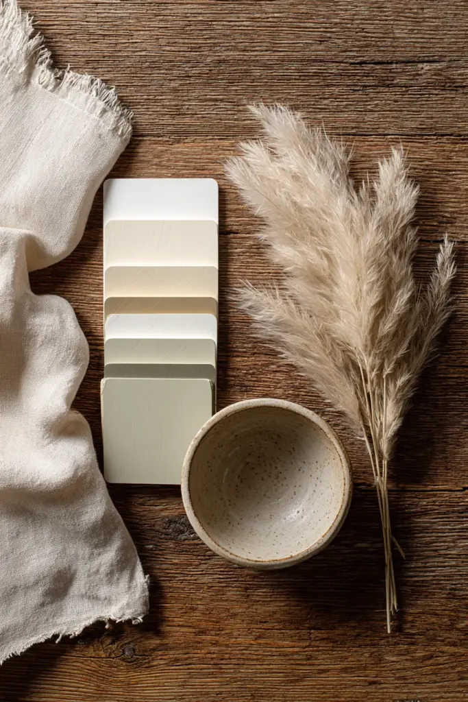
Your base paint should feel like a deep exhale—calming, neutral, and versatile. Warm whites like ivory or cream create brightness without the clinical feel of stark white. These shades catch natural light beautifully, making smaller living rooms feel more expansive.
Greige (grey-beige) serves as the quintessential Japandi neutral. This sophisticated hybrid reads warm in morning light and cool in evening shadows. Look for matte or eggshell finishes that absorb light gently, avoiding glossy sheens that feel too contemporary.
Soft taupe grounds a space with earthy warmth. Pair this with natural wood tones and black accents for depth. These colors work especially well on all four walls, creating a continuous, cocoon-like atmosphere.
Accent Walls with Purpose
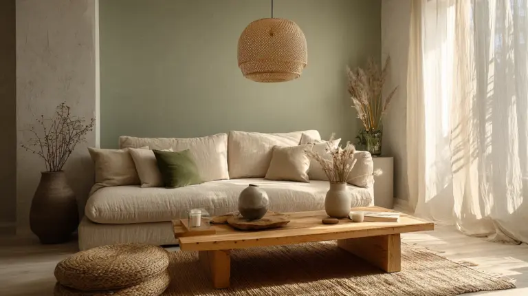
While Japandi favors restraint, a single accent wall in a deeper tone can anchor your living room beautifully. Sage green or dusty olive connects to nature without overwhelming. These colors pair wonderfully with light neutrals and blonde wood furniture.
Warm terracotta or soft clay tones introduce subtle warmth, evoking Japanese pottery and Scandinavian ceramics. Use these sparingly—perhaps on the wall behind your sofa or as a half-wall treatment below natural wallpaper.
Charcoal grey creates dramatic contrast when used thoughtfully. This works best in rooms with ample natural light, where the darkness feels intentional rather than oppressive.
Paint Finish Considerations
Matte finishes align perfectly with Japandi’s understated elegance. They diffuse light softly and hide wall imperfections while creating a velvety, tactile quality. However, matte paints can be harder to clean, so consider eggshell finishes in high-traffic areas.
Low-VOC and eco-friendly paints support the Japandi commitment to natural, sustainable materials. These options improve indoor air quality while aligning with mindful living principles.
Selecting Japandi Wallpapers
Pattern Philosophy
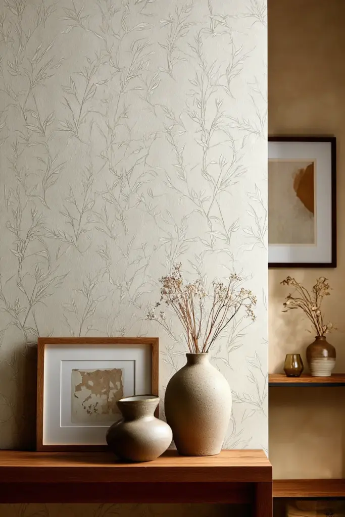
Japandi wallpapers walk a delicate line between visual interest and restraint. The patterns should enhance tranquility rather than demand attention. Think subtle botanical prints—delicate branches, scattered leaves, or abstract bamboo rendered in muted tones.
Minimalist geometric patterns offer another compelling option. Thin vertical lines, soft hexagons, or irregular organic shapes create rhythm without busyness. These work particularly well in small spaces, where they add dimension without overwhelming.
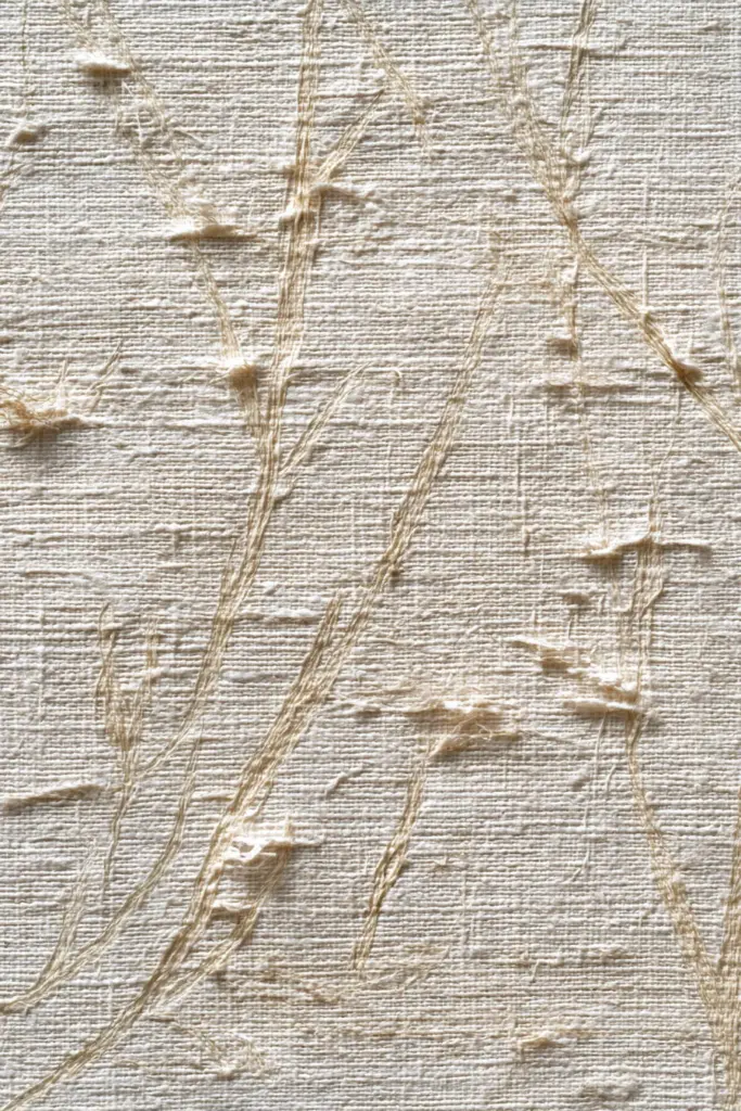
Textured grasscloth or linen-look wallpapers introduce tactile depth while maintaining visual simplicity. The natural imperfections in these materials embody wabi-sabi philosophy beautifully.
Color and Tone
Your wallpaper palette should harmonize with your paint choices. Beige on beige might sound boring, but tonal variations create sophisticated depth—imagine warm sand wallpaper against cooler greige walls.
Cream with soft grey accents feels fresh yet timeless. This combination works especially well with black-framed artwork and dark wood furniture. The subtle contrast keeps the space from feeling flat.
Taupe wallpapers with sage undertones bridge the gap between earth and foliage. These colors feel grounded and organic, perfect for creating a nature-inspired retreat.
Strategic Placement
Not every wall needs wallpaper. In fact, restraint makes a stronger statement. Consider these placements:
- Behind the sofa: This creates a natural focal point without competing with your seating arrangement
- Half-wall treatments: Wallpaper on the lower half with matte paint above divides space elegantly
- Recessed alcoves or nooks: Highlight architectural features with textured wallpaper while keeping main walls simple
Pairing Paint and Wallpaper Successfully
Complementary Combinations
The magic happens when paint and wallpaper work together rather than competing. Here are proven pairings:
| Paint Color | Wallpaper Style | Effect Created |
|---|---|---|
| Warm white | Natural grasscloth in beige | Bright, airy, textural |
| Greige | Botanical line drawings (grey on cream) | Sophisticated, nature-inspired |
| Soft taupe | Minimalist geometric (darker taupe) | Grounded, cohesive, modern |
| Sage green accent | Vertical stripe texture (cream/beige) | Balanced, elongating, fresh |
| Charcoal grey | Light linen-look (ivory) | Dramatic contrast, refined |
Creating Visual Flow
When combining paint and wallpaper, consider the 60-30-10 design rule adapted for Japandi sensibilities. Your primary neutral paint covers about 60% of wall space, wallpaper occupies 30% (typically one feature wall), and deeper accent colors appear in 10% of the room through textiles and accessories.
This creates visual hierarchy without chaos. Your eye travels naturally from the calming painted walls to the textured wallpaper feature, then rests on carefully chosen accent pieces.
Balancing Texture and Tone
If your wallpaper is heavily textured (like grasscloth or embossed patterns), pair it with smoother matte paint. This prevents sensory overload. Conversely, if you choose flat, printed wallpaper with delicate patterns, the surrounding paint can have slightly more sheen or tonal variation.
Think about how light interacts with different surfaces throughout the day. Morning light might make textured wallpaper cast beautiful shadows, while evening lamps warm up matte-painted walls.
Design Techniques for Small Living Rooms
Creating the Illusion of Space
Small living rooms require strategic paint and wallpaper choices. Light, warm neutrals reflect natural light and push walls outward visually. Avoid dark colors on all walls unless you have exceptional natural light.
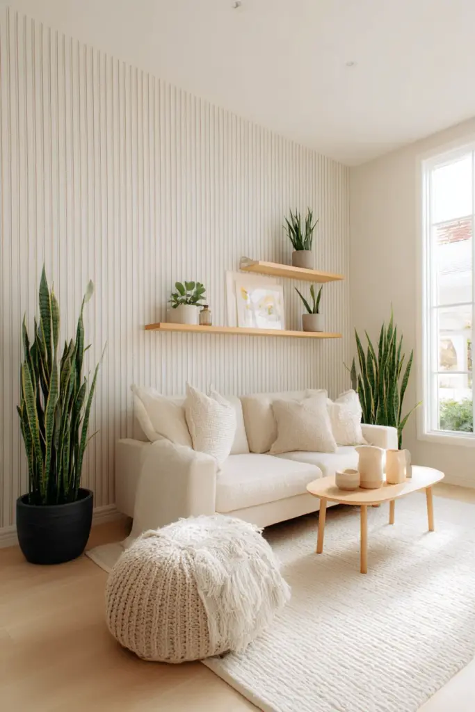
Vertical stripe wallpapers draw the eye upward, making ceilings feel higher. Choose subtle stripes in tonal variations rather than bold contrasts. The effect should be barely noticeable yet impactful.
Paint the ceiling the same color as walls to blur boundaries and expand perceived space. This technique works beautifully in Japandi interiors where continuity matters more than traditional contrast.
Feature Wall Strategies
In compact rooms, limit wallpaper to one wall—typically the longest uninterrupted surface. This creates depth without fragmenting the space. Choose wallpapers with small-scale patterns that don’t overwhelm narrow rooms.
Alternatively, wallpaper a single vertical section from floor to ceiling, like the area around a window or between two doorways. This creates visual height without covering entire walls.
Furniture and Layout Considerations
Your paint and wallpaper choices should complement low-profile furniture characteristic of Japandi design. Light walls make natural wood pieces stand out beautifully. The grain and warmth of oak, walnut, or teak becomes a focal point against neutral backgrounds.
Position furniture to highlight your wallpaper feature wall. A streamlined sofa placed several inches away creates shadows and depth, emphasizing the wall’s texture and pattern.
Practical Installation and Maintenance
Preparing Your Walls
Proper preparation ensures professional-looking results. Fill holes and cracks, then sand smooth. For paint, use primer on new drywall or when making dramatic color changes. This creates an even base that true-to-sample color.
Clean walls thoroughly before wallpaper installation. Dust, grease, and moisture prevent proper adhesion. Some wallpapers require sizing (a preparatory coating) for optimal results—check manufacturer instructions.
DIY vs. Professional Installation
Painting is generally DIY-friendly, especially in the matte finishes Japandi favors. Use quality brushes and rollers, and apply two coats for depth and coverage. The forgiving nature of matte paint hides minor application imperfections.
Wallpaper installation requires more skill, particularly with pattern matching and corners. Peel-and-stick options offer easier DIY application, though traditional paste wallpapers often provide better quality and longevity. For expensive grasscloth or delicate papers, professional installation protects your investment.
Long-Term Care
Matte and eggshell paints resist stains less effectively than semi-gloss. Use gentle cleaning methods—warm water and mild soap on a soft cloth. Test in inconspicuous areas first.
Most Japandi-style wallpapers are delicate. Dust regularly with a soft brush or vacuum attachment. Avoid moisture on grasscloth or paper-based wallpapers. Vinyl or coated options withstand light wiping for high-traffic living rooms.
Budget-Friendly Japandi Transformations
Smart Shopping Strategies
You don’t need luxury prices to achieve Japandi serenity. Look for quality neutrals in standard paint lines rather than designer collections. Basic beiges, taupes, and greys from reputable brands perform beautifully at accessible price points.
For wallpaper, consider peel-and-stick options in Japandi-appropriate patterns. These cost less than traditional wallpaper and allow for easier changes. Shop end-of-season sales for natural textures and minimalist geometrics.
Wallpaper accent sections rather than entire walls. A 6-foot-wide strip behind your sofa delivers visual impact for a fraction of full-wall cost.
Upcycling and Creative Solutions
Transform existing walls without complete overhauls. Paint over outdated wallpaper after proper preparation (cleaning, repairing loose seams, priming). This works best with flat patterns; remove heavily textured wallpaper first.
Create DIY textured finishes using paint techniques like stippling or limewash effects. These add organic, wabi-sabi character without wallpaper costs.
Mix high and low investments strategically. Splurge on premium grasscloth for your feature wall, balance with budget-friendly neutral paint elsewhere.
Enhancing Your Japandi Living Room
Lighting Integration
Paint and wallpaper respond dramatically to lighting choices. Warm white LED bulbs (2700-3000K) enhance the coziness of taupe and beige tones. They make neutral walls feel inviting rather than clinical.
Position floor lamps beside textured wallpaper to create dimensional shadows that emphasize natural materials. The interplay of light and texture brings wabi-sabi imperfections to life.
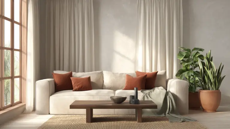
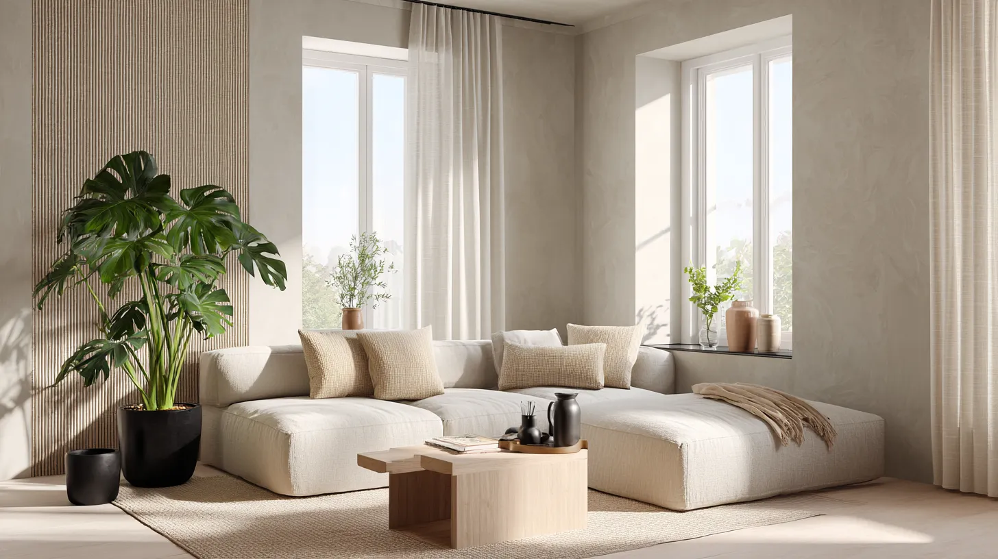
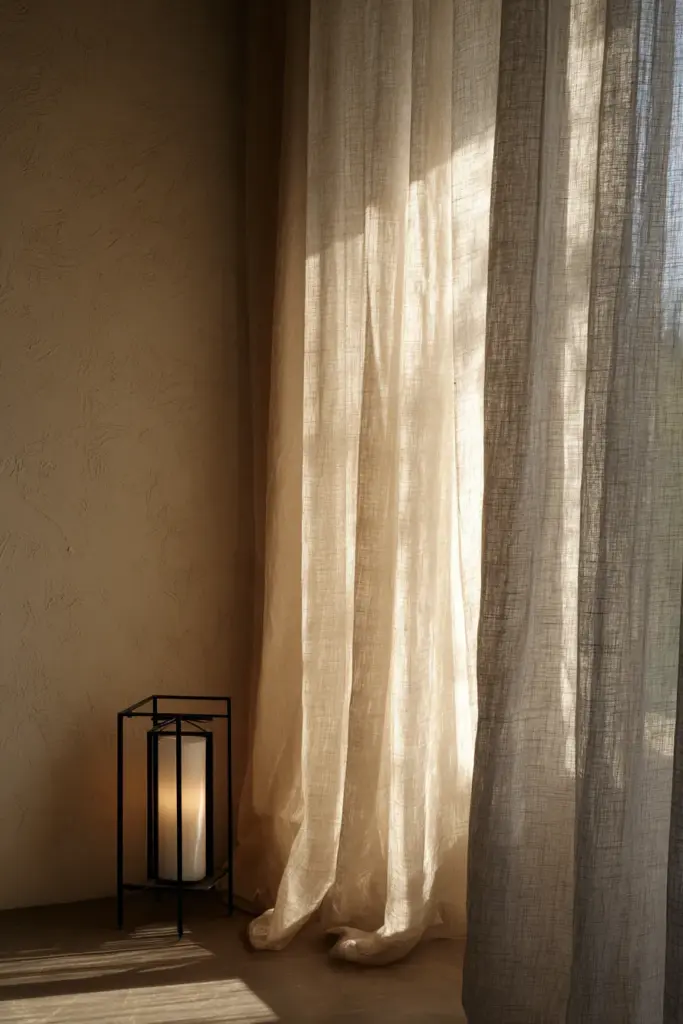
Natural light remains the most important consideration. Sheer linen curtains diffuse harsh sunlight while maintaining brightness. This soft illumination makes neutral paint colors shift beautifully throughout the day.
Plant Pairings
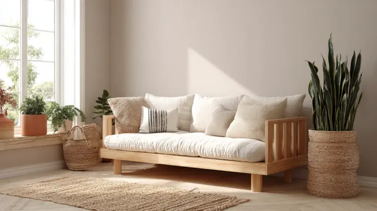
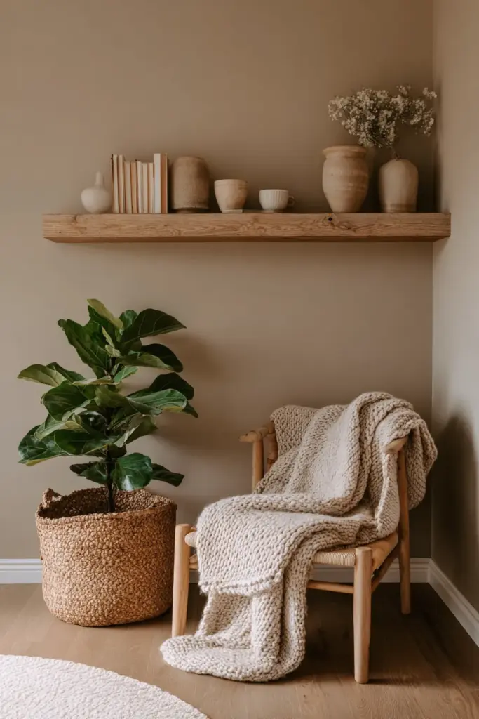
Green plants provide the perfect contrast to neutral walls and natural wallpapers. Fiddle leaf figs, snake plants, and pothos all thrive indoors while adding organic shapes and air-purifying benefits.
Place plants strategically against wallpapered walls. The living greenery emphasizes the nature-inspired patterns while adding authentic texture that no print can replicate.
Choose simple ceramic planters in white, grey, or terracotta. These complement Japandi color palettes without adding visual clutter.
Artwork and Accessories
With neutral walls and subtle wallpaper, your accessories carry more visual weight. Choose black-framed line drawings, abstract prints in muted tones, or simple calligraphy that honors Japanese aesthetics.
Natural wood shelving against painted walls creates functional storage that feels intentional. Display carefully curated objects—a single ceramic vase, a wooden bowl, a woven basket—rather than collections.
Textured textiles in linen, cotton, and wool add warmth. Layer a chunky knit throw over your sofa, place a jute rug underfoot, arrange linen cushions in complementary neutrals.
Japandi Living Room Paint & Wallpaper Checklist
- Choose a dominant neutral paint color: warm white, greige, or soft taupe in matte or eggshell finish
- Select one accent wall location: behind the sofa, longest uninterrupted wall, or architectural feature
- Pick wallpaper that balances pattern and restraint: subtle botanicals, minimalist geometrics, or natural textures
- Ensure paint and wallpaper have complementary undertones: both warm or both cool for cohesion
- Prepare walls properly: fill holes, sand smooth, prime as needed
- Consider lighting effects: how will natural and artificial light interact with your chosen surfaces?
- Plan furniture placement: ensure your feature wall remains unobstructed
- Budget for quality where it matters most: invest in your primary paint or feature wallpaper
- Incorporate natural materials: wood furniture, plants, organic textiles
- Maintain restraint with accessories: less is more in Japandi design
Bringing It All Together
Your Japandi living room should feel like a refuge—a space where visual noise fades and authentic comfort emerges. The right paint and wallpaper combination creates this atmosphere by honoring both minimalism and warmth, restraint and texture.
Start with walls that breathe. Choose neutrals that shift with the light, that welcome you home after demanding days. Add wallpaper thoughtfully, letting texture and subtle pattern create interest without distraction.
Remember that Japandi design celebrates imperfection and evolution. Your space doesn’t need to be perfect immediately. Live with your choices, adjust as needed, and trust your instincts about what feels calm and right.
The beauty lies not in strict adherence to rules, but in creating a living room that supports your life—where you can read, rest, connect, and simply be. That’s the true essence of Japandi.
Frequently Asked Questions
What are the best paint colors for a Japandi living room?
Warm whites, greige (grey-beige), soft taupe, and sage green work beautifully for Japandi interiors. Choose matte or eggshell finishes in low-VOC formulas. These neutral tones create calming backdrops that complement natural wood furniture and minimalist decor while reflecting light gently throughout the day.
Can I use wallpaper in a small Japandi living room?
Yes, but choose wisely. Opt for light-colored wallpapers with subtle patterns—vertical stripes, delicate botanicals, or natural textures like grasscloth. Limit wallpaper to one accent wall to avoid overwhelming the space. Light tones and vertical patterns actually help small rooms feel larger and more open.
How do I combine paint and wallpaper in Japandi style?
Use the 60-30-10 principle: paint covers about 60% of wall space in a neutral base color, wallpaper occupies 30% as a feature wall, and deeper accent colors appear in 10% through textiles. Ensure both share similar undertones (warm or cool) for cohesion. Balance heavily textured wallpaper with smooth matte paint.
What wallpaper patterns work best for Japandi aesthetics?
Minimalist botanical prints with delicate branches or leaves, subtle geometric patterns like thin lines or soft hexagons, and natural textured wallpapers like grasscloth or linen-look finishes all align with Japandi principles. Choose muted colors—beiges, greys, soft greens—and avoid busy, colorful, or overly decorative patterns.
Are peel-and-stick wallpapers suitable for Japandi living rooms?
Absolutely, especially for renters or those wanting flexibility. Many peel-and-stick options now feature Japandi-appropriate designs like natural textures and minimalist patterns. While traditional wallpapers often offer superior quality and texture, modern removable wallpapers provide accessible, DIY-friendly alternatives that still achieve the aesthetic when chosen carefully.