Table of Contents
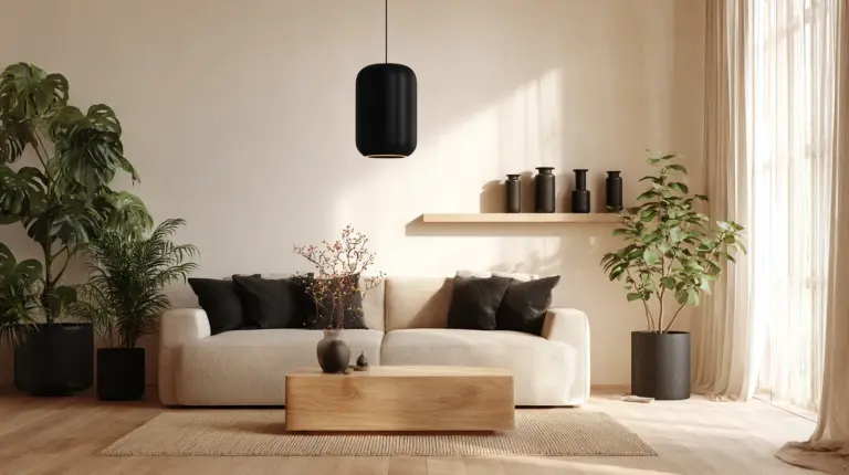
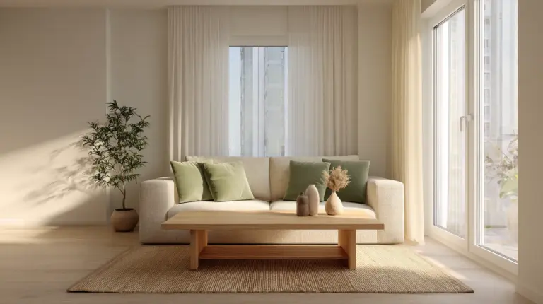
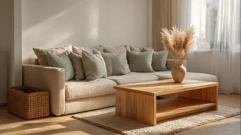
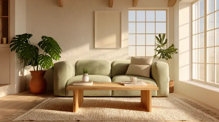
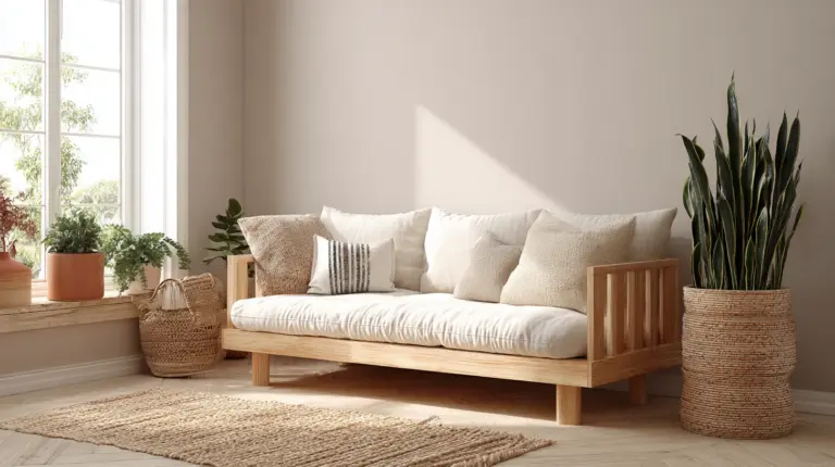
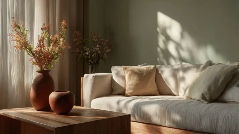
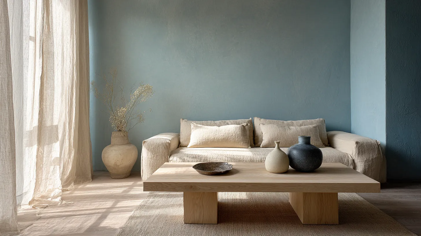
There’s something quietly magnetic about a living room that breathes calmness into your day. A space where Japanese minimalism meets Scandinavian warmth, softened by the whisper of blue — like morning mist over a quiet lake.
This is Japandi with a Scandinavian blue accent: a design philosophy that honors simplicity without coldness, elegance without pretense. It’s the marriage of wabi-sabi imperfection and hygge coziness, grounded in neutral tones and lifted by the gentle presence of blue.
In this guide, we’ll explore how to craft a Japandi living room color palette that feels both serene and lived-in. You’ll discover specific shades, proportions, and sensory details that transform a room into a sanctuary — especially valuable in humid climates like Silang, where breathable materials and calming hues create year-round comfort.
Let’s step into the art of Japandi blue.
What is the Japandi Color Palette?
The Japandi color palette is a curated collection of neutral tones — soft beiges, warm grays, earthy taupes — accented by muted blues, sage greens, and the occasional whisper of charcoal or indigo. It’s minimalist by nature, but never stark.
Think of it as a visual exhale. The palette avoids bright whites or bold contrasts, instead favoring off-whites (#F5F5F0), light gray (#D3D3D3), and warm neutrals that mimic unbleached linen or clay. When Scandinavian blue (#B0C4DE or #A7C7E7) enters the scene, it brings depth without disruption — a calming counterpoint to wood and stone.
The result? A living room that feels grounded, airy, and quietly sophisticated.
What Colors Make Up Japandi with Scandinavian Blue?
Japandi palettes layer three color families: neutral bases, natural accents, and intentional blues. Each plays a distinct role in building tranquility.
Neutral Foundations
Start with warm off-whites like ivory (#FFFFF0) or bone (#F9F6EE) for walls. These shades reflect natural light gently, avoiding the clinical feel of pure white. Pair them with light gray (#BEBEBE) or greige (#C9B8A8) for larger furniture pieces — sofas, shelving, or area rugs.
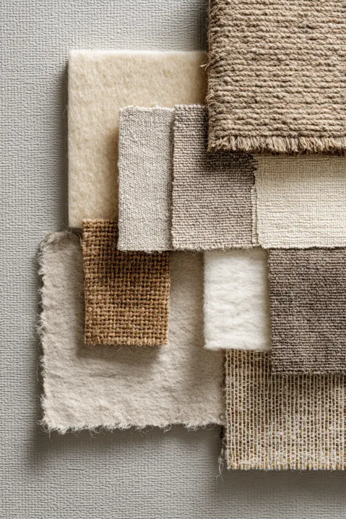
Add taupe (#B38B6D) or sand beige (#D2B48C) through textiles: linen cushions, wool throws, or jute baskets. These earthy hues ground the space, echoing the wabi-sabi appreciation for natural, unrefined beauty.
Natural Wood and Earthy Hues
Wood is non-negotiable in Japandi design. Opt for light oak, ash, or bamboo in honey tones (#D4A574) for coffee tables, shelving, or exposed beams. In humid areas like Silang, choose FSC-certified teak or acacia — both moisture-resistant and sustainably sourced.
Introduce terracotta (#E2725B) or clay red (#BC6C53) sparingly: a ceramic vase, a handwoven basket, or a single accent chair. These warm tones prevent the palette from feeling too cool or distant.
Scandinavian Blue Accents
Here’s where magic happens. Scandinavian blue — soft, dusty, almost gray-tinged — adds emotional depth. Use shades like powder blue (#B0E0E6), misty blue (#A7C7E7), or slate blue (#6A7B8B) for:
- Accent walls (one wall, not all four)
- Upholstered armchairs or ottomans
- Textiles: throw pillows, wool blankets, or curtains
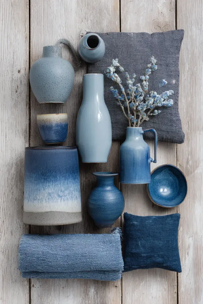
- Decorative elements: ceramic bowls, painted frames, or indigo pottery
Studies suggest that soft blues reduce stress by up to 20%, making them ideal for living rooms designed for rest and conversation. The key is restraint: let blue punctuate, not dominate.
The 60-30-10 Rule in Japandi Blue Palettes
The 60-30-10 rule is Japandi’s secret to balance. It ensures your living room feels cohesive, not chaotic — a principle borrowed from Scandinavian design and perfectly suited to minimalist interiors.
60% Neutral Base: Walls, flooring, and large furniture in off-white, light gray, or beige. This creates visual calm and lets natural light bounce freely.
30% Secondary Tones: Natural wood finishes, earthy accents like terracotta or sage green (#8A9A5B), and textured neutrals (linen, wool, rattan). These add warmth and tactile interest.
10% Accent Color: Scandinavian blue. Use it for one statement piece — a velvet sofa, a painted sideboard, or a collection of indigo cushions. This restraint keeps blue feeling intentional, not overwhelming.
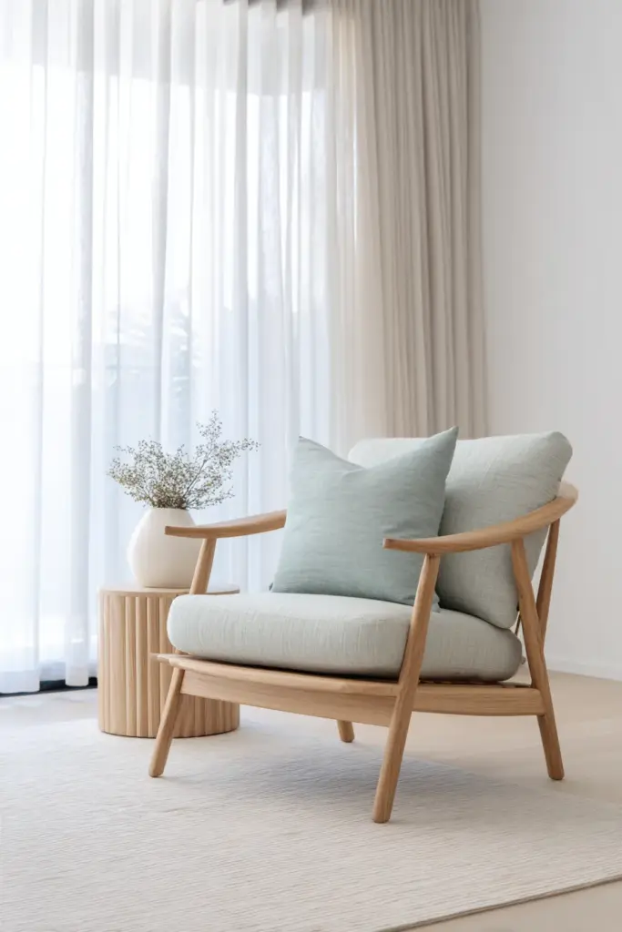
For example: imagine a living room with ivory walls (60%), light oak furniture and greige textiles (30%), and a single misty blue accent chair with matching throw pillows (10%). The room breathes, yet feels complete.
Japandi Living Room Blue Palette Combinations
Here are five curated palettes that blend Japandi neutrals with Scandinavian blue, each with specific hex codes for easy implementation.
Palette 1: Misty Morning
| Element | Color Name | HEX Code |
|---|---|---|
| Walls | Warm Off-White | #F5F5F0 |
| Sofa | Light Greige | #C9B8A8 |
| Accent Chair | Misty Blue | #A7C7E7 |
| Wood | Light Oak | #D4A574 |
| Textiles | Charcoal Gray | #4A4A4A |
Mood: Serene, airy, perfect for small spaces. Misty blue walls create depth without shrinking the room.
Palette 2: Stone and Sky
| Element | Color Name | HEX Code |
|---|---|---|
| Walls | Bone White | #F9F6EE |
| Rug | Taupe | #B38B6D |
| Cushions | Powder Blue | #B0E0E6 |
| Coffee Table | Ash Wood | #D9CDB8 |
| Vase | Terracotta | #E2725B |
Mood: Grounded yet uplifting. Powder blue cushions soften the earthiness of taupe and terracotta.
Palette 3: Indigo Whisper
| Element | Color Name | HEX Code |
|---|---|---|
| Walls | Soft Gray | #D3D3D3 |
| Sofa | Ivory Linen | #FFFFF0 |
| Throw Blanket | Slate Blue | #6A7B8B |
| Shelving | Bamboo | #D4A574 |
| Accents | Deep Indigo | #3F4A5C |
Mood: Sophisticated, slightly moody. Indigo adds richness without heaviness, ideal for cozy evening gatherings.
Palette 4: Coastal Calm
| Element | Color Name | HEX Code |
|---|---|---|
| Walls | Cream | #FFFDD0 |
| Armchair | Pale Blue | #AFDBF5 |
| Floor | Light Teak | #B8926A |
| Textiles | Sand Beige | #D2B48C |
| Pottery | Sage Green | #8A9A5B |
Mood: Breezy, warm, with a hint of tropical ease. Pale blue and sage green evoke humidity-friendly freshness.
Palette 5: Winter Hygge
| Element | Color Name | HEX Code |
|---|---|---|
| Walls | Warm Gray | #BEBEBE |
| Sofa | Oatmeal | #DDD8C7 |
| Cushions | Denim Blue | #6F8FAF |
| Wood | Walnut | #5C4033 |
| Blanket | Charcoal | #36454F |
Mood: Cozy, enveloping, perfect for cooler months. Denim blue adds a touch of depth, balanced by warm oatmeal tones.
Can You Have Color in Japandi?
Absolutely — as long as it’s intentional. Japandi isn’t about eliminating color; it’s about choosing shades that enhance tranquility rather than disrupt it.
Scandinavian blue works beautifully because it’s muted, not bright. Unlike coastal turquoise or electric cobalt, blues in the #A7C7E7 to #6F8FAF range feel natural, almost mineral-like. They mimic early morning skies, aged denim, or weathered pottery.
Pair blue with sage green for a nature-inspired scheme, or add mustard yellow (#E1AD01) through a single pillow or art piece for unexpected warmth. The rule: one accent color per room, supported by neutrals.
How Lighting Interacts with Japandi Blue
Color doesn’t exist in a vacuum — lighting transforms how Scandinavian blue reads in your living room. Understanding this relationship is key to achieving the calm, layered look Japandi demands.
Natural Light Considerations
In bright, sunlit rooms, misty blue (#A7C7E7) on walls appears almost ethereal, reflecting light without harshness. In dimmer spaces, the same blue deepens, taking on gray-purple undertones. Test paint samples at different times of day before committing.
For humid climates like Silang, where diffused tropical light dominates, choose blues with warm gray bases to prevent the space from feeling too cool or damp.

Artificial Lighting
Warm LED bulbs (2700K-3000K) enhance Scandinavian blue, making it feel cozy rather than cold. Avoid cool white bulbs (4000K+), which turn soft blues harsh and clinical.
Layer lighting: floor lamps with linen shades, pendant lights in matte black, and candles in ceramic holders. This creates depth and lets blue accents glow gently in the evening.
Japandi Blue for Small Spaces and Humid Climates
Japandi’s minimalism shines in compact living rooms, where every element must earn its place. Scandinavian blue, used strategically, can actually make small spaces feel larger.
Small-Space Strategies
- Accent walls: Paint one wall in powder blue (#B0E0E6) to create visual depth without overwhelming the room.
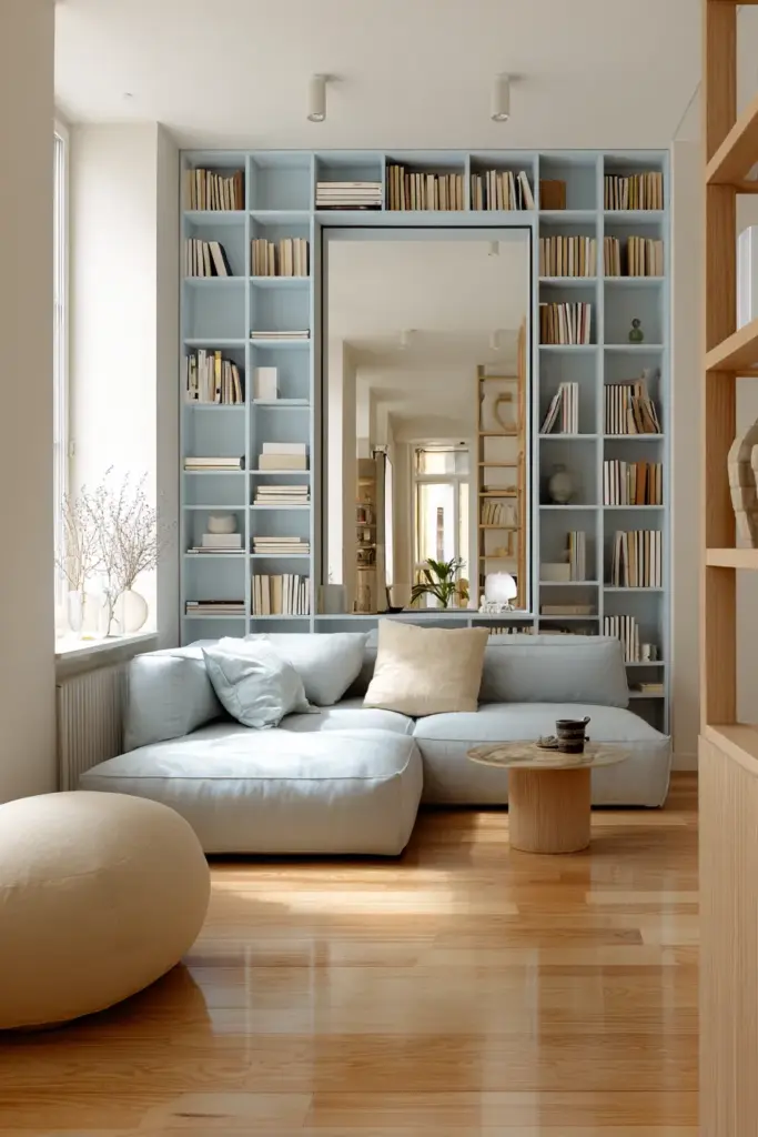
- Vertical blue elements: A tall blue bookshelf or curtain draws the eye upward, making ceilings feel higher.
- Reflective surfaces: Pair blue with light wood and mirrors to bounce light around the room.
Adapting for Philippine Humidity
In places like Silang, Calabarzon, humidity demands breathable, mold-resistant materials. Choose:
- Cotton-linen blends for blue cushions and curtains (avoid heavy velvets)
- Bamboo or rattan furniture with blue cushions for airflow
- Terracotta or ceramic blue accents that won’t trap moisture
Opt for low-VOC paints in blue shades to prevent odors and improve indoor air quality. Brands like Nippon Paint offer humidity-resistant formulas ideal for tropical climates.
DIY Scandinavian Blue Palette Mixing
Not ready to commit to store-bought blues? Mix your own Japandi-friendly shades at home.
Custom Blue Recipe
Start with white base paint and add:
- 5% ultramarine blue for a soft sky tone
- 2% raw umber to gray it down
- 1% yellow ocher for warmth
Test on poster board, let dry fully (colors lighten as they dry), and compare under both daylight and lamplight.
Textile Dyeing
For cushions or throws, use natural indigo dye diluted with water for a faded, wabi-sabi effect. Dip linen or cotton once for pale blue, three times for deeper slate tones. The irregular finish adds artisan charm.
Japandi Blue Accents: What to Buy
Ready to shop? Here’s what to prioritize for a cohesive Japandi living room with Scandinavian blue.
Furniture
- Blue linen sofa or armchair in powder blue or slate
- Light oak coffee table with clean lines
- Woven rattan chair with blue cushion
Textiles
- Wool throw blanket in misty blue, draped over neutral sofa
- Linen curtains in off-white with blue embroidery
- Jute rug with subtle blue border
Décor
- Ceramic vases in indigo or pale blue
- Handmade pottery in matte finishes
- Wall art: abstract prints featuring blue, gray, and cream
- Wooden trays holding blue glass candles
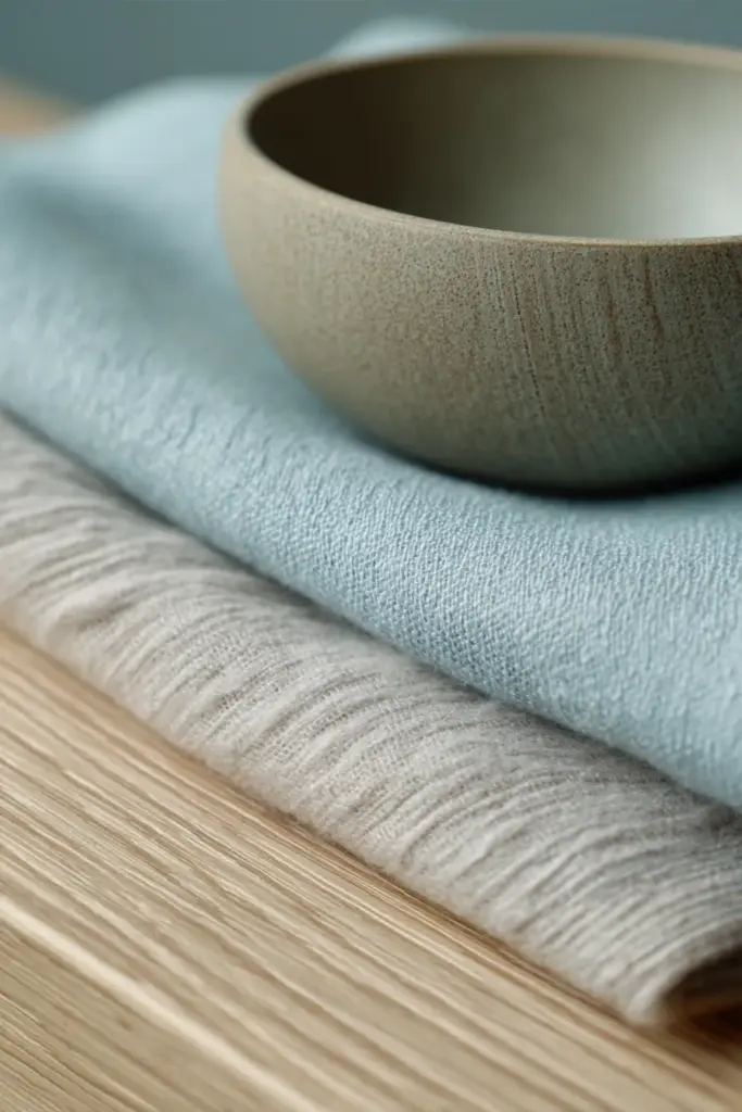
Choose pieces with visible texture: chunky knits, unglazed clay, rough-hewn wood. Japandi thrives on tactile contrast.
Seasonal Adjustments for Japandi Blue Palettes
Japandi palettes evolve with the seasons, allowing you to refresh your living room without overhaul.
Spring/Summer: Lighten up. Swap heavy indigo throws for pale blue linen, add fresh greenery in white ceramic pots, and open curtains wide to let in natural light.
Fall/Winter: Layer warmth. Introduce deeper blues like denim (#6F8FAF), add wool blankets in charcoal, and incorporate candles with amber or sandalwood scents. The blue remains, but supporting tones shift toward hygge coziness.
Monitor Ahrefs or Pinterest trends for emerging palettes — 2026 forecasts suggest deeper denim blues and dusty navy will rise in Japandi interiors.
Japandi Blue vs. Coastal Blue: What’s the Difference?
A common question: isn’t Scandinavian blue just coastal blue? Not quite.
Coastal blue (think aqua, turquoise) is vibrant, saturated, and evokes ocean energy. It pairs with crisp whites and nautical stripes.
Scandinavian blue is muted, gray-tinged, and whisper-soft. It suggests early mornings, not midday beaches. It pairs with warm neutrals and natural wood, never stark white.
Japandi leans heavily toward the latter. If your blue feels energetic, it’s too bright. If it feels like a sigh, you’ve nailed it.
Sustainability in Japandi Blue Palettes
Japandi’s roots in Japanese and Scandinavian culture emphasize sustainability: longevity over trends, natural over synthetic.
Eco-Friendly Choices
- FSC-certified wood for furniture (teak, oak, bamboo)
- Natural fiber textiles (linen, hemp, organic cotton) in blue hues
- Low-VOC paints for walls and furniture
- Vintage or secondhand blue ceramics and glassware
Avoid fast-furniture in synthetic blues. Instead, invest in pieces that age beautifully: a hand-dyed indigo cushion that fades over time, a solid wood chair you can refinish.
This approach aligns with wabi-sabi — the acceptance of impermanence and imperfection — and ensures your living room grows more characterful, not dated.
Key Takeaways: Crafting Your Japandi Blue Living Room
- Start with 60% neutrals (off-white, light gray, beige), 30% natural tones (wood, terracotta, sage), and 10% Scandinavian blue
- Use HEX codes like #A7C7E7 (misty blue) or #B0E0E6 (powder blue) for consistent color matching
- Choose muted, gray-tinged blues — never bright or saturated
- Layer warm LED lighting (2700K-3000K) to enhance blue’s coziness
- Prioritize breathable materials in humid climates: cotton-linen, bamboo, ceramic
- Mix textures: smooth linen, rough pottery, chunky knits, natural wood
- Add blue through one statement piece or multiple small accents, not everywhere
- Embrace sustainability: FSC wood, natural dyes, vintage finds
- Adjust seasonally: lighter blues in summer, deeper tones in winter
- Let imperfection show — wabi-sabi honors aged, hand-crafted elements
Conclusion: Where Calm Meets Color
A Japandi living room touched by Scandinavian blue is more than a design choice — it’s a daily ritual of calm. It’s the chair you sink into after a long day, the light that falls softly across linen, the quiet pride of a space that reflects your values.
Blue doesn’t shout here. It whispers. It invites you to pause, breathe, and simply be.
As you build your palette, trust your instincts. Notice how morning light changes your walls, how a single blue cushion transforms a beige sofa, how texture — more than color — gives a room soul. Japandi is a practice, not a formula.
Welcome home to calm. Welcome home to blue.
Frequently Asked Questions
What is the Japandi color palette?
The Japandi color palette combines Japanese minimalism and Scandinavian warmth through neutral tones — off-white, beige, light gray, taupe — accented by muted blues, sage greens, and natural wood. It emphasizes calm, earthy hues with subtle pops of color like Scandinavian blue to create serene, uncluttered living spaces.
Can you have color in Japandi design?
Yes, Japandi welcomes color as long as it’s muted and intentional. Soft blues, sage greens, terracotta, and charcoal work beautifully. The key is choosing shades that enhance tranquility rather than disrupt it — think dusty powder blue (#B0E0E6) over bright turquoise. One accent color per room maintains minimalist balance.
What is the 60-30-10 rule in Japandi interiors?
The 60-30-10 rule divides your palette into proportions: 60% neutral base (walls, large furniture in off-white or gray), 30% secondary tones (natural wood, earthy accents like terracotta), and 10% accent color (Scandinavian blue through cushions, art, or a statement chair). This creates visual harmony without overwhelming the senses.
How do I choose the right Scandinavian blue for my living room?
Test paint samples in your space under both natural and artificial light. Look for blues with gray or warm undertones — misty blue (#A7C7E7), powder blue (#B0E0E6), or slate blue (#6A7B8B) — rather than bright or cool-toned shades. In humid climates like Silang, choose blues with warm bases to prevent the room from feeling damp or cold.
What’s the difference between Japandi blue and coastal blue?
Coastal blue is vibrant and saturated (aqua, turquoise), evoking beach energy with crisp whites. Scandinavian blue in Japandi is muted, gray-tinged, and whisper-soft — like early morning mist, not midday ocean. It pairs with warm neutrals and natural wood for a calm, grounded aesthetic rather than a breezy, nautical vibe.