Table of Contents
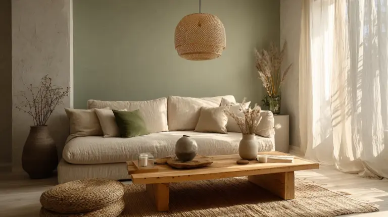
There’s a quiet moment that happens when you stand in a room bathed in morning light, watching how cream walls shift to gold, how shadows soften hard edges. This is where Japandi color testing begins—not with paint swatches alone, but with observation, patience, and a willingness to let your space teach you what it needs.
Japandi design marries Scandinavian warmth with Japanese restraint, creating interiors that breathe with intention. But achieving that serene balance hinges on one crucial step: testing your colors before committing. A shade that looks peaceful in the store can feel stark under your home’s unique light, or lose its warmth against your existing textures.
Testing isn’t about perfection—it’s about partnership. It’s learning how your walls drink in afternoon sun, how your furniture casts its own palette onto floors, how evening lamplight transforms everything you thought you knew about beige.
Let’s walk through this together, slowly and with care.
Why Color Testing Matters in Japandi Spaces
Japandi thrives on subtlety. Where bolder styles forgive missteps, this aesthetic reveals every nuance—the difference between off-white and warm white becomes a conversation between calm and clinical.
Your home’s light changes hourly. That soft gray you loved at noon might turn cold and distant by evening, or glow beautifully under your pendant lights. Testing reveals these shifts before you’ve painted an entire room.
Consider this: studies suggest neutral palettes can reduce cortisol levels, promoting genuine calm. But only if the neutrals feel right in your space, with your light, surrounded by your textures.
Understanding the Japandi Color Foundation
The Base Palette
Japandi’s soul lives in nature-inspired neutrals. Think Cloud Foundation (#F7F4ED)—a whisper of warmth that catches light without announcing itself. Or true whites (RGB 255,255,255) that reference Scandinavian brightness while honoring Japanese ma, that essential breathing room.
These aren’t sterile whites. They’re shades with memory: the color of rice paper catching dawn, of birch bark after rain, of linen sheets dried in summer wind.
Earthy Accents and Muted Tones
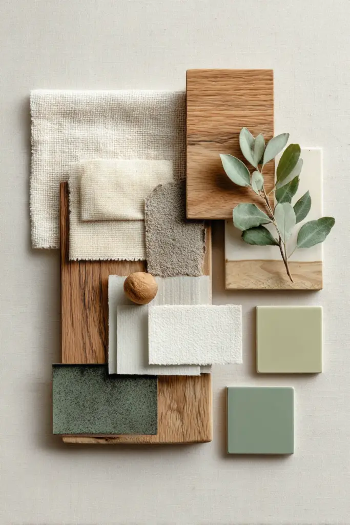
Soft sage green anchors without overwhelming. Warm browns—from raw walnut to sun-bleached oak—add grounding weight. Muted blues recall distant mountains at dusk or ceramic glazes that have aged gracefully.
The key word is muted. Japandi doesn’t shout; it suggests. Even accent colors come from nature’s quieter moments: dusty terracotta, charcoal gray, the subtle green of moss on stone.
Essential Tools for Color Testing
Physical Swatch Materials
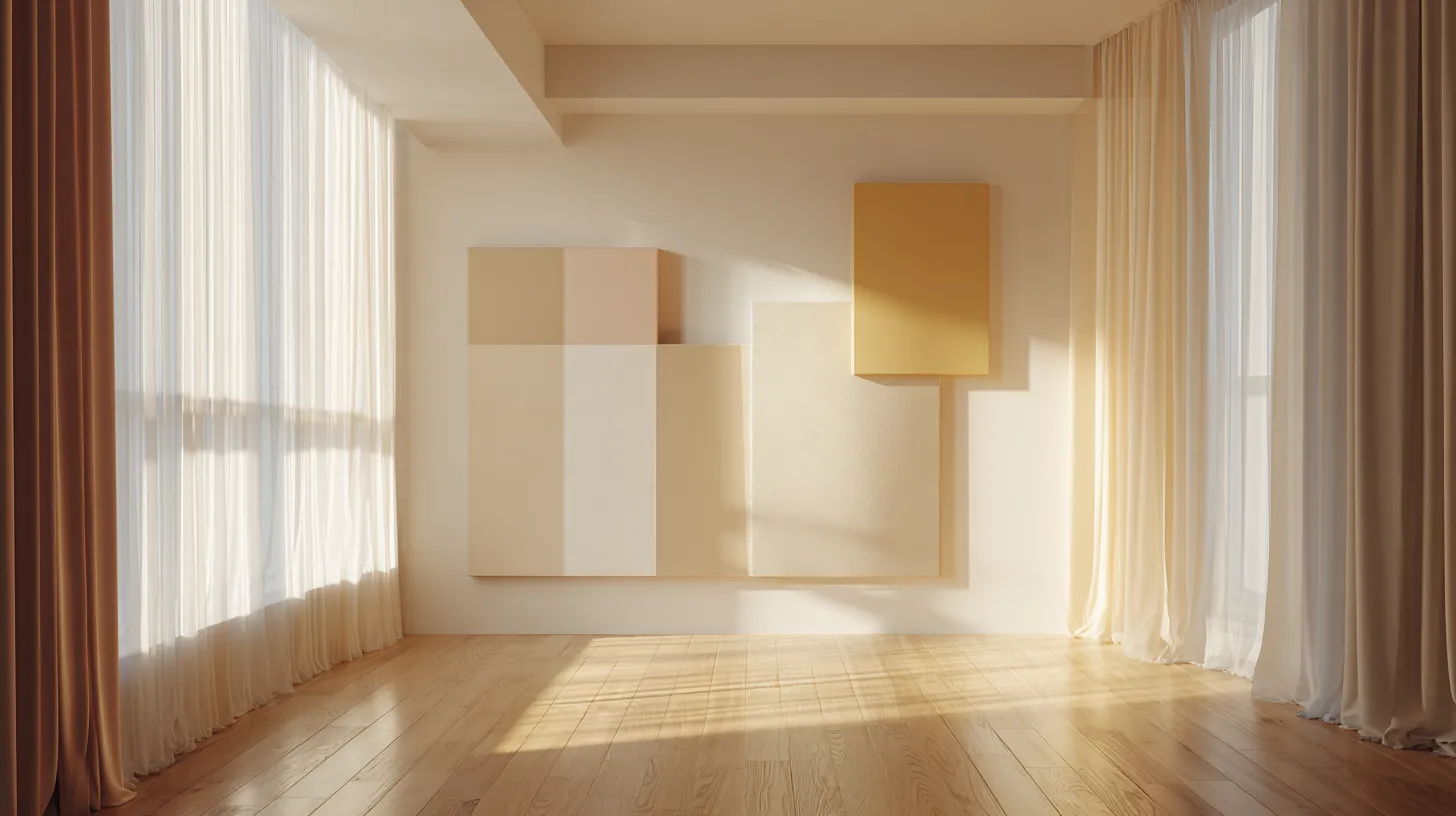
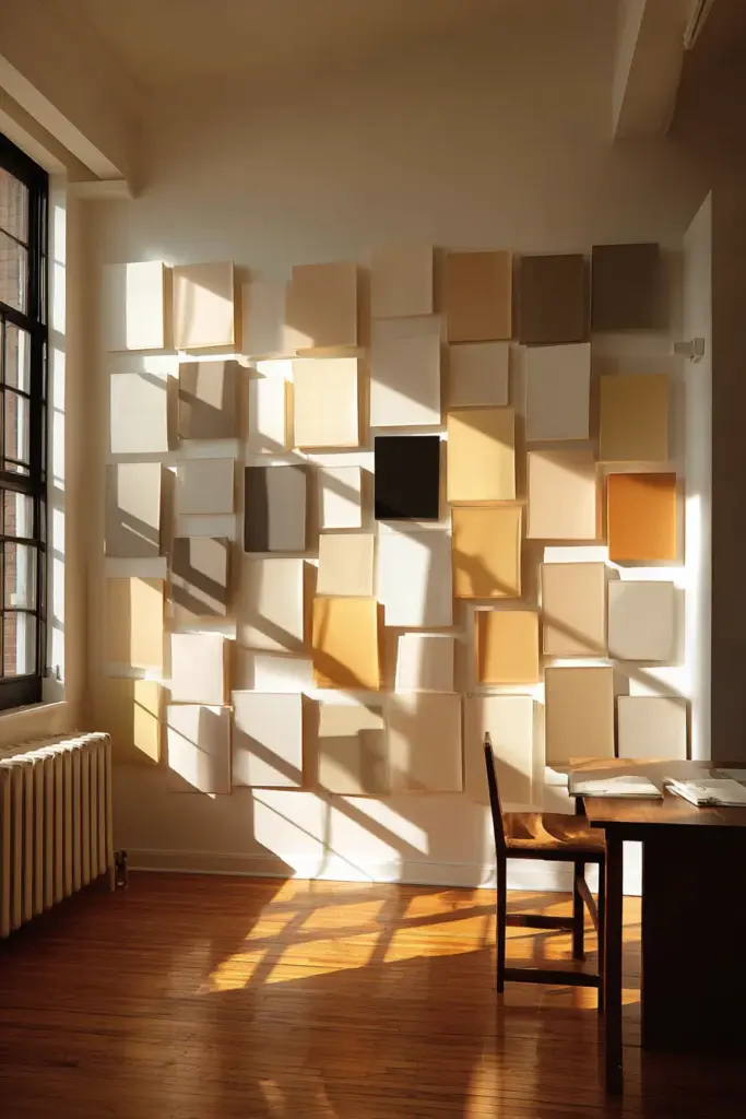
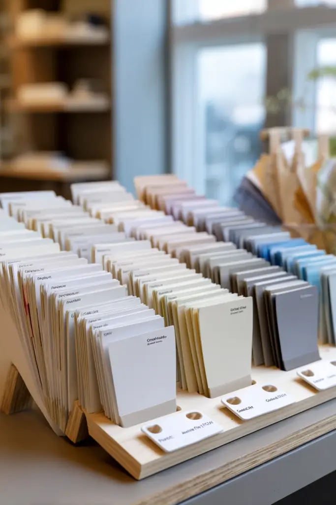
Start with poster boards painted in your candidate colors—large enough to see properly (at least 2×2 feet). Pin them to different walls and observe throughout the day.
Fabric swatches work beautifully too. Drape raw linen, bouclé, or cotton canvas in your colors across furniture. These materials interact with light the way your textiles will, revealing how color and texture dance together.
Budget-friendly Philippine tip: Create a DIY swatch kit for under ₱500 using Boysen’s Breathe palette samples and foam boards from local art supply stores.
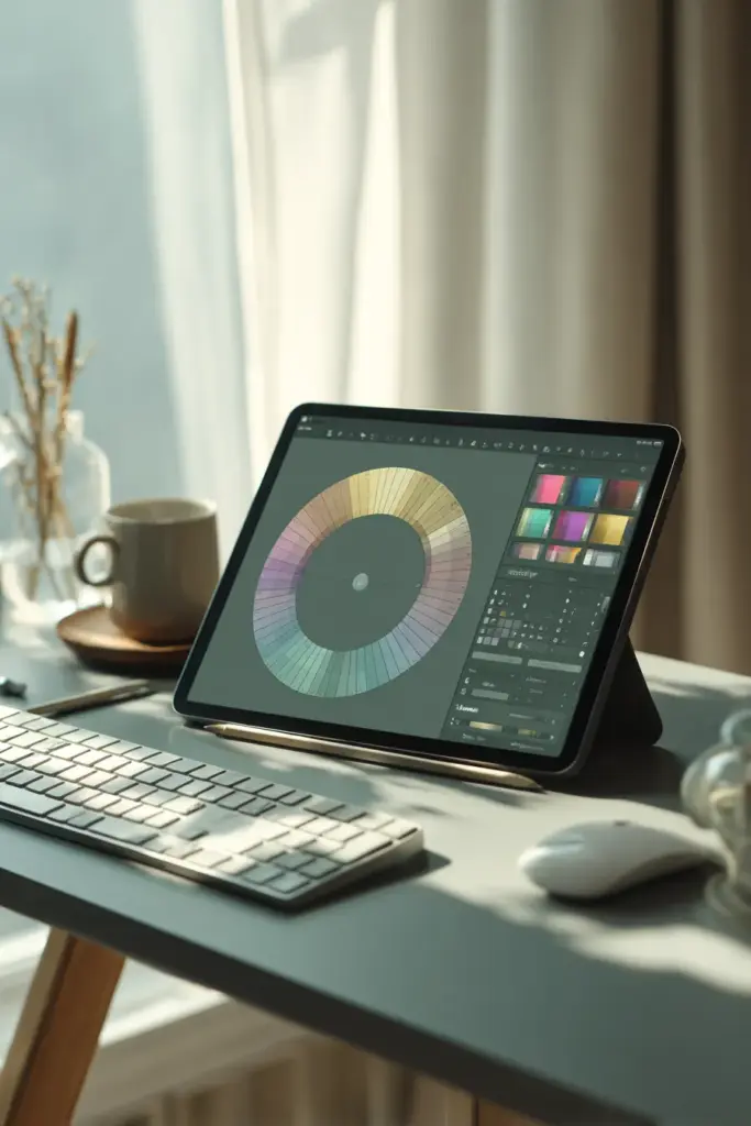
Digital Testing Tools
Adobe Color and Coolors let you simulate palettes digitally, though screens can’t replace real-world testing. Use them for initial exploration, building mood boards that guide your physical tests.
For tropical climates like Silang’s, these tools help visualize how intense natural light—that bright, almost white midday glare—will interact with your choices. Adjust for high-brightness scenarios to predict real-world performance.
Smart LED systems now offer palette syncing, letting you preview colors through adjustable bulb temperatures. It’s 2025’s answer to the age-old “will this work?” question.
The Testing Process: Morning to Evening
Morning Light Observations
Begin at dawn. Morning light in Japandi spaces should feel like hope—gentle, clear, full of possibility. Your whites should glow, not glare.
Place swatches near windows and watch. Does your chosen off-white turn golden or stay crisp? Do your accent colors emerge or disappear? Morning reveals a color’s truest warmth.
Note how shadows fall. Japandi embraces shadow as design element—does your palette allow for those pools of quiet darkness, or does everything flatten?
Midday Intensity Check
Tropical midday is unforgiving. Colors that felt subtle at dawn might wash out completely, or conversely, reveal undertones you didn’t know existed.
This is when grayscale contrast matters most. Your palette needs enough variation to maintain visual interest even under that bright, leveling light that erases nuance.
If you’re testing in the Philippines during summer months, add 20% more contrast than you think necessary. The intensity will surprise you.
Evening and Artificial Light
As natural light fades, your chosen colors meet your home’s electrical personality. Warm-toned LEDs will shift cool grays toward beige; cool-tones can make warm whites feel sterile.
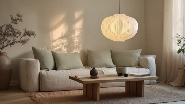
Test under every light source you actually use. That reading lamp, your pendant lights, even candles if you light them regularly. Japandi’s evening mood should feel like gentle embrace—never harsh, never cold.
Watch for the magic hour right before full dark, when remaining daylight mingles with lamplight. Your palette should transition gracefully, not fight the change.
Seasonal Palette Adjustments
Warm Season Testing
Summer calls for cooler neutrals with more gray undertones. These counterbalance heat, creating psychological cooling even when temperatures rise.
Test how your palette performs with windows open, curtains drawn back, ceiling fans running. Air movement changes light quality subtly but meaningfully.
Consider seasonal accents: soft blues and greens feel particularly right when nature outside is lush and overwhelming.
Cool Season Considerations
Winter (or the Philippines’ cooler months) invites warmer undertones. Creams over stark whites, beiges with golden notes, browns that recall earth and wood.
Your testing should account for more closed-in spaces, heavier textiles, perhaps different furniture arrangements. The same palette performs differently when you’re layering throws and adjusting for coziness.
Working with Texture and Material
Natural Material Pairings
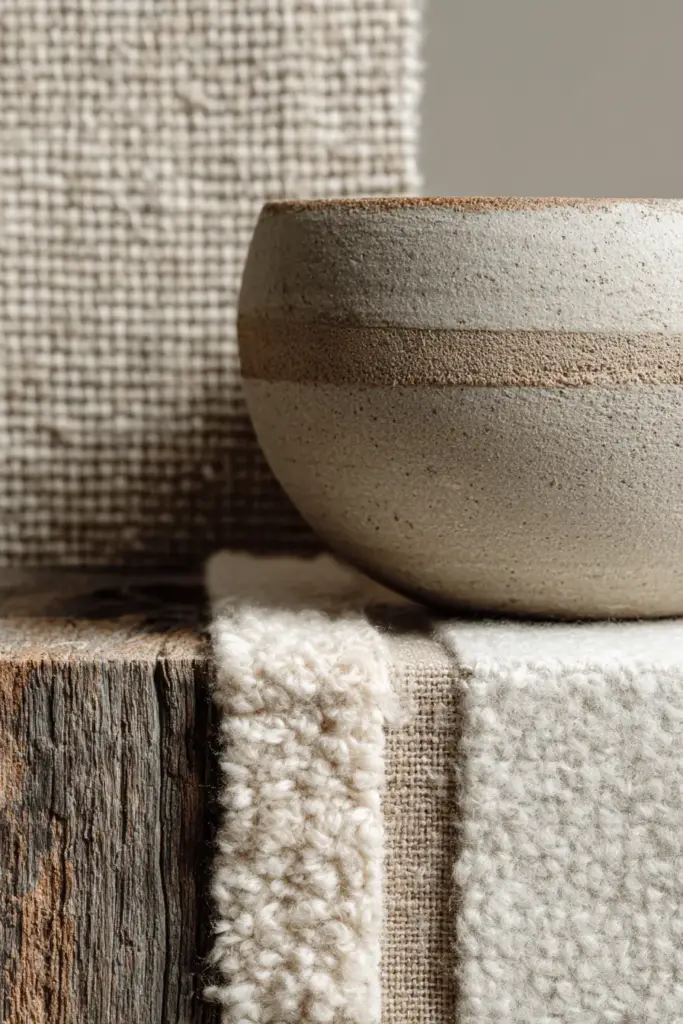
Japandi color never exists in isolation—it’s always in conversation with texture. Raw linen in Cloud Foundation speaks differently than the same color in smooth paint.
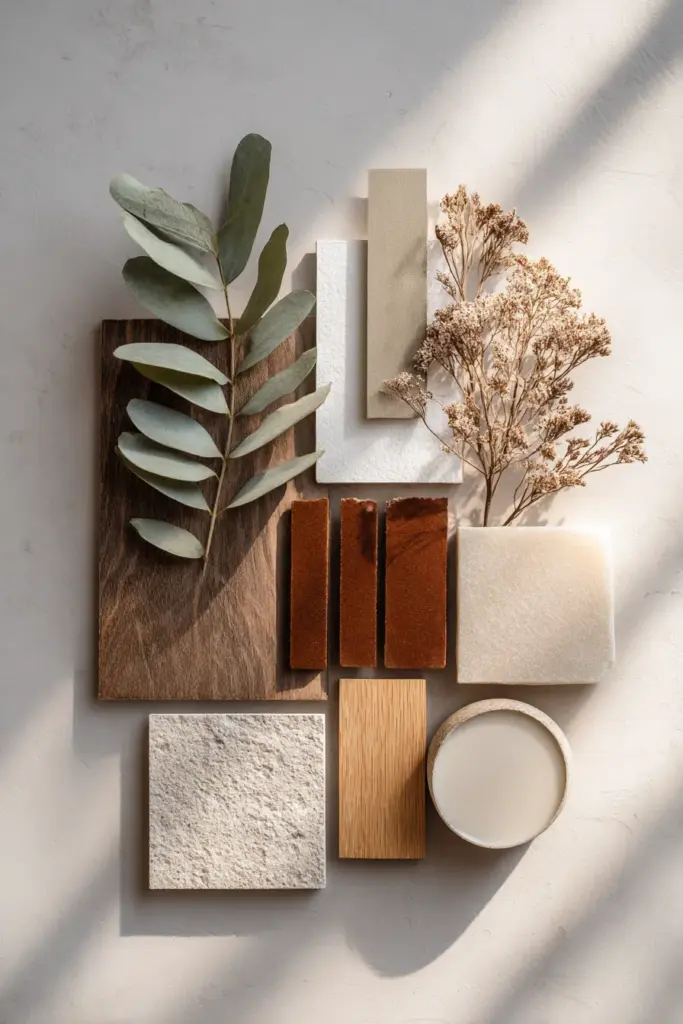
Test your colors against actual materials you’ll use: wood samples, fabric swatches, stone tiles, ceramic vessels. Bring them together and see what happens. Does the wood grain sing against that beige, or does everything blur into sameness?
Natural materials add depth that compensates for Japandi’s restrained palette. A limited color range feels rich when textures vary—smooth plaster next to rough-hewn wood, soft textiles against hard ceramics.
Creating Visual Rhythm
Your eye needs places to rest and places to engage. Test how your accent colors—that muted sage, that charcoal—create gentle waypoints in neutral fields.
Black accents deserve special attention in small spaces. A little goes far, providing definition without domination. Test black elements near your candidate colors to ensure balance.
Color Psychology in Practice
The Science of Japandi Calm
Research suggests neutral palettes can lower stress responses, but not all neutrals are created equal. Warm neutrals generally promote relaxation; cool neutrals can enhance focus but may feel emotionally distant if taken too far.
Your testing should include how you feel in the space. Stand in your room surrounded by test swatches for ten minutes. Not thinking, just being. Does your breathing slow? Do your shoulders drop?
This isn’t abstract—it’s practical. Japandi aims for spaces that restore you. If your palette doesn’t pass the feeling test, keep searching.
Balancing Energy and Tranquility
While Japandi leans toward calm, complete monotony can feel draining. Your palette needs enough variation to maintain gentle interest—that’s where muted accent colors earn their place.
Test accent-to-neutral ratios. The classic 80/20 rule works: 80% neutrals, 20% soft accents. But test it in your actual space to confirm it feels right.
Advanced Testing Techniques
The Hex Code Documentation System
Create a digital library of tested colors with their exact hex codes. This systematic approach lets you reference back, share with contractors, or recreate successful combinations later.
Sample Tested Palette:
| Color Name | Hex Code | RGB Values | Best Use |
|---|---|---|---|
| Cloud Foundation | #F7F4ED | 247, 244, 237 | Main walls |
| Pure White | #FFFFFF | 255, 255, 255 | Trim, ceiling |
| Soft Sage | #C8D5B9 | 200, 213, 185 | Accent wall |
| Warm Walnut | #8B6F47 | 139, 111, 71 | Furniture |
| Charcoal | #4A4A4A | 74, 74, 74 | Details |
Document which lighting conditions work best for each shade. This becomes your personal Japandi reference guide.
Creating Test Zones
Rather than committing to full walls, paint 3×3 foot test zones in multiple locations. Live with them for at least two weeks, watching them through various weather conditions.
Move test swatches around the room. Colors perform differently on north-facing versus south-facing walls, in corners versus open spaces, near windows versus in interior zones.
Take photos at different times of day using your phone’s camera. While not perfect, these create a visual diary that reveals patterns you might miss in real-time observation.
The Quiz Approach: Test Your Space’s Needs
Ask yourself:
- Does my room receive harsh direct sun, filtered light, or limited natural light?
- Do I have warm-toned wood or cool-toned metals dominating?
- What’s my largest textile—a rug, curtains, or upholstery?
- How many hours daily do I use artificial light only?
- Do I prefer morning energy or evening calm in this space?
Your answers guide which palettes to test first, making the process more efficient and personally relevant.
Common Testing Mistakes to Avoid
Testing Too Small
Tiny paint chips lie. They can’t show you how a color breathes across a full wall or how it shifts throughout the day. Always test larger than feels necessary—you’ll thank yourself later.
The smallest test size should be 2×2 feet. Ideally, go bigger for main wall colors.
Ignoring Existing Elements
Your floors, cabinets, and fixed finishes aren’t going anywhere. Test new colors directly against these permanent features rather than imagining they’ll somehow coordinate.
Bring samples to your space, not the other way around. Colors look completely different under store lighting versus your home’s unique conditions.
Rushing the Timeline
Good testing takes time—minimum two weeks, ideally a full month. You need to see your palette through various moods, weather conditions, and daily routines.
Notice what you see first thing in the morning versus what draws your eye after a long day. Colors that energize at dawn might exhaust by evening, or vice versa.
Making Your Final Decision
The Integration Checklist
Before committing, confirm:
- Colors perform well in all lighting conditions (morning, midday, evening)
- Palette works with existing furniture and materials
- Accent colors enhance rather than compete
- Overall feeling aligns with your Japandi goals: calm, natural, balanced
- Seasonal shifts won’t drastically undermine the palette
- Colors photograph well if sharing your space matters to you
Trusting Your Response
Data matters, but so does instinct. If a color tests well technically but something feels off emotionally, trust that hesitation.
Japandi is about creating personal sanctuary. Your palette should feel like coming home—recognizable, comfortable, quietly right.
Creating Your Personalized Palette Library
Building Flexibility
Develop not just one palette but a system: base neutrals that anchor, rotating accents that shift seasonally, and “bridge” colors that work year-round.
This approach lets you refresh without repainting. Swap textiles, adjust accessories, and your space evolves while maintaining its essential character.
Sharing and Documenting
Create a simple document with paint names, hex codes, application notes, and photos of successful combinations. This becomes invaluable for future projects or when helping friends navigate their own Japandi journeys.
Consider free tools like Canva to design shareable palette cards—beautiful, practical, and a way to contribute to the Japandi community.
Testing Checklist: Your Japandi Color Journey
Before finalizing any palette, ensure you’ve covered:
- Created large-format swatches (minimum 2×2 feet) for all candidate colors
- Observed colors at morning, midday, and evening for at least two weeks
- Tested against existing materials: flooring, fixed furniture, permanent textiles
- Documented with photos throughout various lighting conditions
- Noted emotional responses and how the space makes you feel
- Checked seasonal performance if possible, or simulated with curtains/lighting changes
- Confirmed grayscale contrast maintains visual interest under intense light
- Saved hex codes and paint names for future reference and touch-ups
- Tested accent ratios (typically 80% neutral, 20% muted accents)
- Verified texture pairings with actual material samples, not imagination
Closing Thoughts: The Patience of Beautiful Spaces
The loveliest Japandi interiors aren’t accidents—they’re conversations between intention and observation. They happen when we stop rushing and start listening to what our spaces are trying to tell us.
Your walls will teach you about light. Your furniture will show you where shadows gather. Your own breathing will reveal which colors truly calm you.
Testing takes time, yes. But so does living with colors you only half-love, or repainting because you skipped the observation phase. The hours spent watching your swatches shift and glow aren’t wasted—they’re investments in daily joy.
May your testing be thorough, your patience gentle, and your final palette exactly what your soul needs to settle and stay awhile.
Frequently Asked Questions
How long should I test Japandi colors before painting?
Test for minimum two weeks, ideally a full month. You need to observe colors through various weather conditions, daily routines, and lighting scenarios. Quick decisions lead to costly repaints—Japandi’s subtlety demands patience to get right.
What’s the easiest way to test new colors without commitment?
Use large poster boards (2×2 feet minimum) painted in your candidate colors, or invest in removable peel-and-stick wallpaper samples. Drape large fabric swatches across furniture too. These methods let you live with colors before permanent application, revealing how they perform under your specific lighting.
Can I use bold accent colors in a Japandi palette?
Japandi accepts accents, but they should come from nature’s quieter moments—muted terracotta, soft sage, dusty blues rather than vibrant brights. Test accent colors using the 80/20 rule: 80% neutrals, 20% gentle accents. The goal is enhancing tranquility, not disrupting it.
How does tropical lighting affect Japandi color testing?
Intense midday sun in tropical climates can wash out subtle neutrals or reveal undertones invisible under softer light. If testing in the Philippines or similar regions, add 20% more grayscale contrast than typical guidelines suggest, and observe colors specifically during harsh noon hours when light is most unforgiving.
What tools help test Japandi colors digitally before buying paint?
Adobe Color and Coolors offer digital palette simulation, while smart LED systems let you preview colors through adjustable lighting. However, these supplement rather than replace physical testing—screens can’t replicate how actual paint interacts with your space’s unique natural light, textures, and existing materials.