Table of Contents
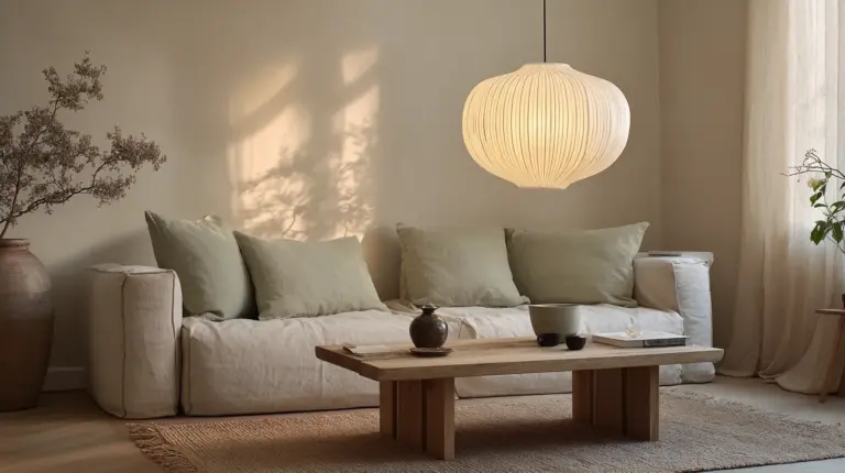
There’s something quietly magnetic about a Japandi living room. It doesn’t shout for attention with bold patterns or bright bursts of color. Instead, it whispers—through the grain of walnut wood, the soft drape of linen, the gentle shadow cast by a paper lamp.
If you’ve been drawn to this style, you already understand its appeal: the marriage of Scandinavian warmth and Japanese minimalism. But choosing the right Japandi living room accent colors can feel like walking a tightrope between too stark and too busy.
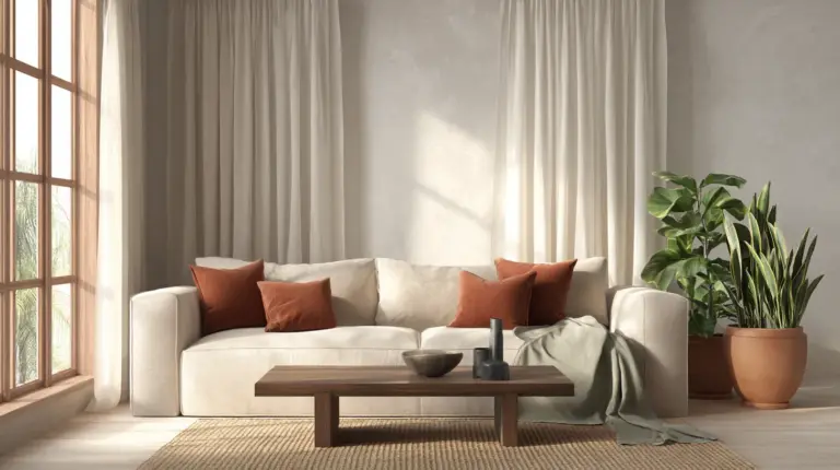
The truth is, accent colors in Japandi design aren’t afterthoughts. They’re the soul of the room—the terracotta cushion that grounds a neutral sofa, the sage green throw that echoes the garden outside, the inky blue vase that adds depth without drama. These muted hues bring personality while honoring the style’s commitment to calm.
This guide will walk you through every accent color that works in a Japandi living room, from earthy tones to unexpected darks, with practical tips for layering texture, balancing wood tones, and adapting the palette to your space—especially if you’re working with tropical humidity or budget-conscious materials.
Understanding the Japandi Color Palette
Before we dive into accents, let’s establish the foundation. The Japandi color palette is built on neutrals: off-whites, creams, warm beiges, taupes, greiges, and soft greys. These are your walls, your largest furniture pieces, your canvas.
Think of these neutrals as morning light filtering through sheer curtains. They’re never cold or clinical. Instead, they lean warm—echoing natural linen, raw silk, or sun-bleached wood.
The Role of Neutral Tones
Neutral tones in Japandi style create breathing room. They allow your eye to rest, your mind to settle. In a living room, this might mean a creamy sofa against taupe walls, or a greige accent wall paired with light oak flooring.
These colors also amplify natural materials. When your base is neutral, the texture of a woven abaca rug or the grain of teak furniture becomes the focal point. The room feels intentional, not empty.
Why Muted Accents Matter
Japandi living room accent colors are never saturated or bright. They’re pulled from nature—the soft green of moss after rain, the rust of terra cotta pottery, the deep grey of river stones. This restraint keeps the space feeling cohesive and calm.
Muted hues also age beautifully. Unlike trendy brights that feel dated quickly, colors like olive, charcoal, and warm terracotta remain timeless. They work across seasons and moods without demanding constant updates.
Top Japandi Accent Colors for Living Rooms
Let’s explore the specific colors that define Japandi living room design, with tips on how to use each one effectively.
1. Sage Green (#9CA49A)
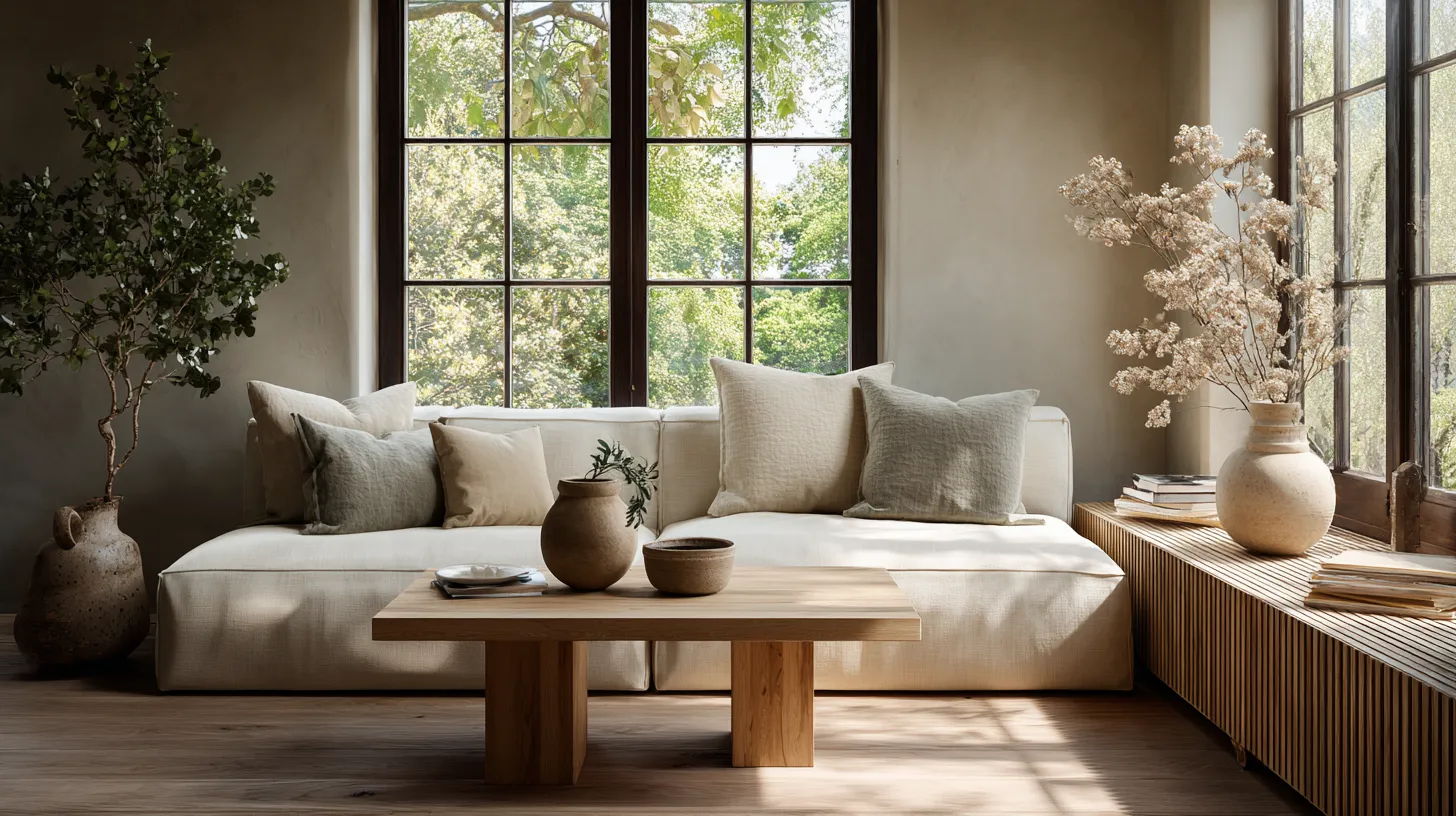
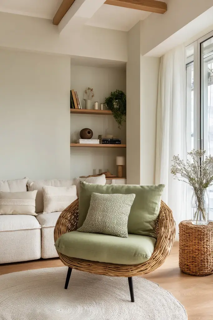
Sage green is perhaps the most iconic Japandi accent. It’s earthy without being heavy, fresh without being bright. This color brings the outdoors in—think of lichen on bark, eucalyptus leaves, the patina on aged copper.
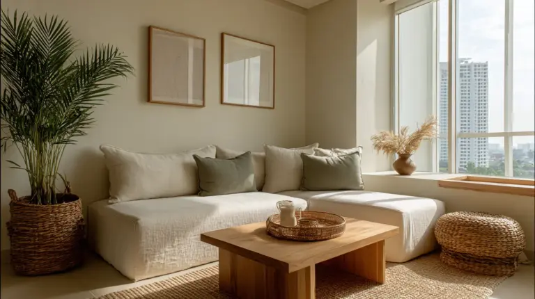
Use sage green in throw pillows on a neutral sofa, or as an accent wall behind floating shelves. Pair it with natural wood tones like oak or walnut for balance. In humid climates, consider mold-resistant paints like Boysen’s Green Luster (under PHP 2K) for longevity.
For small living rooms, sage works beautifully in textiles rather than paint. A sage linen curtain or a wool throw adds color without overwhelming the space.
2. Olive (#6B705C)
Deeper than sage, olive grounds a room with quiet strength. It’s the color of aged olive trees, sun-dried herbs, vintage Japanese pottery. Olive pairs especially well with black accents and darker wood tones.
Try olive in an upholstered accent chair, a ceramic planter, or cushion covers. Layer it with cream and beige to keep the palette light. Avoid pairing olive with cool greys—it needs warmth to shine.
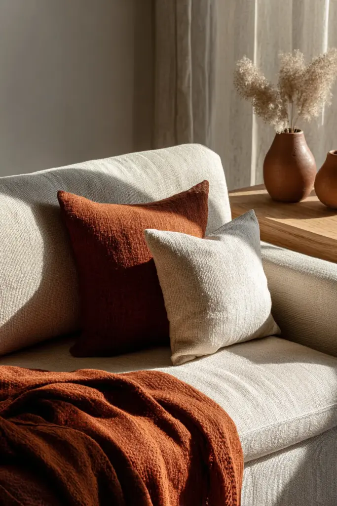
3. Terracotta (#C1876B)
Terracotta brings warmth and earthiness to Japandi spaces. It’s the color of clay pots baking in the sun, autumn leaves, rust on iron. This accent works particularly well in spaces that feel too cool or sterile.
Introduce terracotta through textiles—a rust-colored throw blanket, linen cushions, or a handwoven rug. Small doses are key: terracotta can overpower if used too generously. Balance it with plenty of white or cream, and natural wood in lighter tones.
In the Philippines, terracotta also pairs beautifully with locally sourced materials like capiz shells or rattan, creating a tropical-meets-minimalist vibe.
4. Charcoal (#36454F)
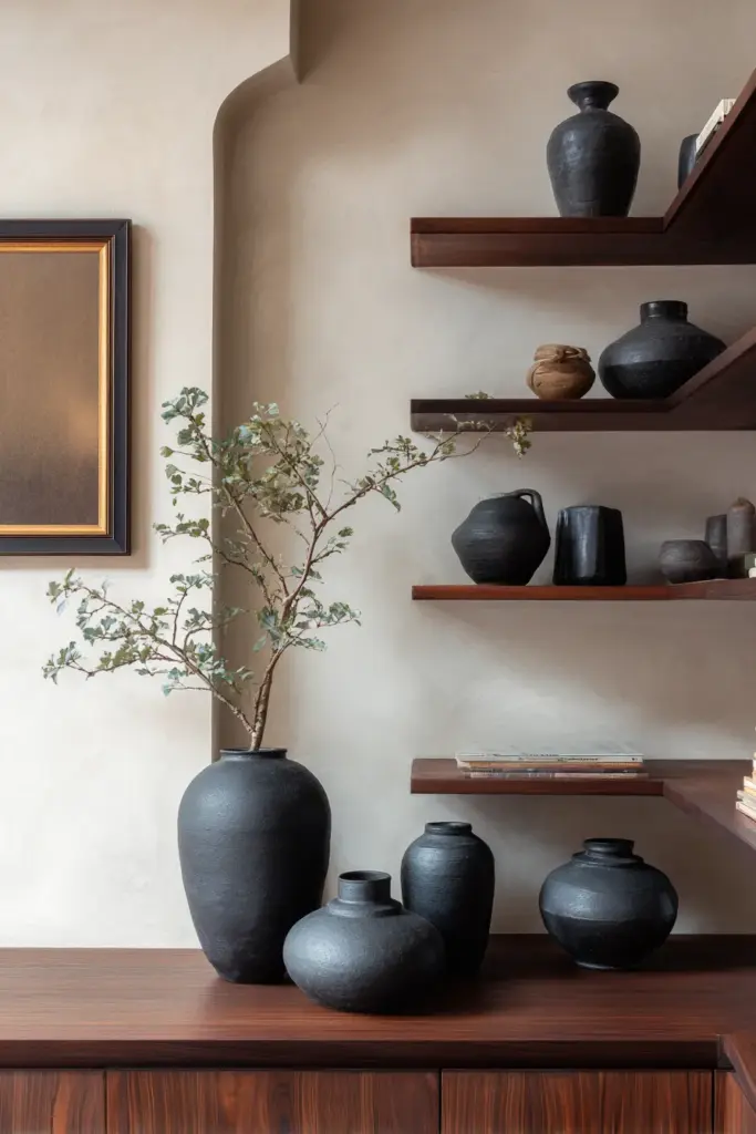
Charcoal adds depth and sophistication without the harshness of pure black. It’s the color of volcanic rock, aged iron, shadow on water. In Japandi design, charcoal provides contrast while maintaining the muted aesthetic.
Use charcoal in coffee tables, picture frames, ceramic vases, or accent furniture. A charcoal linen sofa against light walls creates striking balance. Avoid overusing it—Japandi spaces need light to breathe, so limit charcoal to 10-15% of your palette.
5. Inky Blue (#2F4550)
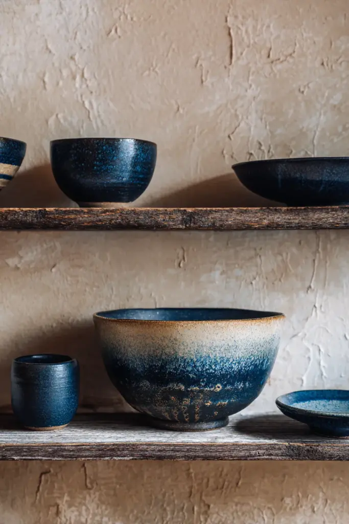
Inky blue is the color of twilight, deep water, indigo dye. It brings a meditative quality to living rooms, evoking Japanese shibori textiles and Scandinavian evening skies.
This accent works beautifully in smaller decorative elements: cushions, throws, pottery, or artwork. Pair inky blue with warm neutrals like beige or cream to prevent the space from feeling cold. In low-light living rooms, use sparingly—too much can make the room feel dim.
6. Warm Walnut Brown (#5D4E37)
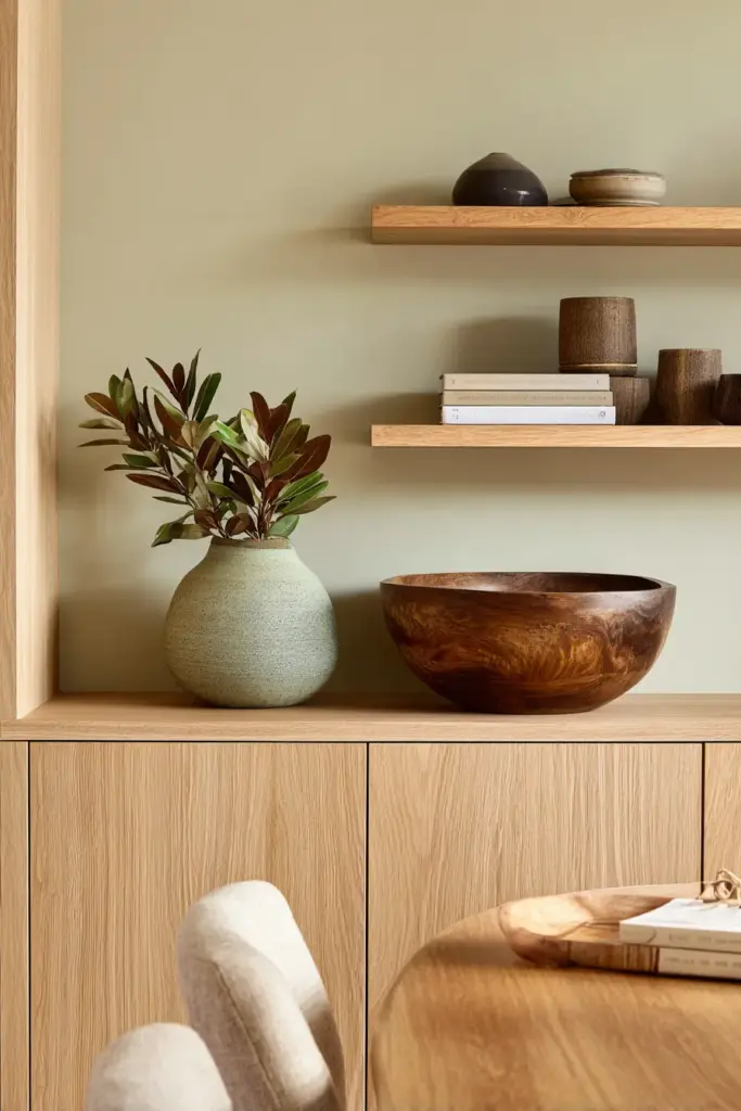
While technically a wood tone, warm walnut functions as an accent color in Japandi living rooms. It adds richness and natural beauty, grounding lighter neutrals with organic texture.
Walnut appears in furniture—side tables, shelving, bench legs—but also in smaller accents like wooden bowls, picture frames, or decorative objects. For budget-friendly options, consider DIY staining thrifted wood pieces to achieve that walnut warmth.
7. Soft Burgundy (#6D4C41)
Less common but equally effective, soft burgundy adds unexpected warmth. It’s muted enough to stay within Japandi’s restrained palette while offering something different from the usual greens and terracottas.
Use burgundy in velvet cushions, a wool throw, or ceramic accents. It pairs beautifully with cream, greige, and walnut tones. Keep it minimal—one or two burgundy elements are enough.
8. Warm Grey (#8B8680)
Warm grey bridges the gap between Scandinavian cool and Japanese earthiness. Unlike stark greys, warm grey has beige or taupe undertones that keep spaces cozy.
This color works in larger textiles like sofas or area rugs, or in painted furniture pieces. Combine warm grey with natural wood and touches of sage or terracotta for a balanced, layered look.
How to Choose Japandi Living Room Colors
Selecting accent colors isn’t just about personal preference—it’s about understanding your space’s natural qualities and functional needs.
Consider Your Natural Light
Living rooms with abundant natural light can handle deeper accents like charcoal or inky blue. These colors gain dimension in sunlight, revealing undertones throughout the day.
Low-light spaces need lighter accents. Stick to sage green, soft terracotta, and warm neutrals. These colors reflect light rather than absorb it, keeping the room from feeling cave-like.
Balance Wood Tones and Accent Colors
Japandi style relies heavily on wood, so your accent colors must complement your wood tones. Lighter woods (oak, ash, maple) pair beautifully with sage, olive, and terracotta. Darker woods (walnut, teak) work with charcoal, inky blue, and warm grey.
Avoid creating too much tonal contrast. If your furniture is dark walnut, don’t choose very light accents—instead, opt for medium tones like olive or warm grey that create harmony.
Factor in Humidity and Climate
In tropical climates like the Philippines, choose mold-resistant paints for walls and avoid fabrics that trap moisture. Look for Boysen or Nippon paints in Japandi hues with anti-mold properties.
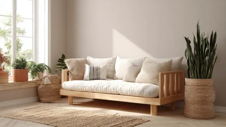
Natural materials like abaca, bamboo, and rattan thrive in humidity and add authentic texture. Pair them with terracotta, sage, or olive for a tropical Japandi interpretation.
Scale Your Accents Appropriately
In small living rooms, keep accent colors in small doses: cushions, throws, vases, artwork. Painting a full accent wall can overwhelm tight spaces.
Larger living rooms can handle bigger statements—an olive velvet sofa, a charcoal area rug, or a terracotta accent wall. Just maintain the 70-20-10 rule: 70% neutral base, 20% wood/natural materials, 10% accent colors.
Layering Texture with Accent Colors
Color alone doesn’t create a Japandi living room—texture does. The same sage green feels completely different in smooth ceramic versus rough linen.
Textiles: Linen, Wool, Cotton
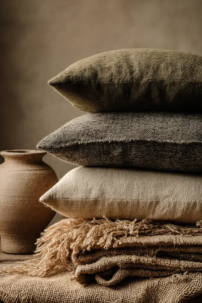
Layer your accent colors through natural textiles. A sage linen throw has more visual interest than a solid sage pillow. Olive wool cushions add warmth and depth. Terracotta cotton curtains soften windows while introducing color.
Mix textures within the same color family. Combine a smooth ceramic vase in inky blue with a chunky knit throw in the same hue.
Ceramics and Pottery
Handmade ceramics are central to Japandi style, embracing wabi-sabi’s celebration of imperfection. Choose pottery in terracotta, charcoal, or warm grey with visible texture—finger marks, uneven glaze, natural variations.
Display ceramic pieces on open shelving or as coffee table vignettes. Group odd numbers (three or five) for visual balance.
Natural Materials
Rattan, bamboo, jute, and abaca bring texture and warmth while functioning as accent colors. A rattan basket in natural honey tones acts as a warm brown accent. A jute rug adds both texture and neutral grounding.
These materials are especially practical in humid climates, as they resist mold and age beautifully.
Room-by-Room Application Tips
While this guide focuses on living rooms, these principles adapt across your home.
Open-Plan Living Spaces
In open-plan homes, use accent colors to define zones without walls. A sage green sofa in the living area, terracotta cushions in the dining nook, and charcoal accents in the reading corner create subtle boundaries.
Maintain consistency by repeating one or two colors throughout. If you use sage in the living room, echo it in a plant pot in the kitchen.
Small Japandi Living Rooms
Small spaces need restraint. Choose one primary accent color—sage, olive, or terracotta—and introduce it through three to five small elements: cushions, a throw, a vase, a plant pot.
Keep walls neutral and light. Use mirrors to bounce light and make the room feel larger. Multifunctional furniture in natural wood maximizes space without adding visual clutter.
Living Rooms with High Ceilings
High ceilings can feel stark if everything is light. Bring warmth down by using darker accents like charcoal or inky blue in artwork hung at eye level, or in pendant lighting that draws the eye downward.
A low-slung sofa in olive or warm grey also helps ground the space visually.
Budget-Friendly Japandi Accent Color Ideas
Creating a Japandi living room doesn’t require expensive designer pieces. With creativity and thrifting, you can achieve the look affordably.
DIY Staining and Painting
Thrift solid wood furniture and restain it in walnut or teak tones. Use water-based stains from local hardware stores (often under PHP 500). Sand, stain, and seal for a custom look.
Paint old ceramic pots or vases in sage, terracotta, or charcoal using chalk paint. This gives you exact color control while saving money.
Local Philippine Materials
Source abaca textiles, bamboo, and rattan from local artisans. These materials are affordable, sustainable, and perfectly suited to Japandi style. A handwoven abaca basket might cost PHP 300-800 and serves as both storage and décor.
Visit weekend markets or online shops like Habi for natural fiber textiles in muted tones.
Upcycling and Repurposing
Turn old cotton T-shirts into throw pillow covers in olive or sage (dye them with natural dyes like avocado pits or tea). Use scrap wood to build simple floating shelves.
Repurpose glass jars as vases, wrapping them in jute twine for texture. Shop end-of-season sales for neutral textiles you can layer with existing pieces.
Color Psychology in Japandi Design
The colors you choose affect how you feel in your space. Japandi accent colors are chosen not just for aesthetics but for their calming, grounding effects.
The Calming Effect of Sage and Olive
Green tones reduce stress and promote relaxation. Studies show that soft greens can boost feelings of calm by up to 25%. In a living room—a space for unwinding—this makes sage and olive particularly powerful.
Terracotta’s Warmth and Security
Warm earth tones like terracotta create feelings of safety and comfort. They’re especially effective in spaces that feel too cool or unwelcoming. Terracotta invites you to settle in, to stay awhile.
Charcoal and Inky Blue for Depth
Darker accents add sophistication and contemplation. They slow the eye, encouraging mindfulness. In Japandi design, these colors balance lighter neutrals, creating visual harmony that feels complete rather than flat.
Japandi Accent Colors: Quick Reference Guide
Here’s a practical checklist for incorporating Japandi living room accent colors:
- Start with a neutral base (off-white, cream, beige, taupe, greige, soft grey)
- Choose 1-2 primary accents from sage, olive, terracotta, charcoal, inky blue, or warm grey
- Introduce accents gradually through cushions, throws, pottery, plants, and artwork
- Balance cool and warm tones—pair green accents with warm wood, charcoal with cream
- Layer texture through linen, wool, cotton, ceramics, rattan, and natural fibers
- Consider lighting—test paint samples at different times of day
- Adapt to climate—choose mold-resistant paints and humidity-friendly materials
- Limit accent coverage to 10-15% of total visual space
- Embrace imperfection—wabi-sabi celebrates natural variations and aged patinas
- Source locally when possible—Philippine materials like abaca and bamboo add authenticity
Seasonal Updates Without Losing Balance
Japandi style is timeless, but subtle seasonal shifts keep your space feeling fresh without disrupting its calm foundation.
Summer: Lighten and Brighten
In warmer months, swap heavier wool throws for lightweight linen in sage or cream. Replace darker cushions with lighter terracotta or warm grey options. Add fresh greenery—monstera, sansevieria, or pothos—in ceramic pots.
Winter: Add Warmth and Depth
As temperatures drop (or rainy season hits), introduce deeper tones. Layer an olive wool throw over your sofa, add charcoal cushions, display warm walnut accessories. Swap thin cotton curtains for heavier linen in inky blue.
The key is subtlety. You’re not redecorating—you’re adjusting, like putting on a sweater when it’s cool.
Common Mistakes to Avoid
Even with the best intentions, certain missteps can disrupt Japandi harmony.
Too Many Accent Colors
Japandi thrives on restraint. Using four or five different accent colors creates visual noise. Stick to one or two primary accents, with occasional touches of a third.
Ignoring Undertones
Not all neutrals work together. Cool grey walls clash with warm beige furniture. Before committing, test paint samples next to your existing pieces. Look for undertones—does your “grey” lean blue or brown? Choose accents accordingly.
Over-Accessorizing
Japandi spaces need breathing room. If every surface holds a vase, basket, or candle, the calm evaporates. Edit ruthlessly. Display only what you truly love.
Neglecting Natural Materials
A room with perfect colors but no wood, stone, or natural fiber doesn’t feel Japandi—it feels like minimalism. The warmth comes from materials as much as hues.
Color Combinations That Work
Here are proven Japandi accent color pairings for living rooms:
| Primary Neutral | Accent Color 1 | Accent Color 2 | Wood Tone | Best For |
|---|---|---|---|---|
| Cream | Sage Green | Terracotta | Light Oak | Bright, airy spaces |
| Greige | Olive | Charcoal | Walnut | Sophisticated, grounded |
| Soft Grey | Inky Blue | Warm Walnut | Teak | Contemplative, calm |
| Beige | Terracotta | Warm Grey | Ash | Cozy, welcoming |
| Taupe | Sage Green | Charcoal | Maple | Balanced, timeless |
Mix and match based on your existing furniture and lighting conditions.
Sustainable Accent Choices
Japandi philosophy values sustainability—choosing materials that last, that age gracefully, that respect the earth.
Eco-Friendly Paint Options
Look for low-VOC or zero-VOC paints in Japandi hues. Boysen and Nippon both offer eco-friendly lines. These reduce indoor air pollution while providing the muted colors you need.
Natural Dyes for Textiles
If you’re DIY-ing cushion covers or throws, use natural dyes. Avocado pits create soft terracotta, tea makes warm brown, and indigo yields beautiful blues. These colors fade gracefully over time, embodying wabi-sabi.
Locally Sourced Materials
Choosing Philippine-made textiles and furniture reduces environmental impact while supporting local artisans. Abaca, bamboo, and rattan are renewable resources that align perfectly with Japandi values.
Secondhand and Vintage Finds
Thrifted furniture and décor add character while preventing waste. A vintage ceramic vase in sage green or a reclaimed wood bench brings history and authenticity to your space.
Maintaining Your Japandi Color Palette
Once you’ve established your Japandi living room, maintenance is minimal—but intentional.
Refresh Without Replacing
When your space feels stale, don’t buy new. Instead, move things around. Swap cushions between rooms, rotate artwork, rearrange accessories. Sometimes a sage cushion simply needs a new spot.
Clean Naturally
Use natural cleaners to maintain your materials. Lemon juice and olive oil polish wood, baking soda cleans ceramics, and mild soap keeps textiles fresh. Harsh chemicals strip the natural patina that makes Japandi spaces beautiful.
Let Things Age
Embrace wear. A linen throw that’s slightly faded, a ceramic pot with a chip, wood furniture with subtle scratches—these imperfections tell stories. They make your space feel lived-in, not staged.
The Soul of Japandi Color
At its heart, choosing Japandi living room accent colors is about more than design trends. It’s about creating a space that feels like exhaling—where sage green reminds you of morning walks, where terracotta echoes the warmth of shared meals, where charcoal adds just enough weight to ground you.
These colors don’t demand attention. They don’t try to impress. Instead, they whisper invitations: sit here, rest here, breathe here.
Your living room should be a sanctuary. Not a showroom, not a museum, but a place where life unfolds gently—where natural light shifts across cream walls, where the grain of walnut wood catches your eye, where an olive cushion provides exactly the comfort you need after a long day.
The beauty of Japandi accent colors is that they grow with you. They don’t tire. They don’t fade from relevance. Instead, they deepen, their muted tones becoming more beloved with each season that passes.
Start small. Add a sage throw. Place a terracotta pot on your shelf. Notice how the light changes, how the room breathes differently. Let these colors guide you toward the calm, elegant space you’ve been craving.
Because in the end, Japandi design isn’t about following rules perfectly. It’s about finding balance—between function and beauty, between fullness and emptiness, between color and calm.
And once you find it, you’ll wonder how you ever lived any other way.
FAQs
What colors are used in Japandi style?
Japandi style uses a neutral base of off-whites, creams, beiges, taupes, and soft greys, paired with muted accent colors like sage green, olive, terracotta, charcoal, inky blue, and warm browns. All colors are pulled from nature and kept intentionally muted.
What accent colors go with Japandi?
The best Japandi accent colors include sage green (#9CA49A), olive (#6B705C), terracotta (#C1876B), charcoal (#36454F), inky blue (#2F4550), warm walnut brown, and soft burgundy. Use these in small doses through cushions, throws, pottery, and plants.
How do I choose Japandi living room colors for small spaces?
For small Japandi living rooms, keep walls neutral in cream or greige, then add one primary accent color through 3-5 small elements like cushions or vases. Avoid painting full accent walls, and maximize natural light with sheer curtains and mirrors.
Can I use Japandi colors in humid climates like the Philippines?
Yes! Choose mold-resistant paints like Boysen or Nippon in Japandi hues, and opt for humidity-friendly materials like bamboo, rattan, and abaca. These natural fibers resist moisture while maintaining authentic Japandi texture.
How many accent colors should I use in a Japandi living room?
Stick to 1-2 primary accent colors to maintain Japandi’s restrained aesthetic. You can add occasional touches of a third color, but more than that creates visual clutter. Remember: Japandi thrives on simplicity and breathing room.