Table of Contents
There’s something deeply calming about walking into a room that breathes—where every color whispers rather than shouts, where light settles softly on walls the shade of morning mist. This is the soul of Japandi design, a beautiful marriage of Japanese minimalism and Scandinavian hygge that’s captured hearts worldwide.
If you’re dreaming of transforming your living room into this kind of sanctuary, you’re in the right place. The Japandi color palette isn’t about following rigid rules—it’s about creating a space that feels like exhaling after a long day.
In this guide, we’ll walk through the exact colors, mixing formulas, and budget-friendly DIY techniques to bring Japandi warmth into your home. Whether you’re working with a cozy Metro Manila apartment or planning a complete room refresh, these practical steps will help you create something truly special.
Let’s begin where all beautiful rooms do—with color that tells a story.
Understanding the Japandi Color Palette
The Japandi aesthetic lives in the space between wabi-sabi imperfection and Scandinavian brightness. These aren’t just paint chips on a card—they’re the foundation of how a room makes you feel when you step inside.
The Core Neutral Foundation
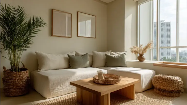
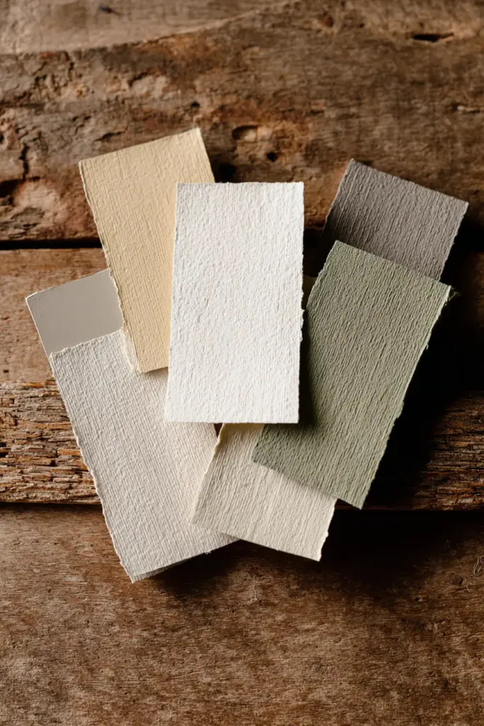
Warm whites and off-whites form the backbone of any Japandi living room. Think of colors like ivory, cream, and soft chalk—shades that catch natural light and throw it gently back into the space. These aren’t the stark whites of modern minimalism; they’re warmer, softer, almost touchable.
Beige and taupe tones add depth without weight. A taupe wall behind your sofa creates visual calm while providing enough contrast to let furniture breathe. These earthy neutrals ground a space, making it feel collected and intentional rather than empty.
Muted grays bridge the gap between cool and warm. Look for grays with brown or green undertones—what designers call “greige”—that shift beautifully as daylight moves through your windows. These are the colors of river stones and morning fog.
Earthy Accent Colors
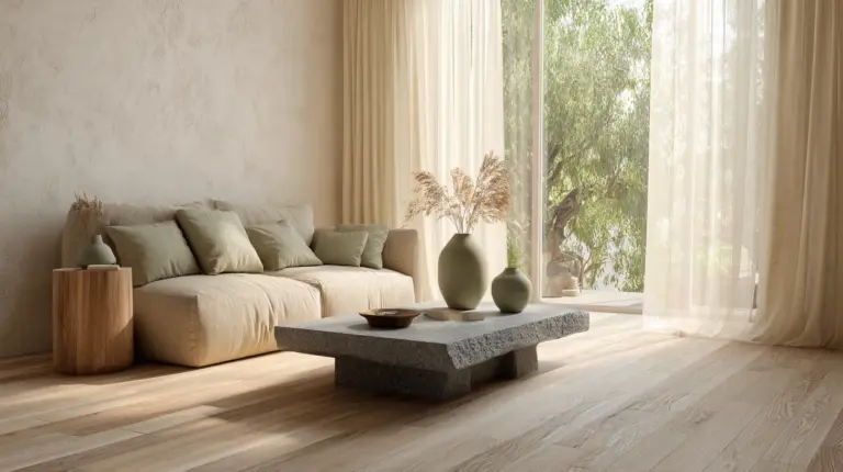
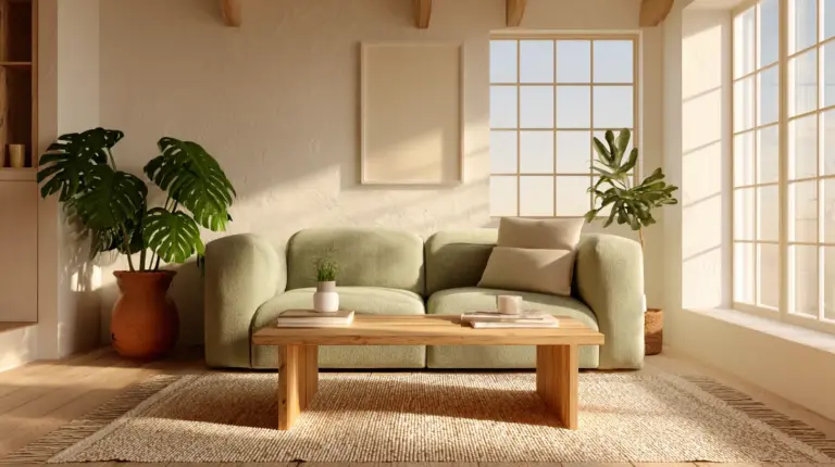
Sage green has become the signature Japandi accent color, and for good reason. It brings the outdoors in without overwhelming your senses. Pair sage with natural wood tones and you’ve created an instant connection to nature—the heart of both Japanese and Scandinavian design philosophies.
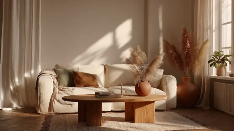
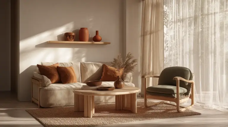
Warm terracotta and clay tones add grounded warmth. These colors work beautifully in small doses—a rust-colored throw pillow, a terracotta planter—creating focal points that feel organic rather than forced.
Dusty blues and olive greens offer cooler alternatives while maintaining that signature muted quality. These colors echo the natural world—the blue-gray of distant mountains, the olive of ancient trees—without introducing visual noise.
Wood and Natural Material Tones
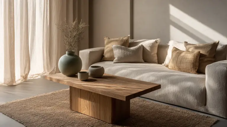
In Japandi spaces, wood isn’t just furniture—it’s color. Light oak, ash, and birch bring honey-gold warmth, while darker walnut and teak introduce sophisticated depth. These natural wood tones work as your color palette’s anchor, connecting all your paint choices back to nature.
What Colors Are Used in Japandi Living Rooms?
The most successful Japandi living rooms layer their colors like a well-composed photograph. Start with a neutral base—warm white or soft beige on walls—then build depth through furniture, textiles, and accent pieces in complementary earthy tones.
Primary wall colors typically include:
- Warm whites with subtle yellow or gray undertones
- Soft beiges that read almost pink in certain light
- Pale taupes that shift between brown and gray
- Very light sage greens for feature walls
Accent and contrast colors appear in:
- Cushions and throws in dusty rose, terracotta, or olive
- Artwork incorporating muted blues and greens
- Natural wood furniture in light to medium tones
- Black accents (sparingly) in frames or hardware
The key is proportion. Your living room should be 70% neutrals, 20% wood tones, and 10% soft accent colors. This ratio creates visual rest—the calm that makes Japandi spaces feel like a deep breath.
What Is the Best Color for Japandi Walls?
If you’re painting just one wall (or all four), the answer depends on your room’s natural light and size. But there are clear winners that work across different spaces.
For Small Living Rooms
Warm off-white (like Boysen’s Antique White or a custom mix of 90% Pure White with 10% Sand) opens up tight quarters while staying true to Japandi warmth. Small Metro Manila apartments particularly benefit from this approach—the light bounces, the room expands visually, and you’ve created a blank canvas for wooden furniture to shine.
Add warmth by mixing in the tiniest amount of yellow or pink undertone. You want the color to read as “soft” rather than “clinical.”
For Medium to Large Spaces
Greige or warm gray (think Boysen’s Color Trend Palette in Dove or DIY-mixed equal parts white base, gray tint, and beige tint) adds sophisticated depth while maintaining brightness. These colors photograph beautifully and create stunning backdrops for hanging plants and minimal art.
Test your paint mixture on a large poster board and observe it at different times of day. The right greige should never look cold or flat—it should shift subtly from warm to cool as light changes.
For Feature Walls
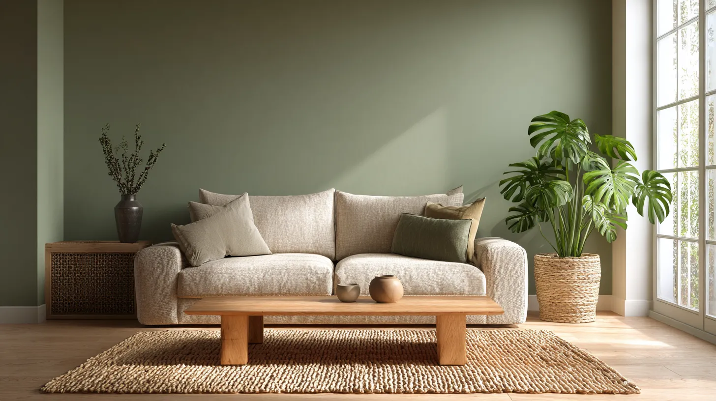
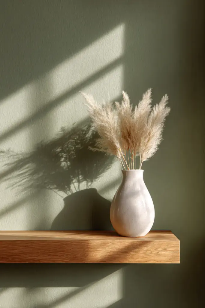
Sage green creates instant Japandi atmosphere. Mix your own using white base paint with forest green (about 15%) and a touch of gray (5%) for that perfect muted quality. Davies Professional Paints offers affordable base whites perfect for this DIY approach.
Position your sage feature wall where natural light hits it directly—typically opposite your largest window. This ensures the green stays soft and inviting rather than dark or muddy.
DIY Japandi Paint Mixing Guide: Budget-Friendly Formulas
Creating custom Japandi colors costs less than buying premium mixed paints. Here’s your practical mixing workshop using Philippine paint brands available in any hardware store.
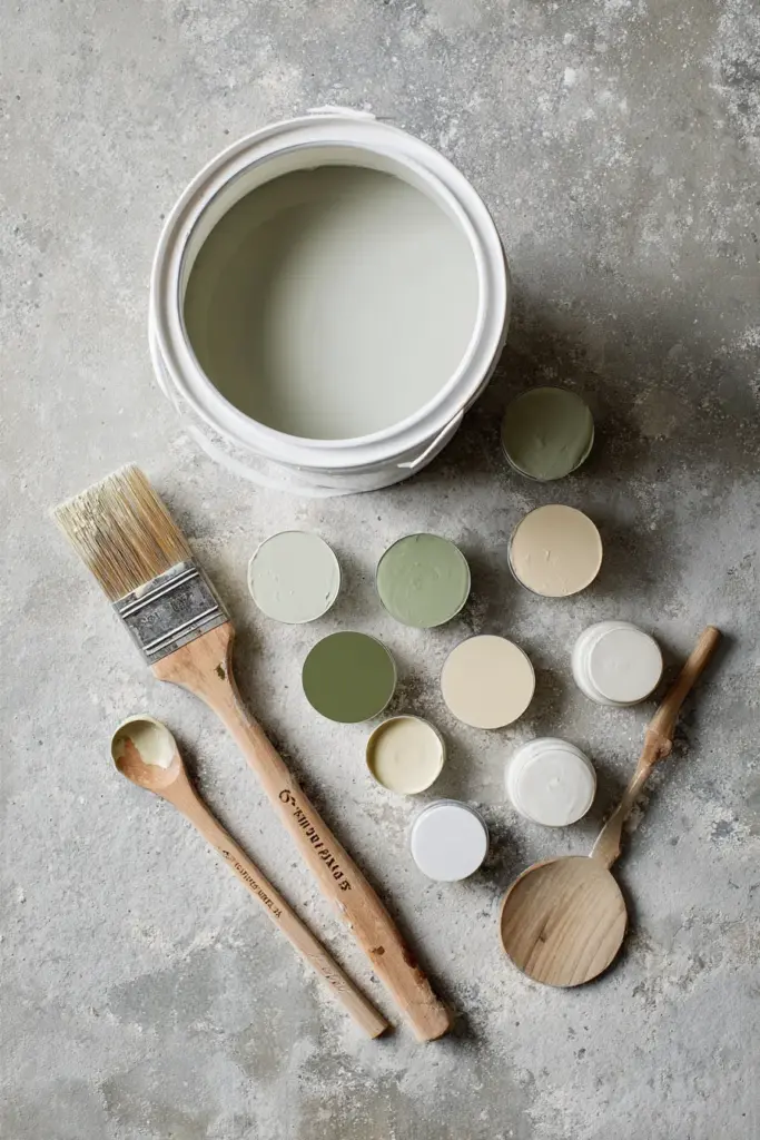
Custom Sage Green (Cost: PHP 1,200-1,500 for 4L)
Formula:
- 1 gallon white base (Boysen Permacoat Flat)
- 2 tablespoons forest green tint
- 1 tablespoon gray tint
- ½ tablespoon yellow ochre tint
Mix thoroughly in your paint bucket, testing on cardboard first. Adjust by adding more white if too dark, or more green if too gray. This creates approximately 50 square meters of coverage—enough for most living rooms.
Perfect Warm Beige (Cost: PHP 1,000-1,300 for 4L)
Formula:
- 1 gallon white base
- 1½ tablespoons tan tint
- ½ tablespoon pink/coral tint
- ¼ tablespoon yellow tint
The pink undertone keeps beige from reading yellow or orange—crucial for Japandi warmth. This formula creates a beige that shifts beautifully throughout the day, looking cooler in morning light and warmer in afternoon sun.
Muted Olive Accent (Cost: PHP 1,100-1,400 for 4L)
Formula:
- 1 gallon white base
- 2 tablespoons olive green tint
- 1 tablespoon brown tint
- Tiny drop of black tint (optional, for depth)
This deeper shade works beautifully for a single accent wall behind a minimalist shelving unit or sofa. The brown grounds the olive, preventing it from looking too bright or artificial.
Pro Mixing Tips
Always mix more paint than you need—touching up custom colors later is nearly impossible to match perfectly. Keep track of your exact measurements by photographing your mixing process. Request low-VOC or zero-VOC paint bases for healthier indoor air quality, a priority in Japandi’s nature-focused philosophy.
What Colors Go with Japandi?
Japandi color harmony comes from understanding which pairings enhance tranquility and which create subtle visual interest..
Winning Color Combinations
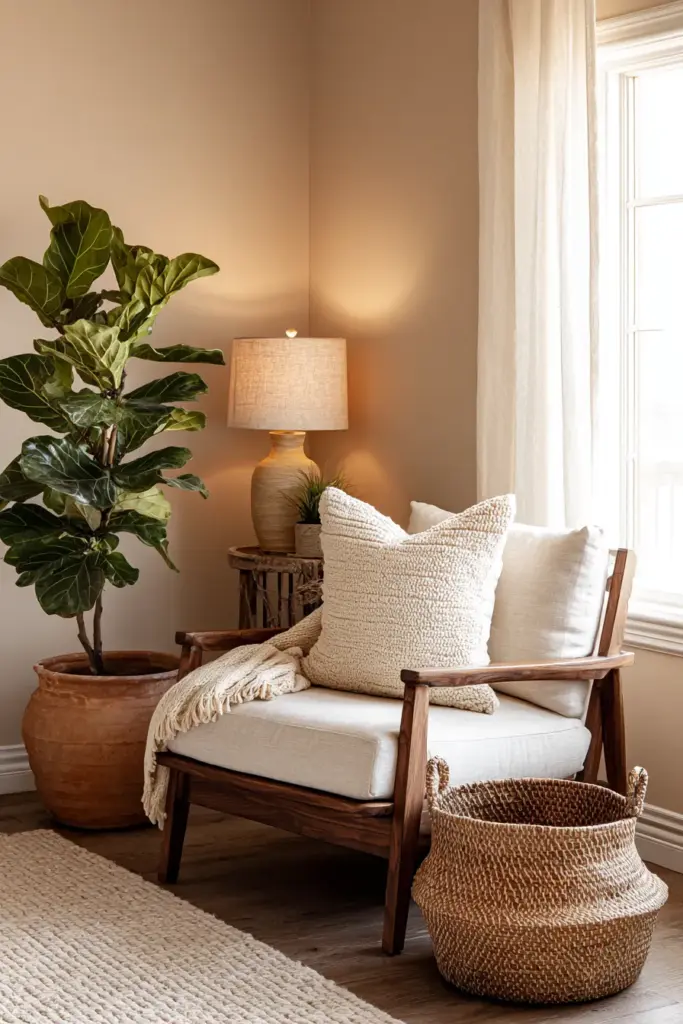
Sage green + light oak wood remains the most popular pairing. The cool-warm contrast feels balanced and natural, like a forest floor dappled with sunlight. Add cream-colored textiles to soften the palette further.
Warm beige + walnut wood + terracotta accents creates a warmer, cozier interpretation of Japandi. This combination works beautifully in living rooms with less natural light, as the warm tones compensate for dimmer conditions.
Soft gray + birch wood + dusty blue offers a cooler, more Scandinavian-leaning palette. Perfect for hot Philippine climates, this combination feels refreshing while maintaining Japandi serenity.
Color Pairings to Avoid
Stay away from high-contrast combinations like pure white with black, or bright jewel tones with neutrals. Japandi thrives on subtle transitions—colors should flow into each other rather than create sharp divisions.
Avoid cool whites with warm woods (the undertones clash) or mixing too many accent colors in one space. Stick to one or two accent colors maximum to maintain visual calm.
Room-by-Room Application: Small Space Solutions
Manila apartments and compact living rooms need special consideration when applying Japandi colors. Here’s how to maximize your space while staying true to the aesthetic.
For Low-Light Living Rooms
If your living room has limited natural light (common in townhouses or condo units), prioritize warm whites on walls to maximize light reflection. Add warmth through textiles and wood furniture rather than paint color.
Install warm LED bulbs (2700K-3000K color temperature) to mimic natural light and prevent cool whites from looking sterile. Strategic mirror placement opposite windows doubles your available light.
For Open-Plan Spaces
Use color to define zones without physical barriers. Paint your TV wall in soft sage while keeping other walls in warm white—this creates visual separation between living and dining areas while maintaining flow.
Extend your floor-level color palette upward through area rugs in complementary neutrals. A jute rug under your coffee table, for instance, extends the earthy tones from your wood furniture down to the floor.
For Rental-Friendly Options
If you can’t paint walls, create Japandi color impact through removable solutions:
- Large-scale fabric wall hangings in sage or beige
- Peel-and-stick wallpaper in muted patterns
- Color-coordinated furniture and textiles in your chosen palette
- Statement pieces like a beige linen sofa or sage velvet chair
Plant Pairings and Living Color
No Japandi living room is complete without greenery—and choosing plants that complement your color palette enhances the entire aesthetic.
Best Plants for Japandi Color Schemes
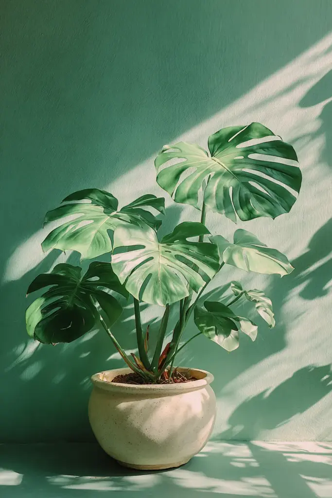
Monstera deliciosa against sage green walls creates a stunning tonal harmony—the plant’s deep green plays beautifully with muted wall tones. Position it where morning light can backlight the leaves for dramatic effect.
Fiddle leaf fig works perfectly with warm beige and taupe palettes. The plant’s structural leaves and light green color add life without introducing jarring contrast.
Snake plants and pothos provide sculptural interest against neutral grays and whites. Their darker foliage creates just enough contrast to feel dynamic while maintaining calm.
Planter Color Choices
Stick to ceramic planters in white, cream, terracotta, or natural concrete gray. Avoid colored or patterned planters that compete with your carefully curated color scheme. The planter should disappear—the plant should shine.
Lighting and Color Temperature
Your paint colors will only look right if your lighting supports them. This is where many DIY projects fall short.
Choosing the Right Bulbs
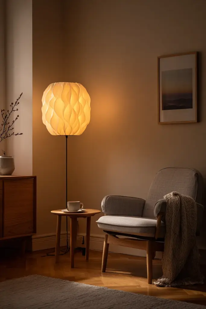
Warm white LEDs (2700K-3000K) make beiges and warm whites glow while preventing sage greens from looking too cool. Cool white bulbs (4000K+) kill Japandi warmth—avoid them entirely in living spaces.
Dimmable bulbs let you adjust ambiance throughout the day. Morning brightness for energizing your space, evening warmth for unwinding—this flexibility is crucial in multipurpose living rooms.
Layered Lighting Strategy
Combine ambient (overhead), task (reading lamps), and accent (picture lights or uplighting for plants) lighting to create depth. This layering makes your colors appear more dimensional and interesting as different light sources hit them throughout the day.
Position warm-toned lamps near your seating area to create cozy pockets of light that enhance the room’s Japandi calm.
Budget Breakdown: DIY Japandi Living Room Under PHP 5,000
Here’s exactly how to allocate your budget for maximum impact in a standard 20-25 square meter living room.
Paint and Materials (PHP 2,500-3,000)
- 4 liters quality flat paint base: PHP 1,200
- Tinting colors (3-4 bottles): PHP 400
- Primer (if needed): PHP 600
- Painter’s tape, drop cloth, brushes/rollers: PHP 500
Upcycling and Accents (PHP 1,500-2,000)
- Sandpaper and wood stain for furniture refresh: PHP 300
- Neutral linen pillow covers (2-3): PHP 600
- Jute or natural fiber rug: PHP 800
- Clay or ceramic planters: PHP 300
Smart Lighting (PHP 1,000)
- Warm LED bulbs (3-4 bulbs): PHP 600
- Paper lantern or woven shade: PHP 400
This budget assumes you’re keeping existing furniture and focusing on color transformation. Paint delivers the biggest visual impact for the lowest cost—start there.
Seasonal Color Adjustments
Japandi design embraces nature’s cycles through subtle seasonal shifts in accent colors.
Summer Lightness
During hot months, lean into cooler tones. Add dusty blue cushions, swap terracotta accents for pale gray, and maximize white space. Your sage green walls will feel cooler and more refreshing.
Cozy Autumn Warmth
As months cool (relatively, in the Philippines), introduce warmer accent textiles—rust-colored throws, cream-colored knit pillows, warmer wood tones in new accessories. Your beige walls suddenly feel more enveloping.
The beauty of a neutral Japandi base is how easily it adapts to these small shifts without requiring repainting.
Sustainability and Low-VOC Paint Choices
Japandi philosophy prioritizes environmental consciousness. Choosing sustainable paint options aligns perfectly with the aesthetic’s values.
Eco-Friendly Paint Options in the Philippines
Boysen Healthy Home and Davies Pure offer low-VOC formulations that maintain air quality while delivering excellent coverage. They cost slightly more (10-15% premium) but are worth it for rooms where you spend significant time.
Zero-VOC paints have improved dramatically in recent years. They cover as well as conventional paints while eliminating the chemical off-gassing that can linger for weeks after painting.
Sustainable Painting Practices
Use drop cloths and careful taping to minimize waste. Store leftover paint properly for touch-ups rather than disposing. Choose reusable brushes and rollers over disposable options.
When possible, repurpose old furniture with paint rather than buying new. A secondhand wood coffee table refinished in natural stain embodies Japandi’s appreciation for imperfection and sustainability.
Your Japandi Color Checklist
Before you start your DIY transformation, ensure you’ve covered these essential elements:
Color Selection:
- Primary wall color chosen (warm white, beige, or sage green)
- Accent colors limited to 1-2 (olive, terracotta, dusty blue)
- Wood tone coordinated (light oak with cool colors, walnut with warm)
- Plant colors considered for overall palette
Materials and Tools:
- Paint base and tints purchased
- Custom color mixed and tested on poster board
- Observed test color at different times of day
- Low-VOC or zero-VOC option selected
- Quality brushes, rollers, and prep materials ready
Room Preparation:
- Furniture moved or covered
- Walls cleaned and primed if needed
- Lighting plan finalized (bulb temperature 2700-3000K)
- Accent pieces and textiles selected in complementary tones
Application Strategy:
- Feature wall location chosen (if applicable)
- Two coats planned for proper coverage
- Drying time built into schedule
- Touch-up paint reserved for later corrections
Bringing It All Together
Creating a Japandi living room through DIY color choices is less about perfection and more about intention. Every brush stroke is a small act of creating calm in your everyday space.
The colors you’ve chosen—those soft beiges, grounding grays, whisper-quiet sage greens—will become the backdrop to your life’s quiet moments. Morning coffee in gentle light. Evening conversations as the room settles into warm lamp glow. The simple pleasure of a space that feels right.
Don’t rush the process. Mix your colors carefully. Test them in your actual light. Live with samples for a few days before committing. The beauty of Japandi is that it asks us to slow down, to be mindful, to create spaces that nourish rather than overwhelm.
Your living room is waiting to exhale with you. All it needs is color that understands the language of calm.
Frequently Asked Questions
What is the most popular Japandi living room color?
Warm beige and soft sage green tie as the most popular Japandi wall colors, each serving different needs. Beige creates versatile warmth that works with any natural wood tone and provides a fail-safe backdrop for minimalist furniture. Sage green makes a bolder statement while remaining subtle, introducing nature-inspired calm that pairs beautifully with light oak and cream textiles. For first-time DIY painters, warm beige offers more forgiving results since slight variations in mixing don’t dramatically change the final appearance.
Can I create Japandi colors with affordable local paint brands?
Absolutely—Boysen and Davies paints available at any Philippine hardware store work perfectly for DIY Japandi colors. Start with their flat white base paints (Permacoat or Professional line) and add universal tints to create custom sage greens, warm beiges, and muted grays. A 4-liter bucket costs PHP 1,000-1,500 and covers roughly 50 square meters with two coats. The key is patience in mixing—add tints gradually, testing on cardboard between additions until you achieve the soft, muted quality Japandi requires.
How do I prevent sage green from looking too bright or artificial?
The secret to authentic Japandi sage green is adding gray to your green-white mixture. Mix white base paint with forest green tint and approximately 30% as much gray tint—this u0022dirtiesu0022 the green, creating that essential muted quality. Test your mixture in both morning and afternoon light, as sage green shifts appearance dramatically throughout the day. If it still looks too vibrant, add more white rather than more gray, which can make the color muddy. Always err on the side of lighter—you can always add depth with accent pieces.
What’s the best way to test paint colors before committing?
Paint large poster boards (at least 2×2 feet) with your mixed colors and move them around your living room, observing them at different times of day for at least 48 hours. Tape them to walls in areas with different light exposure—near windows, in corners, opposite your primary seating area. Take photos on your phone at various times, as cameras often reveal undertones your eyes miss. This method costs under PHP 100 and prevents expensive repainting mistakes. Remember that colors always look lighter and brighter once covering an entire wall versus a small sample.
How often should I repaint to maintain the Japandi look?
Quality low-VOC paints in Japandi’s muted tones show wear more gradually than bright colors, typically lasting 5-7 years before needing refresh. However, high-traffic areas near doorways or behind furniture may need touch-ups every 2-3 years as natural oils and dust accumulate. The neutral palette actually ages gracefully—slight fading over time can add to the wabi-sabi character. Focus on maintaining walls through gentle cleaning with damp microfiber cloths rather than harsh scrubbing, which preserves the paint’s flat finish and extends its life considerably.