Table of Contents
There is a particular kind of stillness that a well-decorated wall can hold. Not silence exactly — something warmer. The kind you feel when morning light touches linen, or when a single branch in a ceramic vessel makes an entire corner feel resolved.
That is the spirit of Japandi living room wall decor. It does not shout. It settles.
Japandi — the quiet marriage of Japanese minimalism and Scandinavian warmth — has moved well past trend. It has become a way of living with intention, especially in the spaces where we exhale the most: our living rooms. And the walls, so often afterthoughts, are where this philosophy speaks most clearly.
At ERYLIN, we believe a wall is never just a wall. It is a canvas for how you want to feel at home. This guide will walk you through everything — from choosing the right art and materials, to placing pieces with purpose, to making it work whether you own your space or rent it.
What Truly Defines Japandi Wall Decor
It Is Not Just Minimalism — It Is Meaning
Many people confuse Japandi with simply “having less.” But the philosophy runs deeper. Every piece on a Japandi wall earns its place — not because it fills space, but because it contributes something quiet and real.
Two cultural concepts anchor this beautifully. Wabi-sabi, from Japanese aesthetics, finds beauty in imperfection and transience. A handmade print with slightly uneven edges, a wood frame with natural grain variation, a botanical sketch that is not perfectly symmetrical — these are not flaws. They are soul. Hygge, from Scandinavian culture, layers in warmth: the idea that a room should feel like a gentle embrace.
Together, they mean your walls should feel both restful and alive.
The Role of Ma — Embracing Negative Space
In Japanese design, Ma (間) refers to the meaningful pause — the space between things. On a Japandi wall, the empty space around a piece of art is not wasted. It is intentional. It breathes.
This is perhaps the most freeing concept for anyone who has agonized over a bare wall. You do not need to fill it. A single oversized canvas in the center of a wide wall, surrounded by generous emptiness, often says more than a crowded gallery.
Let the wall rest. Let your eye settle.
Colors and Materials That Belong Here
Japandi wall decor lives in a muted, natural palette. Think warm whites, soft beige, cool taupe, dusty sage, warm charcoal, and the palest blush. These tones echo the outdoors without mimicking it literally — they feel like dusk light through a paper screen.
| Color Family | Examples | Mood |
|---|---|---|
| Warm Neutrals | Warm white, cream, oat | Soft, airy, welcoming |
| Earth Tones | Taupe, clay, terracotta | Grounded, organic |
| Cool Accents | Sage, muted sage green | Calm, nature-connected |
| Deep Anchors | Charcoal, slate, deep umber | Anchoring, sophisticated |
For materials, lean toward wood frames (particularly oak, walnut, or ash), linen canvases, bamboo-edged panels, and hand-textured paper prints. These materials do not just look natural — they feel it.
Best Japandi Wall Decor Ideas for Your Living Room
The Single Statement Piece
Sometimes one is everything.
The most distinctly Japandi approach is to choose one oversized piece and give it the entire wall. A large-format abstract in ink wash. A botanical study printed on warm ivory linen. A calligraphy-style line drawing with a single, spare brushstroke.
A useful rule: your art should span 60–75% of the width of your sofa or the primary furniture below it. This proportion anchors the piece visually without overwhelming the room. Hang it so the center of the artwork sits approximately 57–60 inches from the floor — eye level in a standing room, and perfect when viewed from a seated position on the sofa.
The Japandi Gallery Wall
Curated, not cluttered.
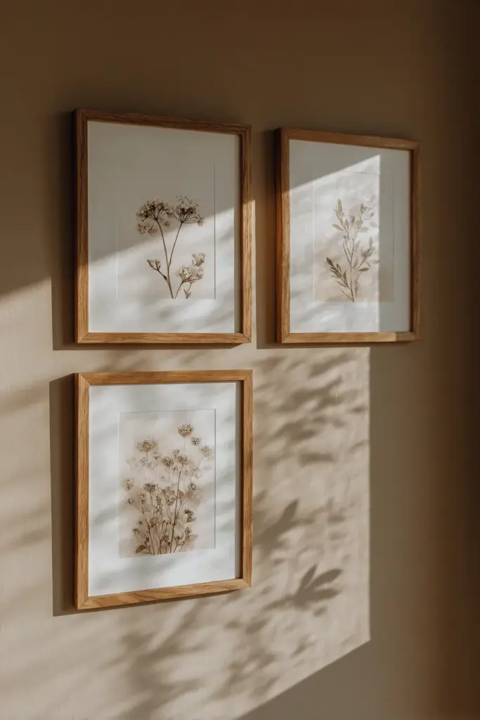
A gallery wall can feel deeply Japandi — if approached with restraint. The key is cohesion: one color family, one or two frame finishes, and generous spacing between pieces. Aim for at least 3–4 inches of breathing room between each frame. More, if your wall allows.
Choose prints that share a visual language — all botanical, all abstract ink, all minimalist landscapes — but vary slightly in size and orientation. A mix of portrait and landscape frames in the same oak tone feels intentional without feeling rigid.
Avoid: mismatched frame colors, too many competing subjects, or pieces hung so close they lose their individual voice.
The TV Wall — Making Peace With the Screen
The television does not have to win.
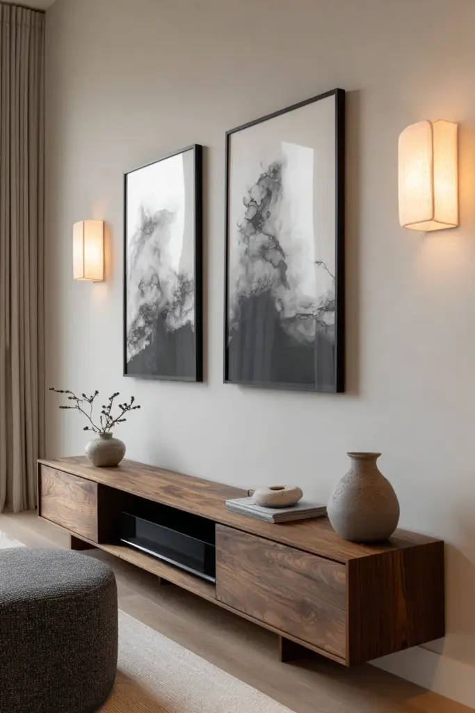
The TV wall is the most challenged space in Japandi design. The screen is a visual anchor by necessity, but it can be softened beautifully. Flank the TV with two identical narrow prints in matching frames — one on each side, hung at the same height. This creates visual symmetry that the eye reads as calm.
Alternatively, consider a floating shelf arrangement beneath or beside the TV, styled with a single ceramic vessel, one small framed artwork, and negative space. The shelf itself becomes part of the wall composition.
Avoid mounting art directly above the TV — it draws the eye upward awkwardly and makes the television feel even more dominant.
The Accent Wall With Texture and Panels
Walls can have dimension without drama.
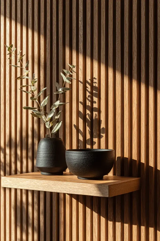
Japandi wall paneling is one of the most searched and underused ideas in living room design. Vertical slat panels in raw oak or walnut add warmth, texture, and a deeply architectural quality without paint or wallpaper. They work especially well as a backdrop for a floating shelf, a single hanging piece, or simply left bare to be admired.
For a softer approach, woven linen wall panels or handmade paper art bring texture through material rather than structure. These are tactile in a way that printed art rarely is — run your hand across them and the room feels more real.
Layering — The Art of Intentional Mix
One print alone is a moment. Three elements together are a story.
The most livable Japandi walls are not bare — they are layered with intention. A simple system that works beautifully:
- One anchor piece: an oversized neutral print or canvas
- One natural element: a rattan mirror, a raw-edge wood shelf, or a black iron sconce
- One small detail: a small ceramic piece on the shelf, or a single dried stem in a bud vase
This combination — art, organic form, handmade object — mirrors the shizen (naturalness) of Japanese design and the cozy layering of Scandinavian homes. Nothing competes. Everything belongs.
Renter-Friendly Japandi Wall Decor
You do not need to own your walls to make them beautiful.
This is one of the most underserved areas in Japandi design, and one of the most needed. If you rent and cannot put nails in walls, you still have elegant options.
- Command strips and adhesive hooks: Modern versions hold up to 5–7 lbs and work beautifully for lightweight linen prints and small framed pieces
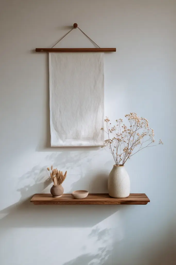
- Tension rods with linen or fabric banners: Hang a wide piece of natural fabric between tension rods for a soft, gallery-quality look — no holes required
- Leaning art: A large canvas or framed print leaned against the wall has an effortlessly relaxed quality that is very much in keeping with Japandi ease
- Floating shelves with removable hardware: Many brands now offer shelf systems that leave minimal marks; style them with art, vessels, and organic objects
- Removable wall panels: Peel-and-stick wood slat systems exist and have improved dramatically — they photograph beautifully and remove cleanly
Renting does not mean settling. It means choosing differently.
How Lighting Transforms Japandi Wall Art
Light is the final layer — and the one most people forget.
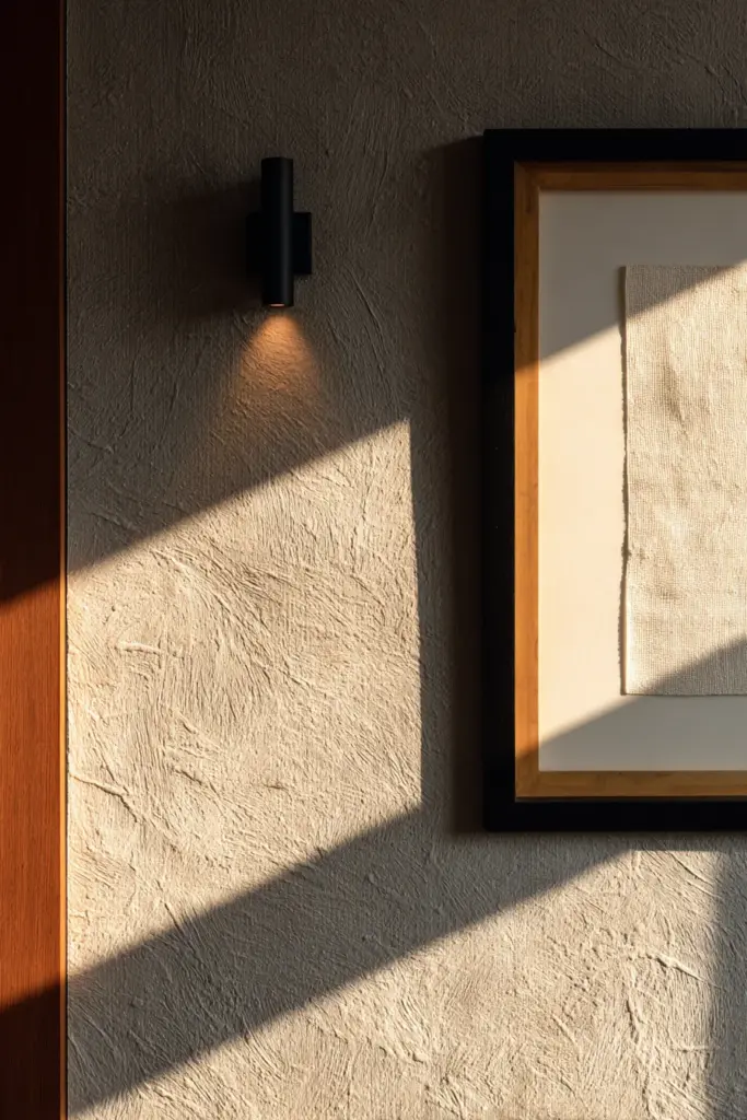
The way light falls on your wall art changes everything. A matte botanical print in warm LED light feels soft and textural. That same print under a cool white bulb feels flat and clinical.
For Japandi wall decor, warm white LED lighting (2700K–3000K) is the most compatible. It enriches wood tones, softens linen textures, and keeps neutral-palette prints feeling alive.
Sconces positioned at art-level — flanking a central piece or placed above a shelf — wash the wall with directional light that creates dimension. Adjustable track lighting is ideal for gallery walls, as you can aim each head at a specific piece without harsh shadows between them.
To protect your prints from fading, place art away from direct sunlight or choose UV-protective glass framing for pieces in sun-exposed rooms. This is especially important for paper-based prints and hand-finished pieces.
What to Avoid in Japandi Living Room Wall Decor
Knowing what not to do is as important as knowing what to choose.
- Too many colors: Even if each piece is beautiful alone, a wall with five different color families reads as chaotic, not curated
- Mismatched frame finishes: Mixing gold, black, silver, and wood in one arrangement breaks the visual calm immediately
- Overly busy prints: Intricate, highly detailed imagery competes with the eye instead of resting it — choose spare, simple subjects
- Symmetry for its own sake: Perfectly mirrored arrangements can feel stiff; Japandi prefers balanced over matched
- Filling every inch: The worst thing you can do to a Japandi wall is give it no room to breathe. Resist the urge to add “just one more piece”
Japandi Wall Decor Checklist
A quick reference before you begin:
- Choose a muted, nature-adjacent color palette (warm white, beige, sage, taupe, charcoal)
- Select natural frame materials: oak, walnut, bamboo, or matte black
- Apply the 60–75% rule: art should span 60–75% of the sofa width beneath it
- Hang art at 57–60 inches from floor to center of piece
- Allow 3–4 inches minimum between pieces in a gallery arrangement
- Use warm LED lighting (2700K–3000K) for the most flattering effect
- Layer thoughtfully: one anchor print + one organic element + one small handmade detail
- For renters: command strips, leaning art, tension rods, and removable panels are your tools
- Protect prints from UV damage and direct sunlight
- Leave negative space — it is part of the design, not a gap to fill
A Soft Closing
The most beautiful Japandi walls share one quality: they do not try too hard.
They hold a piece of art with space around it. They let a single wood frame catch the afternoon light. They make a room feel like someone thoughtful lives here — someone who values quiet as much as beauty.
You do not need to buy everything at once. Start with one piece that genuinely moves you. Hang it with care. Live with it for a while. See how the room settles around it.
That patience — that willingness to let beauty emerge slowly — is itself a Japandi practice.
At ERYLIN, we are here for every quiet, considered step of that journey.
Frequently Asked Questions
What is Japandi wall decor?
Japandi wall decor is a design approach that blends Japanese minimalism with Scandinavian warmth. It uses muted color palettes, natural materials like wood and linen, and spare, nature-inspired imagery to create walls that feel calm, intentional, and deeply livable.
What colors work best for Japandi living room wall decor?
The most Japandi-aligned colors are warm whites, creamy beige, soft taupe, dusty sage, and warm charcoal. These tones feel natural without being literal — they evoke the outdoors and create a restful backdrop for art and texture.
How big should Japandi wall art be over a sofa?
As a general rule, your wall art should span 60–75% of the width of the sofa or furniture below it. This proportion anchors the piece visually without overwhelming the space. Hang the center of the artwork at approximately 57–60 inches from the floor for the most balanced result.
Can I create Japandi wall decor without making holes in my walls?
Absolutely. Renter-friendly options include command strips for lightweight prints, leaning oversized canvases against the wall, tension rods with linen banners, and removable wood slat panel systems. Japandi’s relaxed elegance actually suits the u0022leanedu0022 aesthetic beautifully.
What should I avoid in Japandi wall decor?
Avoid mixing too many frame finishes, using highly detailed or colorful prints, over-filling the wall with art, or ignoring negative space. The most common mistake is adding too much — Japandi walls earn their beauty through restraint, not abundance.