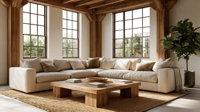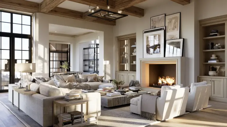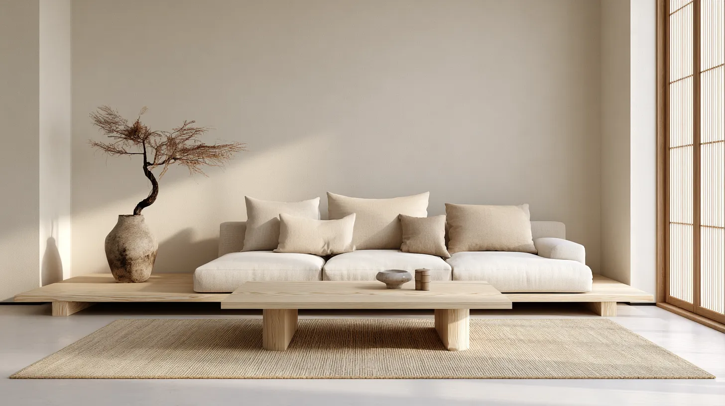
Table of Contents
By ERYLIN — Home Décor & Interior Styling
There is something deeply personal about a living room. It holds your morning light, your quiet evenings, the sound of laughter over warm mugs. It is the room that sets the entire emotional tone of a home.
And yet, it is also the room most often arranged out of habit rather than intention. Sofas pushed against walls. Rugs that float like tiny islands. Furniture that was placed once and never reconsidered.
If your living room feels a little off — a little cold, a little cluttered, a little hard to settle into — the furniture arrangement is likely the quiet culprit. Not the pieces themselves, but how they speak to each other, to the light, to you.
Here at ERYLIN, we believe a beautifully arranged room is less about perfection and more about presence. Let us walk through the most common living room furniture arrangement mistakes — and gently guide you toward a space that finally feels like home.
Mistake 1: Pushing All Furniture Against the Walls
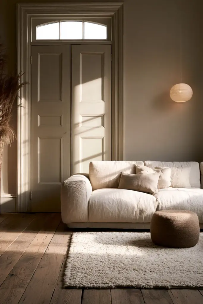
This is perhaps the most universal arrangement habit — and the one that creates the most disconnected spaces. When every piece retreats to the edges, the room loses its sense of intimacy.
The fix: Float your furniture inward. Pull your sofa at least 12–18 inches from the wall and angle seating toward a natural focal point — a fireplace, a window, a beautiful piece of art. The space between the wall and the sofa actually makes the room feel larger, not smaller.
This is especially true in small living rooms, where floating furniture creates breathing room and defines zones without building walls.
Mistake 2: Ignoring Traffic Flow
Your living room should feel effortless to move through — like a slow exhale, not an obstacle course. When furniture blocks natural pathways, the room feels tense before anyone even sits down.
The Clearance Measurements That Actually Matter
Most design guides say “leave adequate space.” We say: here are the numbers.
| Clearance Area | Recommended Space |
|---|---|
| Main walkway / high-traffic path | 28–36 inches |
| Seating area pathways | 18–24 inches |
| Between sofa and coffee table | 14–18 inches |
| Between two facing sofas | 3–4 feet |
| Between individual chairs in a conversation area | 18–30 inches |
| Between TV and nearest seat | 7–9 feet (maximum) |
Think of these numbers as a rhythm. Get them right, and the room breathes. Get them wrong, and even the most beautiful furniture arrangement will feel exhausting.
Mistake 3: Choosing a Rug That Is Too Small
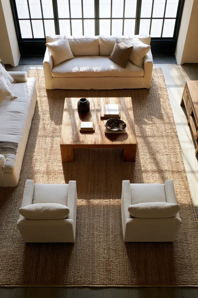
A small rug under a large seating arrangement is one of the most visually jarring mistakes in any living room. It makes furniture look like it is hovering, disconnected from the ground.
The rule of thumb: Your rug should extend at least 6 inches beyond the sofa on both sides. For a standard 3-seater, this typically means an 8×10 ft rug minimum. In a larger room, a 9×12 is almost always the better choice.
Two Rug Placement Styles That Work
- Front legs on — the front two legs of all seating pieces rest on the rug. This is the most common and visually grounding option.
- All legs on — every leg of every piece sits fully on the rug. This works best in larger rooms with a generous rug.
What never works: a rug placed entirely under the coffee table, surrounded by furniture that floats freely above it.
Mistake 4: Building Your Entire Layout Around the Television
The television is a utility — not a focal point. Yet so many living rooms are arranged like a cinema, with every seat angled toward the screen and nothing else considered.
A better approach: Create a dual-zone layout. Position your primary seating around a conversation-first arrangement — facing each other, anchored by a rug and a coffee table. Then orient one or two seats with a natural sightline toward the TV, without making it the gravitational center of the room.
For ergonomic comfort, the TV should sit at eye level when seated, and no viewer should be sitting more than 9 feet away from the screen.
Mistake 5: Forgetting the Focal Point Entirely
Every room needs a visual anchor — something the eye is drawn to upon entering. Without it, the space feels restless and undefined.
Your focal point could be a fireplace, a large window with a layered view, a gallery wall, or even a beautifully styled bookcase. Once you identify it, arrange your seating to face it, rather than ignore it.
If you have a fireplace and a TV on the same wall, choose one. Two competing focal points create visual noise that no amount of beautiful furniture can fix.
Mistake 6: Buying a Matching Furniture Set
There is a certain comfort in buying everything at once — the sofa, the armchairs, the coffee table, all from the same collection. But matching sets often result in rooms that feel more like a showroom floor than a lived-in home.
The ERYLIN approach: Anchor with one quality sofa, then layer in texture and contrast. Pair a linen sofa with a rattan chair and a stone-topped table. Mix warm wood tones with matte black or brushed brass. Let the room feel collected, not coordinated.
Visual weight matters here. A large, low-profile sofa benefits from the height of a tall floor lamp or a sculptural plant beside it — balance the heavy with the airy.
Mistake 7: Getting the Scale and Proportion Wrong
An oversized sectional in a small room. A delicate loveseat lost in a large loft. Scale mismatches are immediately felt, even when they are hard to articulate.
Tips for Getting Scale Right
- Measure first, shop second. Use painter’s tape on your floor to map out the footprint of any furniture before purchasing. It takes ten minutes and saves thousands in returns.
- Coffee table proportions: Your coffee table should be roughly two-thirds the length of your sofa and sit 1–2 inches lower than the seat cushions.
- Sofa height: In a standard-ceiling room, a sofa back that sits between 30–36 inches high feels grounded. Anything taller can visually crowd the space.
- Thrift store trick: Find a piece with the right scale and shape, even if the finish is wrong. A simple paint or reupholster job costs far less than starting over.
Mistake 8: Japandi Living Room Arrangement Errors
Japandi — the quiet meeting of Japanese minimalism and Scandinavian warmth — has become one of the most sought-after aesthetics in modern interior design. But it is also one of the most commonly misunderstood.
Common Japandi Mistakes to Avoid
Low-profile furniture placed too high. Japandi living rooms favor low-to-the-ground seating — platforms, floor cushions, low-slung sofas. If your “Japandi sofa” sits at standard height, it reads as Scandinavian at best, generic at worst.
Over-cluttering with natural materials. Rattan basket and jute rug and bamboo tray and linen throw all in one corner is not Japandi — it is a texture collision. Choose two or three natural materials and let them breathe.
Ignoring asymmetrical balance. Western arrangement tends toward symmetry (matching lamps, even placement). Japandi finds beauty in wabi-sabi asymmetry — one sculptural branch in a ceramic vase beside a single low chair, with space allowed to exist as part of the composition.
Wrong wood tones. Japandi lives in light ash, pale oak, and warm blonde woods. Dark mahogany or cherry pulls the aesthetic away from its calm, natural essence.
Mistake 9: Neglecting Layered Lighting
A single overhead fixture does not a living room make. Flat, top-down light flattens texture, removes shadow, and drains a room of warmth.
The layered lighting formula:
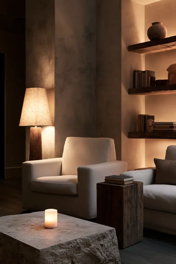
- Ambient light — your ceiling fixture or recessed lights. This is the base layer, not the whole story.
- Task light — a floor lamp beside a reading chair, a table lamp on a console.
- Accent light — candles, LED strips behind shelves, a small lamp tucked into a bookcase.
Use warm-toned bulbs (2700–3000K) throughout. Cool white light makes even the coziest furniture arrangement feel clinical.
Explore ERYLIN’s lighting guide for specific lamp pairings that suit different room sizes and styles.
Mistake 10: Ignoring Plant Placement in the Layout
Plants are not accessories — they are design elements with spatial and visual weight. When placed carelessly, they disrupt the flow of a room instead of elevating it.
A Biophilic Placement Guide
- Odd-number groupings work best. Group plants in clusters of 1, 3, or 5 — never 2 or 4, which read as symmetrical decoration rather than natural abundance.
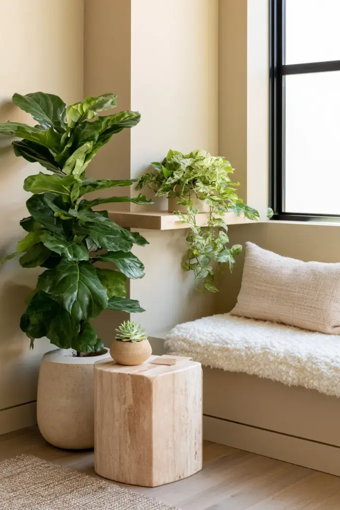
- Vary heights. Pair a tall fiddle-leaf fig with a trailing pothos on a shelf and a low succulent on the coffee table. This creates vertical rhythm throughout the room.
- Keep plants out of high-traffic corners. A large planter in a pathway creates both a visual and physical barrier.
- Use floating shelves for small plants near windows to separate them from the furniture below and allow light to reach both plant and room.
- Never cluster all plants in one corner. Distribute greenery throughout the room to tie zones together and create a sense of living, breathing wholeness.
Mistake 11: Forgetting the Conversation Zone
The living room is, at its heart, a space for connection. But many layouts make conversation feel like an afterthought — seats too far apart, angled away from each other, separated by furniture that acts as a barrier rather than a bridge.
The proxemics sweet spot: Seats in a conversation area should be no more than 7–8 feet apart for comfortable interaction. The coffee table should sit 14–18 inches from the sofa — close enough to set down a cup, far enough to cross your legs.
If your room is long and narrow, resist the temptation to line chairs along opposite walls. Instead, create a slightly angled U-shape or L-shape cluster toward one end, and use the remaining space as a visual buffer or secondary purpose zone.
Quick-Reference: Arrangement Checklist
Before you rearrange, walk through this:
- Sofa floated at least 12–18 inches from the wall
- Rug extends 6+ inches beyond sofa on both sides
- Main pathways are 28–36 inches clear
- Seating areas have 14–18 inches between sofa and coffee table
- Conversation seats no more than 7–8 feet apart
- One clear focal point identified and faced
- Layered lighting in place (ambient + task + accent)
- Plants placed in odd-number groupings, distributed throughout
- No matching furniture set — mix textures and tones
- Scale confirmed with painter’s tape before purchasing
A Final Thought
The best living room is not the most decorated — it is the most considered. Every piece placed with intention. Every measurement made with care. Every material chosen because it adds warmth, texture, or life to the room.
When your space is arranged well, you stop noticing the furniture. You simply feel at ease. You linger longer, breathe more slowly, and settle in the way a good room deserves.
That is what we are always designing toward here at ERYLIN — not rooms that impress, but rooms that hold you.
Frequently Asked Questions
How do I arrange furniture in a small living room?
In a small living room (20–30 sqm), float furniture away from walls to create breathing room, and choose multifunctional pieces — lift-top coffee tables for storage, storage ottomans, modular seating that can reconfigure. Keep the main pathway at least 28 inches wide, and use a rug to define your seating zone rather than relying on walls to do the work. Mirrors and layered lighting also expand the visual space considerably.
What is the rule of thumb for living room furniture arrangement?
The most essential measurements: 28–36 inches for main walkways, 14–18 inches between sofa and coffee table, 18–30 inches between conversation chairs, and 3–4 feet between facing sofas. Your rug should extend at least 6 inches beyond the sofa on both sides, and your TV should be no more than 9 feet from the nearest seat.
Should all living room furniture go against the wall?
No — this is one of the most common and most damaging layout habits. Furniture pushed against all walls creates a disconnected, impersonal space with poor conversation flow. Float your sofa at least 12–18 inches from the wall and anchor the seating arrangement around a rug and focal point instead.
How much space should be between furniture in a living room?
Between your sofa and coffee table: 14–18 inches. Between two facing sofas: 3–4 feet. Between conversation chairs: 18–30 inches. High-traffic walkways need at least 28–36 inches of clearance. These measurements ensure the room feels easy to move through and comfortable to sit in.
How big should a rug be in a living room?
For most standard living rooms, an 8×10 ft rug is the minimum. A 9×12 is often the better choice. The rug should extend at least 6 inches beyond both sides of your sofa — either with front legs resting on the rug, or all legs fully on it. A rug placed only under the coffee table, with surrounding furniture floating off it, will always feel visually off.
Where should the sofa face in a living room?
Your sofa should face the room’s primary focal point — a fireplace, a picture window, a gallery wall, or an architectural feature. If there is no natural focal point, create one before arranging furniture. Avoid orienting your entire seating plan around a television; instead, design for conversation first and allow a natural sightline to the screen from one or two seats.
What is the best furniture arrangement for a long, narrow living room?
For a long and narrow layout, avoid lining furniture along opposite walls — this creates a hallway effect. Instead, anchor one end with your primary seating cluster in a U-shape or L-shape arrangement, use a rug to define that zone, and allow the remaining length to serve a secondary function (a reading nook, a workspace, a styling vignette). Breaking the room into two intentional zones makes it feel wider and more purposeful.