Table of Contents
There’s a particular kind of magic in walking into a room that simply feels right. The light lands softly on the walls. The colors breathe with the furniture instead of fighting it. You exhale before you even sit down.
That feeling isn’t luck. It’s the result of a color decision made with intention — one that considers your room’s light, your sofa’s undertone, and the mood you’re chasing.
Most color guides hand you a list of trendy shades and call it a day. We’re doing something different. This is a decision guide, built around your room’s real conditions, so the accent color you choose actually works once the paint dries.
Think of this as your calm, practical companion for finding a palette that feels less like a trend and more like home.
How to Choose Accent Colors by Room Condition
Before you fall in love with a paint chip, look at your room. Its light, size, and existing furniture will tell you more than any color trend ever could.
Start With Natural Light
North-facing rooms receive cool, indirect light that can make colors look flatter and greyer than the swatch promised. Warm accent colors — terracotta, warm sage, soft ochre — counter that coolness beautifully.
South-facing rooms bask in warm, golden light for most of the day. This is where cooler accents like navy, slate blue, or charcoal come alive without feeling cold.
Dim rooms or those with minimal windows benefit from mid-tone, warm neutrals rather than deep, saturated shades, which can swallow what little light exists. Open-plan spaces need a unifying undertone that flows from the kitchen to the lighting ideas in your living zone, so one wall doesn’t feel disconnected from the next.
Match Accent Color to Room Size
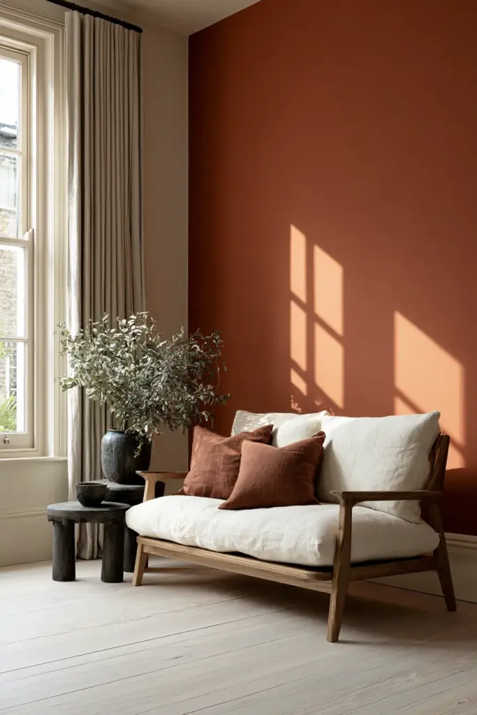
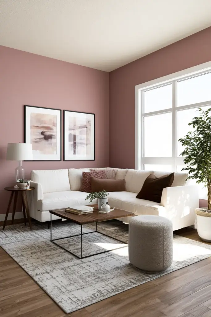
Small living rooms don’t need to live in beige forever. Muted, warm tones like clay, dusty rose, or soft olive can add richness without visually shrinking the space, especially when paired with a lighter ceiling.
Deep, saturated colors on all four walls can compress a small room, but used as a single accent wall, they create depth instead of closing things in. The trick is contrast control: keep trim and ceiling light so the eye still reads the room as open.
Pairing Formulas That Actually Work
A color doesn’t live alone. It performs alongside your trim, your sofa, your wood tones, and your metal finishes. Here’s how to build a palette that holds together.
| Wall Color | Trim Color | Sofa Color | Wood Tone | Metal Finish |
|---|---|---|---|---|
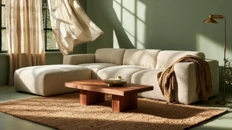
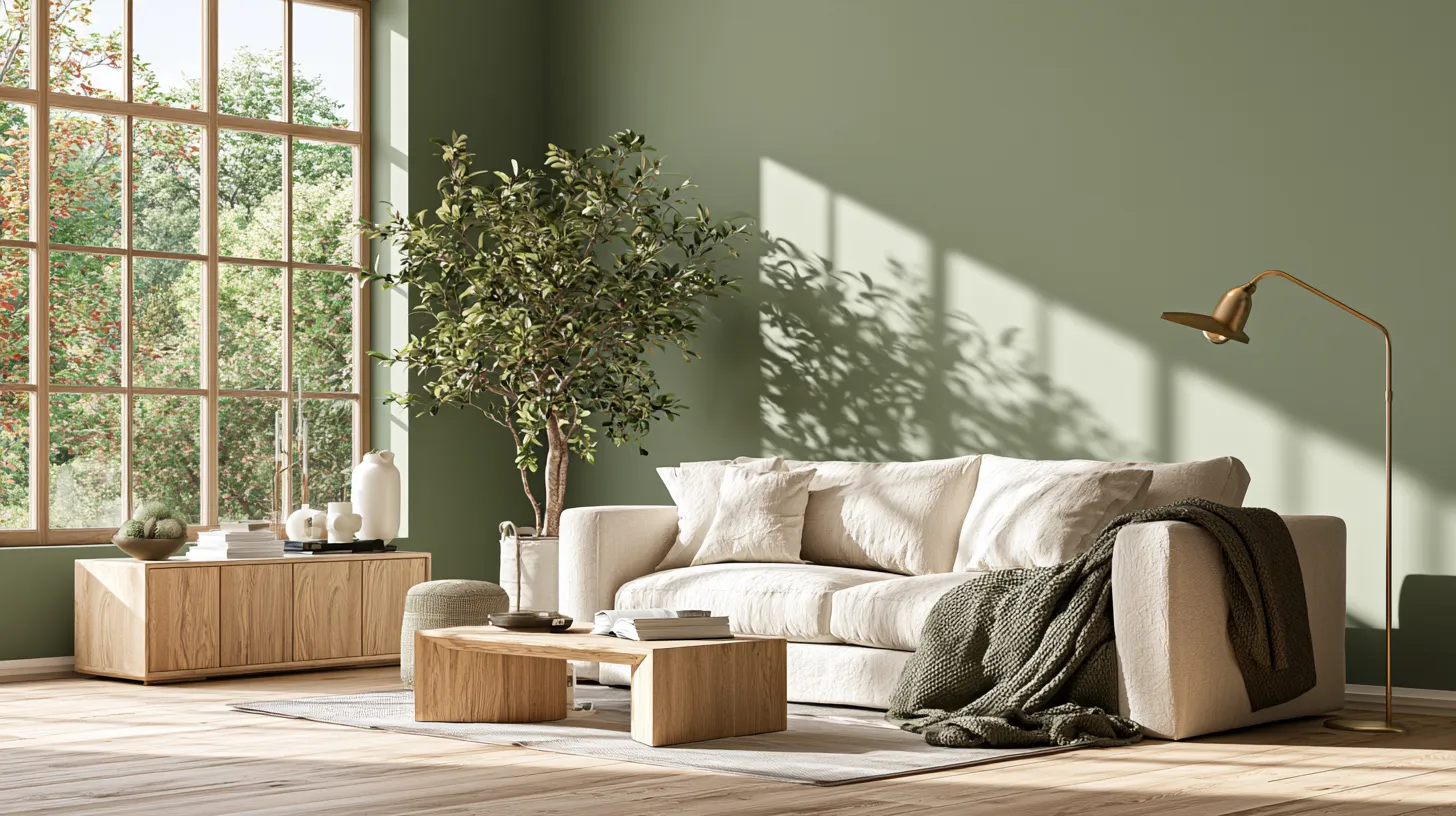
| Warm Sage | Soft White | Oatmeal Boucle | Light Oak | Brushed Brass |
| Terracotta | Warm White | Charcoal Linen | Walnut | Matte Black |
| Slate Blue | Off-White | Cream Wool | Natural Ash | Aged Brass |
| Greige | Cloud White | Camel Leather | Mid-Tone Walnut | Warm Nickel |
| Charcoal | Warm White | Ivory Textile | Light Oak | Brushed Gold |
Use this table as a starting point, not a rulebook. Swap one element and test how the whole grouping feels before committing to a full room.
Undertone Is the Quiet Decision-Maker
Every neutral has an undertone hiding beneath it — pink, yellow, green, or blue. A greige with a green undertone will clash with a warm terracotta accent, even though both are “earthy” on paper.
Hold your paint sample next to your sofa fabric in daylight. If the two feel like they’re arguing rather than agreeing, the undertones are likely mismatched.
Accent Colors by Furniture Undertone
Your furniture already has a personality. The accent color you choose should complement it, not compete with it.
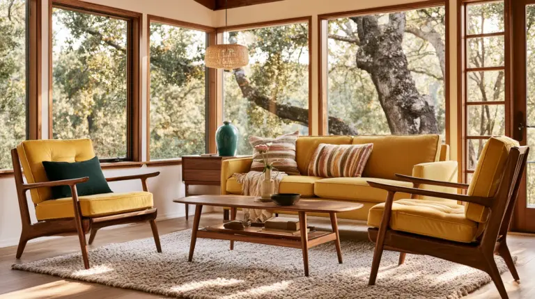
Warm wood furniture (oak, pine, honey-toned finishes) pairs beautifully with sage green, terracotta, and warm cream. These tones echo the wood’s natural warmth instead of clashing with it.
Cool grey sofas lean elegantly into navy, dusty blue, or a soft charcoal accent. Avoid warm oranges here, which can make grey fabric look muddy rather than sophisticated.
Beige sectionals are wonderfully flexible. Sage, terracotta, and even a confident burgundy all sit comfortably alongside beige without overwhelming it.
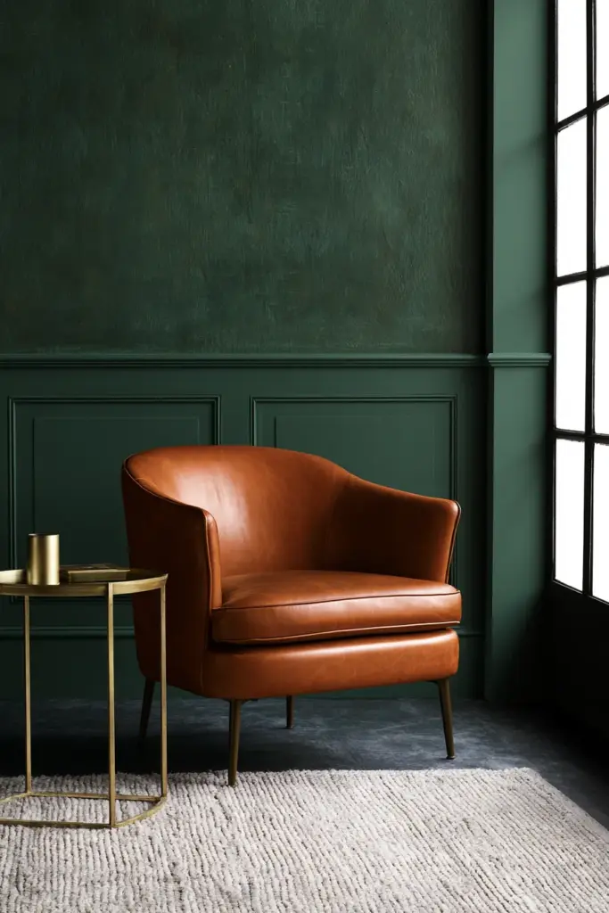
Leather furniture, especially in cognac or chestnut tones, wants deep greens, warm browns, or burnt orange accents that mirror its richness.
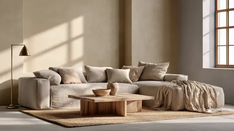
Boucle and velvet textures thrive with softer, muted accents — dusty rose, sage, or warm greige — since the fabric itself already carries visual texture and doesn’t need a loud color to compete with it.
Style-Based Palettes
Different aesthetics call for different accent strategies. Here’s how five popular styles approach color.
Modern Warm Minimalism
Think warm white walls, a single terracotta or clay accent, and natural wood furniture. The palette stays quiet, letting texture — linen, raw wood, stone — do the visual work instead of color.
Japandi
Muted sage, soft charcoal, and warm neutrals define this style. Accent color here is intentionally restrained, often appearing only in a single textile or a low console rather than a full wall.
Eclectic
Bolder, more playful pairings thrive: burgundy with sage, mustard with navy. The key is anchoring these combinations with a neutral base so the room doesn’t tip into visual chaos.
Coastal
Soft blues, sandy neutrals, and a touch of sage evoke breezy, sunlit rooms. Natural textures like rattan and linen soften any color that might otherwise feel too crisp.
Moody and Intimate
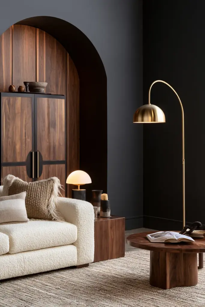
Deep charcoal, forest green, or navy walls, paired with warm brass lighting and soft velvet textures, create an enveloping, cocoon-like living room, perfect for evening gatherings and quiet reading nights.
Paint Finish Guidance
The finish you choose changes how a color behaves in a room just as much as the shade itself does.
- Matte finishes absorb light and deepen color, ideal for moody accent walls in well-lit rooms.
- Eggshell offers a soft sheen with better durability, a reliable choice for full-room application.
- Satin reflects slightly more light, useful in dimmer rooms that need a gentle lift.
- Color-drenching — painting walls, trim, and ceiling in one shade — creates a cocooning effect and works beautifully with moody, saturated colors.
- Accent wall vs. full-room application depends on commitment level: one wall lets you experiment boldly, while a full room creates immersive, enveloping warmth.
Artwork-Led and Plant-Friendly Palettes
Sometimes the best color story is already hanging on your wall. Pull a hue directly from a favorite painting, a patterned rug, or a set of throw pillows, and let that become your accent wall color.
This approach guarantees cohesion, since the wall becomes an extension of pieces you already love rather than a separate decision entirely.
For those drawn to greenery, plant-friendly palettes lean into greens, terracotta, and clay-toned neutrals. These earthy, organic shades support a biophilic feel, making your cozy furniture and potted plants feel like part of one continuous, breathing landscape.
Budget-Friendly Ways to Add Accent Color
Repainting isn’t the only path to a refreshed palette. Small, layered changes can shift a room’s entire mood.
- Add color through throw pillows in your chosen accent shade
- Introduce a statement lamp with a colored shade or base
- Drape a textured throw in a complementary tone over the sofa
- Bring in thrifted decor — vases, trays, frames — in accent hues
- Swap out curtains for a fabric that echoes your palette
Common Accent Color Mistakes
Even a well-chosen color can go wrong in execution. Watch for these common missteps.
Undertone clashes happen when warm and cool tones sit side by side without a bridging neutral. Too many accent colors in one room create visual noise rather than harmony; one or two dominant accents, layered with neutrals, almost always read as more elevated.
Low light can distort color dramatically, making a soft blue look grey or a warm terracotta look muddy. Always test paint swatches at different times of day before committing. Finally, overusing trendy bold shades without considering your room’s light or furniture can date a space quickly — choose colors because they suit your room, not because they’re everywhere online.
Room Use Scenarios
How you use your living room should shape your color choice as much as your style preferences do.
Entertaining spaces benefit from confident, saturated accents like deep green or navy, which feel dramatic under evening lighting. Relaxing, everyday living rooms do better with softer sage, warm neutrals, or muted terracotta for a calmer, everyday feel.
Family living rooms often need durable finishes and forgiving mid-tones that hide daily wear. TV rooms benefit from deeper, matte accent walls that reduce glare and create a cinematic backdrop. Work-from-home hybrid spaces call for calming, focus-friendly tones like sage or soft blue, which support concentration without feeling sterile.
Quick Reference Checklist
- Identify your room’s light direction before choosing a shade
- Match accent color to your furniture’s undertone, not just its color name
- Use one dominant accent color, layered with supporting neutrals
- Test paint swatches at different times of day
- Choose matte for mood, eggshell for durability, satin for light-lifting
- Pull palette inspiration from existing artwork, rugs, or textiles
- Start small with pillows, lamps, and throws before committing to paint
- Keep trim and ceiling lighter in small rooms to preserve openness
A Final, Softer Thought
A living room isn’t just walls and paint. It’s where the day softens into evening, where conversations linger a little longer, where light moves slowly across a room you’ve chosen with care.
The right accent color doesn’t shout for attention. It simply makes the room feel more like you — warmer, calmer, more complete every time you walk in.
Frequently Asked Questions
What are the best living room color schemes?
The most reliable schemes pair one warm neutral base (like greige or warm white) with a single confident accent — sage, terracotta, or navy — layered through walls, textiles, and decor.
What accent colors go with a living room?
It depends on your furniture’s undertone. Warm wood and beige furniture pair well with sage, terracotta, and clay, while cool grey pieces lean into navy, dusty blue, and charcoal.
How do you choose a living room color palette?
Start with your room’s natural light and existing furniture undertones, then pull one accent color from a piece you already love, like a rug or artwork, before testing swatches in daylight.
What colors make a living room look bigger or cozier?
Lighter, warm neutrals with a light ceiling expand a small space, while deeper, saturated accents on a single wall add cozy depth without shrinking the whole room.
What is the best accent wall color for a living room?
For most rooms, a warm sage, soft terracotta, or muted navy works safely across light conditions, though the true best choice depends on your room’s exposure and furniture tones.