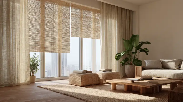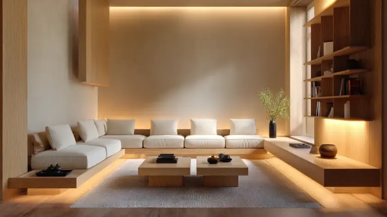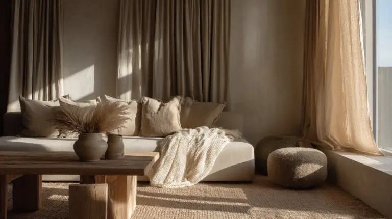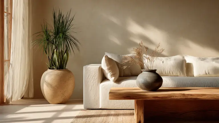
Table of Contents
By ERYLIN | Home Décor & Interior Styling
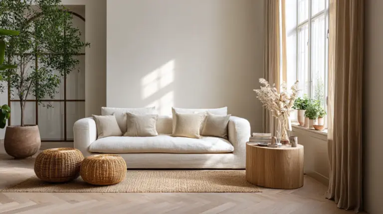
There is a particular kind of quiet that a well-designed living room holds. The light falls soft and golden. The textures — linen, raw wood, a single ceramic vessel — invite you to slow down and breathe. That feeling has a name, and it lives at the intersection of two beautiful design philosophies: Japanese minimalism and Scandinavian warmth. It is called Japandi, and it begins, always, with color.
Choosing a Japandi living room color palette is less about picking a shade off a paint chip and more about listening to your space. What light does it receive? What materials already live there? What feeling do you want to carry home with you at the end of the day?
In this guide, ERYLIN walks you through everything — from the foundational hues of Japandi design to room-specific advice for small spaces, tropical climates, and budget-conscious decorators. We want you to leave not just informed, but inspired, with a palette that feels entirely, quietly, yours.
Whether you are starting from scratch or simply refreshing what you have, this is your space to begin.
What Colors Define a Japandi Living Room?
Japandi color is rooted in restraint. It draws from both wabi-sabi — the Japanese appreciation for imperfect, aged beauty — and hygge, the Scandinavian art of cozy contentment. Together, they produce a palette that feels neither cold nor fussy, but grounded and alive.
The Core Japandi Hues
The signature colors of a Japandi living room are nature’s most honest tones. Think of a morning mist over stone, of dry sand, of aged timber — these are your anchors.
- Warm white — not stark, but creamy and luminous; think bone, chalk, or rice paper
- Beige and greige — the layered neutrals that carry visual warmth without heaviness
- Taupe and warm gray — sophisticated mid-tones that bridge light and shadow
- Clay and terracotta — earthy warmth that grounds without overwhelming
- Muted sage and olive green — nature’s accent; quiet, not vivid
- Soft charcoal and matte black — used sparingly as anchors and contrast
The 60-30-10 Japandi Palette Rule
The most balanced Japandi living rooms follow an intentional proportion when layering color. Here is a simple breakdown to guide your decisions:
| Role | Percentage | Examples |
|---|---|---|
| Base (walls, large surfaces) | 60% | Warm white, soft beige, light taupe |
| Secondary (sofa, rug, large textiles) | 30% | Greige, warm gray, sandy linen |
| Accent (ceramics, frames, plants, cushions) | 10% | Matte black, clay, sage green, rattan |
This ratio keeps the space airy and cohesive without feeling flat. The base breathes. The secondary grounds. The accent whispers, never shouts.
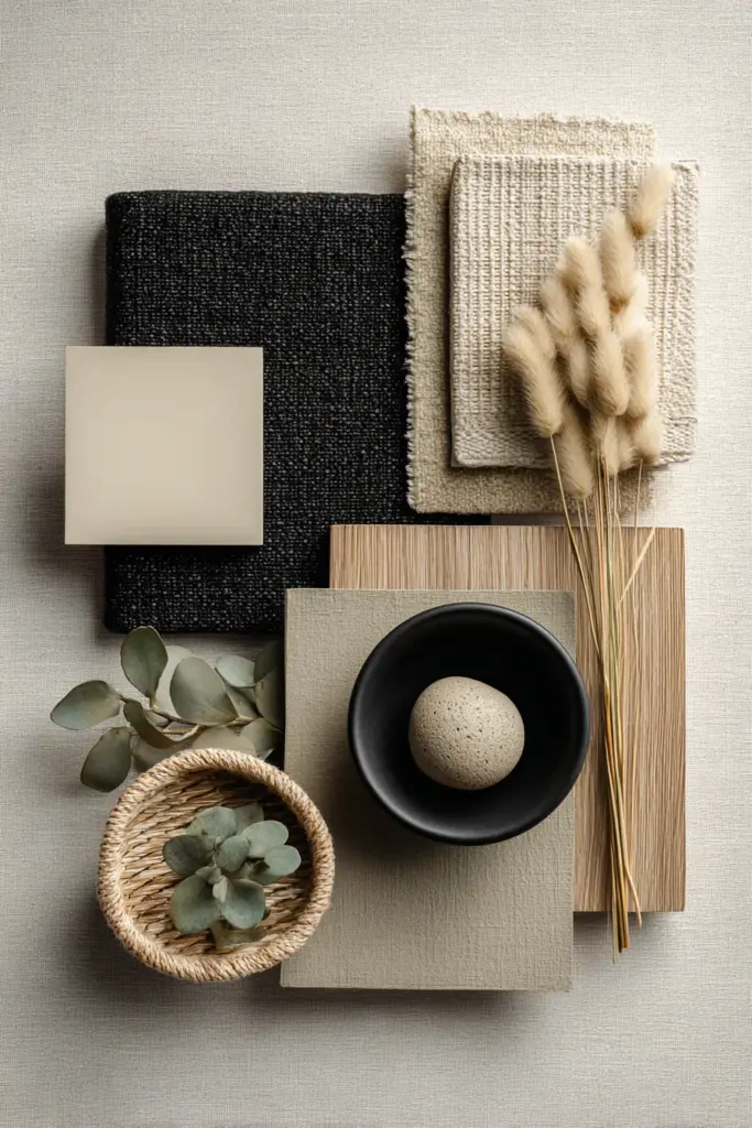
Japandi Palette Calculator: Finding Your Right Starting Point
Not every living room is the same, and not every Japandi palette works the same way in every space. Before you commit to a single shade, ask yourself these questions.
Small or Narrow Living Room?
Reach for a cooler warm-white base — think soft chalk or milky bone — paired with warm accents in rattan, linen, or timber. This combination keeps walls from closing in while still reading as cozy. Avoid warm beiges that are too saturated in very small rooms; they can feel heavy.
North-Facing or Low-Light Room?
Choose a slightly warmer base to compensate for the cool, gray-cast light. A tone like parchment or alabaster works beautifully here. Pair it with reflective textures — glazed ceramics, pale oak floors, linen in oat or ecru — to bounce light back into the room.
Hot Climate or Tropical Setting?
A mid-warm base with muted greens or clay accents works best. Tropical light is intense and warm, so cooler, muted greens (sage, eucalyptus) balance the heat visually. Avoid deep beiges that absorb warmth; opt for pale, dusty tones instead.
High Traffic, Family, or Pets?
Consider greige or warm taupe walls with performance linen-look upholstery in mid-tone neutrals. These shades are forgiving, hide wear, and still carry the Japandi spirit. Layer in washable cotton throws and stain-resistant area rugs in natural tones.
Warm vs. Cool: Understanding Your Japandi Living Room Palette
One of the most misunderstood aspects of Japandi color is temperature. The same beige can read warm and golden in a south-facing room, or cool and flat in a shadowed corner. Understanding light is as essential as understanding color.
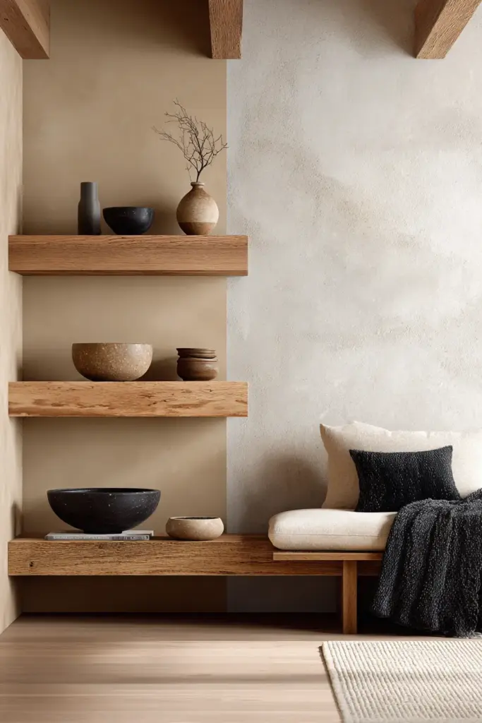
Warm Japandi Palettes
Warm palettes feel like wood, wool, and candlelight. They are anchored by tones like amber-tinged white, warm sand, honey taupe, and accented with raw timber, beeswax candles, and clay vessels. These palettes thrive in rooms with east or west-facing windows, where the light is golden in the morning or evening.
Lighting pairing: Use 2700K warm-white bulbs to deepen the glow and make linen and wood sing.
Cool Japandi Palettes
Cool palettes carry a more Japanese character — spare, precise, meditative. Their base is soft dove gray, cool greige, or pale stone, accented with matte black, charcoal linen, and deep sage. These palettes feel beautifully considered in north-facing rooms with diffuse, even light.
Lighting pairing: 3000K–3500K bulbs offer a balanced, slightly warm light that keeps cool Japandi from reading clinical.
How to Test Your Palette Before Committing
Purchase 3–4 sample paint pots in your shortlisted shades. Paint a generous swatch — at least 30 cm × 30 cm — on two opposite walls, not just one. Live with them for three days, checking each swatch at morning light, midday, and in the evening with your lamps on. The shade that feels most balanced across all three moments is your wall color.
Japandi Living Room Paint Colors: A Room-by-Room Reference
Japandi color is not just about the walls. Every surface, every textile, every piece of furniture contributes to the palette. Here is how to think through each layer.
Walls
Your walls carry 60% of your palette. Choose a shade that feels like a quiet exhale — present but never demanding. Some beautifully Japandi-aligned wall tones include:
- Nippon Paint “White Sand” or similar creamy off-whites
- Clay-toned matte whites in any major local brand — look for undertones of peach or ochre, not pink
- Pale warm gray — the color of overcast morning light on concrete
Always choose matte or eggshell finishes. In humid climates especially, flat matte absorbs light softly and avoids the glare that semi-gloss creates. Eggshell offers a slight sheen that is easier to wipe down — a good balance for family living rooms.
Sofa and Large Upholstery
The sofa is your secondary tone — it occupies the most visual space after the walls. In Japandi design, oat linen, warm sand, mushroom gray, and deep greige are your most versatile choices. They ground the room without competing with the walls.
If budget allows, look for performance linen-weave fabrics that mimic the texture of natural linen but resist staining. In the Philippines, rattan-frame sofas with removable linen cushion covers are a practical and beautifully Japandi choice.
Rugs
A Japandi rug is tactile and understated. Look for natural jute, hand-loomed wool in ecru or warm gray, or flat-weave cotton in pale sand or stone. Avoid busy patterns; if you choose a design, make it a simple geometric or organic stripe in tonal neutrals.
Accent Details
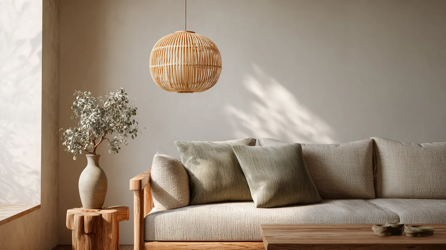
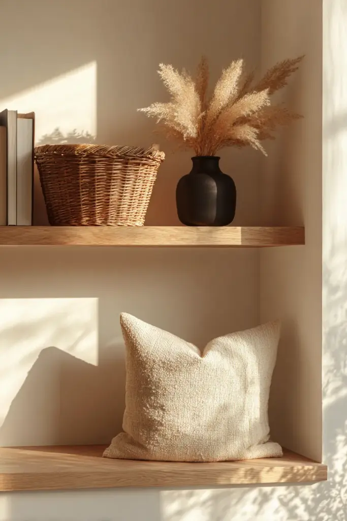
This is where the 10% lives. Matte black frames, clay ceramic vases, a rattan lamp, a single olive branch in a simple vessel — these are the moments that give the room its soul. Each accent should feel like it was found, not chosen. One deeply textured element is worth more than five decorative objects.
Japandi Color Palette for Tropical Living Rooms
For those of us in the Philippines and other tropical climates, Japandi presents a beautiful opportunity: nature already surrounds us with the materials and colors the style calls for. The challenge is managing heat, humidity, and intense light.
A Concrete Tropical Japandi Palette
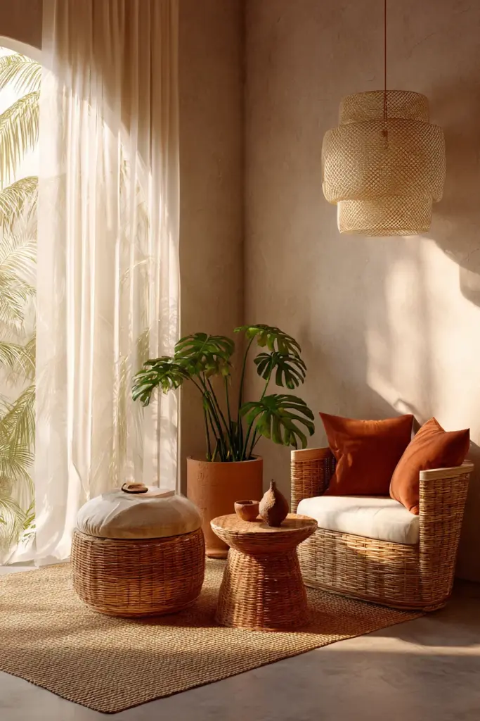
Here is a complete, livable palette suited to a tropical living room:
| Element | Color / Material | Note |
|---|---|---|
| Walls | Warm white (clay undertone, matte finish) | Reflects heat, feels natural |
| Sofa | Sandy linen-look fabric | Light enough, durable |
| Rug | Natural jute or woven cotton in oat | Breathable, easy to clean |
| Accent cushions | Clay terracotta + sage green | Echoes tropical nature |
| Lamp | Rattan or capiz shell pendant | Locally sourced, beautifully Japandi |
| Plant | Single monstera or bamboo in matte clay pot | Adds green without cluttering |
| Accent | Matte black frames, one ceramic vase | Grounding the warmth |
Paint and Material Tips for Humidity
Choose moisture-resistant matte paints designed for tropical conditions — Nippon Paint’s Weatherbond or similar humidity-grade interior lines are well-suited. Avoid silk or gloss finishes on walls, as they highlight imperfections and create harsh reflections under natural tropical light.
For furniture, solid teak, acacia, or bamboo are humidity-friendly and deeply Japandi in spirit. Rattan is ideal for accent chairs and side tables — it breathes, it ages beautifully, and it connects the interior to the natural world outside.
Japandi Color Palette on a Budget
You do not need to renovate to build a Japandi living room. With one paint color, two textile tones, and one accent hue, you can transform a space entirely.
The Budget Japandi Formula
1 paint color — Choose one warm white or pale taupe for your walls. A single consistent wall color is the single highest-impact change you can make.
2 textile tones — Replace or cover your existing sofa and add a rug in two tonal neutrals: one lighter (oat, cream) and one slightly deeper (warm gray, greige). Affordable linen-look covers and second-hand rugs can achieve this beautifully.
1 accent hue — Pick one accent: clay, sage, or matte black. Introduce it through cushion covers, a single vase, or a new lamp shade. Consistency is the secret — one color, three or four small objects, will feel more considered than a mix.
Local and IKEA mix: An IKEA KALLAX in birch paired with locally sourced rattan baskets, capiz lamps, and a hand-thrown clay bowl creates a Japandi vignette that feels entirely cohesive — and costs a fraction of a full redesign.
Are Greens Allowed in Japandi? What About Black?
These are two of the most common questions we hear at ERYLIN, and the answer to both is a warm, considered yes.
Greens in Japandi
Muted, nature-inspired greens are deeply at home in Japandi design. Think sage, olive, eucalyptus, and dusty forest green — the colors of lichen on stone, of bamboo in shade. These work beautifully as accent cushions, plant pots, a single statement chair, or even a softly painted alcove wall.
Avoid vivid or saturated greens. In Japandi, green should feel like something you found in nature on a quiet walk, not something you chose from a trend board.
Black in Japandi
Matte black is one of Japandi’s most powerful tools — but it is a whisper, not a shout. Use it in picture frames, light fixtures, drawer handles, candle holders, and thin shelving. A single matte black element grounds the entire room and gives your neutrals something to lean against.
Black walls are possible in a Japandi context, but only in accent — one wall in a deep charcoal or anthracite, balanced by warm wood floors and pale textiles, can feel quietly dramatic.
How to Choose Your Japandi Palette in 5 Steps
Use this checklist as your practical guide before you commit to a single purchase.
- Step 1: Assess your light. Note the direction your windows face and how light moves through the room across the day. This determines whether you need a warmer or cooler base.
- Step 2: Identify your anchor material. Do you have wood floors, concrete, or tile? Your flooring tone should guide your wall color — they need to feel like they belong to the same family.
- Step 3: Choose your 60% base. Pick one wall color: warm white, soft beige, or pale taupe. Buy a sample and test it for three days before committing.
- Step 4: Select your 30% secondary. Choose your sofa, rug, and large textile in a tone one or two steps deeper or warmer than your wall. They should feel like a natural extension of the base.
- Step 5: Edit your 10% accent. Choose one accent color — clay, sage, or black — and introduce it in three to four small objects. Step back. Edit. Less is almost always more.
Japandi Living Room Color Palettes: Key Takeaways
- The Japandi palette is built on warm whites, beige, taupe, soft gray, muted green, and matte black accents
- Use the 60-30-10 rule to balance your base, secondary, and accent tones
- Warm palettes suit south- and west-facing rooms; cool palettes suit north-facing, diffused light spaces
- In tropical climates, choose clay-undertone matte whites and locally sourced rattan and bamboo
- Test paint samples on two opposite walls for three days before committing
- You can build a complete Japandi palette with one paint color, two textile tones, and one accent hue
- Greens and black are welcome — muted, natural, and used sparingly
- Choose matte or eggshell finishes for walls, especially in humid environments
- The goal is always the same: a room that feels calm, intentional, and entirely at ease with itself
A Closing Thought
A Japandi living room does not ask you to be perfect. It asks you to be present. The palette you choose — that quiet warm white, that linen sofa, that single clay vase catching the afternoon light — is not a design statement. It is an invitation.
An invitation to slow down. To notice. To feel, in your own home, the particular peace that comes when everything around you is chosen with care and nothing is chosen in excess.
At ERYLIN, we believe your home should hold you gently. Let this palette be the beginning of that conversation.
Explore more: Japandi Bedroom Color Palette | Japandi Lighting Ideas | Cozy Furniture for Minimal Spaces
Frequently Asked Questions
What colors are used in Japandi living rooms?
Japandi living rooms are built on warm whites, beige, taupe, soft gray, and muted earthy greens. These are accented with clay, rattan tones, and matte black for grounding contrast. The palette draws from nature and leans toward restraint — rich in texture, never busy.
What is the best Japandi color palette for a small living room?
For small spaces, choose a cool-leaning warm white as your base to keep walls from closing in, then introduce warmth through natural materials like rattan, linen, and timber accents. Limit your palette to two to three tones maximum so the eye can rest.
How do I choose a Japandi color palette?
Start with your light. Assess which direction your windows face and test paint samples on two walls across three days — morning, midday, and evening. Once your wall tone is settled, build outward with a secondary tone for your sofa and rug, and one accent color in small doses.
What paint colors work for a Japandi living room?
Look for off-whites with warm clay undertones, sandy beiges, light earth tones, and pale greige. In humid or tropical climates, choose moisture-resistant matte interior paints. Brands like Nippon Paint offer humidity-grade lines with beautifully Japandi-friendly warm neutrals.
Can I do Japandi without renovation?
Absolutely. A fresh coat of warm white paint, new linen-look cushion covers, a jute rug, and two or three carefully chosen ceramic accents can completely transform a living room in a weekend. The Japandi spirit is not about building from scratch — it is about curating with intention.