Table of Contents
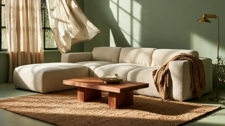
Some living rooms feel like a held breath. Others feel like a hand on your shoulder, gently telling you to sit down and stay a while. The difference often comes down to color — not just which colors, but how closely they relate to one another.
That’s the quiet magic of an analogous color scheme. Instead of throwing contrast at a room, you let three neighboring hues on the color wheel lean into each other, like siblings who happen to share the same eyes.
At ERYLIN, we believe a living room should feel inevitable — as if the walls, the sofa, and the light falling across your rug were always meant to sit together. Analogous palettes make that kind of harmony easy to reach for, even if you’ve never taken a color theory class in your life.
This guide goes further than “what is an analogous color scheme.” We’ll show you how to choose one based on your room’s light, size, and style — plus the undertone mistakes that quietly wreck even a well-intentioned palette.
What Is an Analogous Color Scheme, Really?
An analogous scheme uses three to five colors that sit next to each other on the color wheel — think blue, blue-green, and green. Because they share an underlying hue, they never compete for attention.
This is different from a complementary scheme, which pairs opposites (like blue and orange) for high contrast and energy. Analogous palettes trade drama for ease. They’re the reason a well-designed room can feel restful without feeling flat.
The best analogous rooms follow a simple ratio: one dominant color, one supporting color, and one accent. Skip this structure and even beautiful individual colors start to argue with each other.
The Color Proportion Rule Every Room Needs
Before you pick a single paint chip, borrow this formula from working designers: 70/20/10.
- 70% dominant — walls, large upholstery, flooring undertones
- 20% secondary — an accent chair, drapery, a large rug
- 10% accent — pillows, art, ceramics, a single bold object
This ratio keeps an analogous palette from tipping into visual noise. Without it, three related hues in equal amounts can read as muddy rather than layered.
| Element | Suggested Share | Example |
|---|---|---|
| Dominant | 70% | Warm greige or soft sage walls |
| Secondary | 20% | Olive linen sofa or wood tones |
| Accent | 10% | Terracotta cushions or brass fixtures |
Choosing a Palette Based on Your Room’s Light
This is where most articles stop short — and where your room actually lives or dies. Light changes how every analogous pairing behaves, so match your palette to your exposure, not just your Pinterest board.
North-Facing Rooms (Cool, Steady Light)
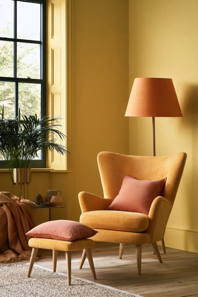
North light stays cool and consistent all day, which can make blue-leaning palettes feel a little chilly by 4 p.m. Counter it with warmer analogous groupings — think butter yellow, warm ochre, and soft terracotta — so the room feels sunlit even when it isn’t.
Layer in a warm lighting plan with amber-toned bulbs to keep evenings cozy rather than clinical.
South-Facing Rooms (Warm, Golden Light)
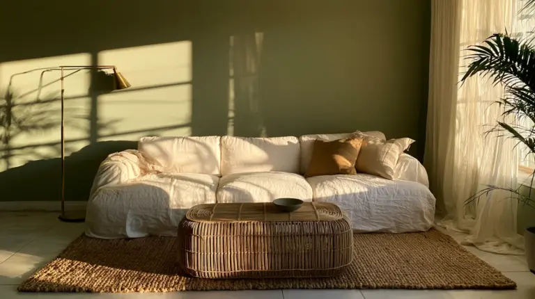
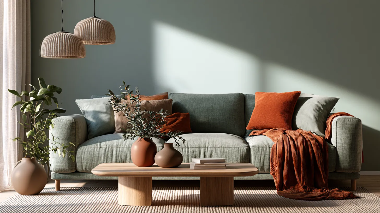
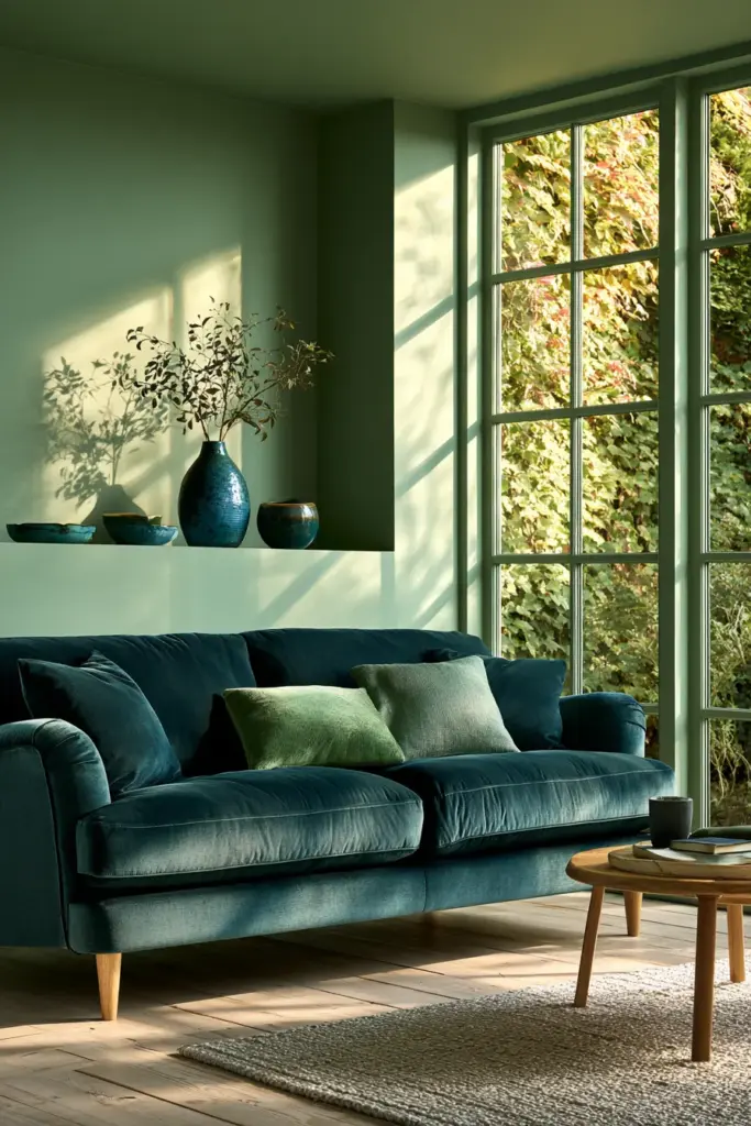
South-facing rooms already run warm, so this is your moment to lean into blue-green, sage, and deep teal. The natural light softens these cooler tones instead of letting them feel cold.
A matte linen sofa in sage, paired with teal ceramics, feels grounded rather than sterile here.
Low-Light or Small Windows
Low light needs contrast in value, not just hue. Choose an analogous palette where one shade is noticeably lighter — like cream, soft gold, and honey oak — so the room doesn’t sink into shadow.
Bright, Sun-Drenched Rooms
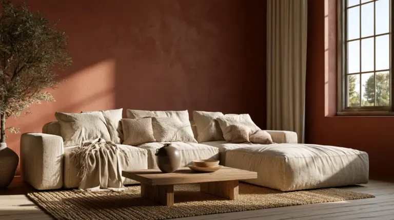
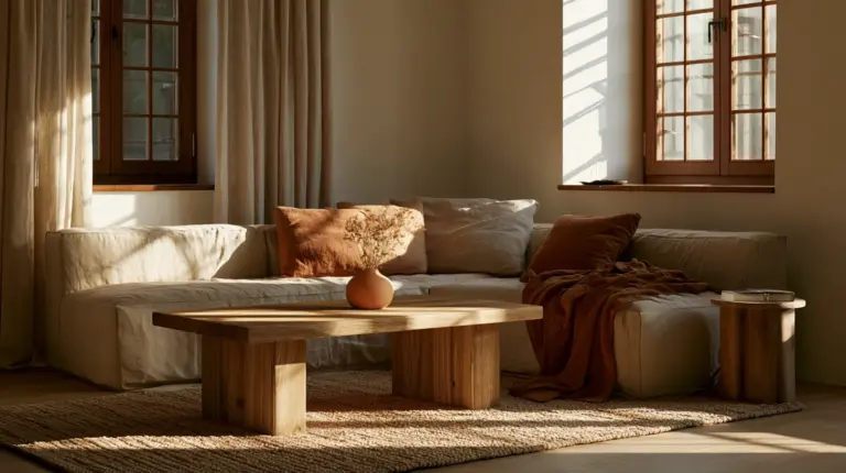
Bright rooms can handle richer saturation without feeling heavy. This is the place for rust, burnt sienna, and deep amber, balanced with a neutral backdrop so the palette still breathes.
Best Analogous Palettes by Living Room Style
A palette should match how you actually live, not just how a room photographs. Here’s how analogous color plays out across the styles ERYLIN clients ask for most.
Modern Living Room
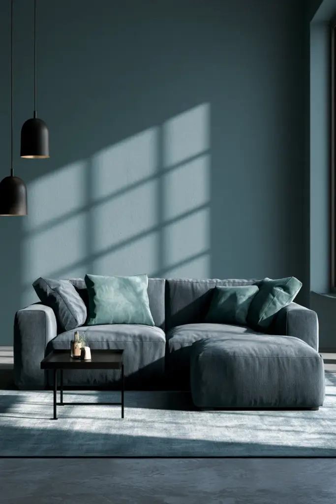
Modern spaces favor clarity, so keep the analogous trio tight: charcoal-blue, slate, and dusty teal. Matte black metal and a low-profile sofa let the color do the talking.
Japandi Living Room
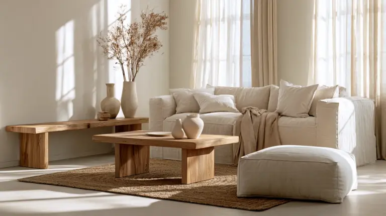
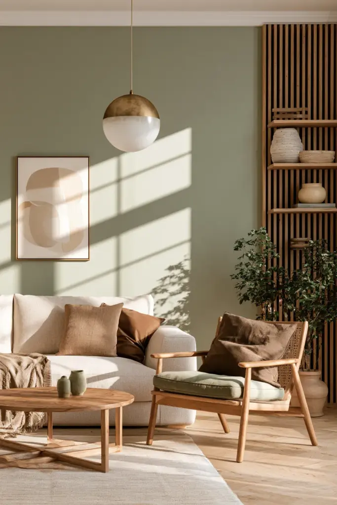
Japandi thrives on restraint. Try oatmeal, soft moss, and warm clay, paired with raw oak and unlacquered brass. Every texture should feel like it was chosen slowly.
Scandinavian Living Room
Scandinavian interiors want light and air, so lean pale: birch white, pale sage, and soft blue-grey. Wool throws and cozy furniture with rounded edges keep it from feeling austere.
Boho Living Room
Boho can carry more saturation. Combine terracotta, rust, and warm mustard, layered through textiles — kilim rugs, macramé, and unglazed pottery.
Mid-Century Living Room
Mid-century loves confident, earthy tones: avocado green, olive, and mustard, offset by warm walnut and brass hardware for a period-accurate glow.
Coastal Living Room
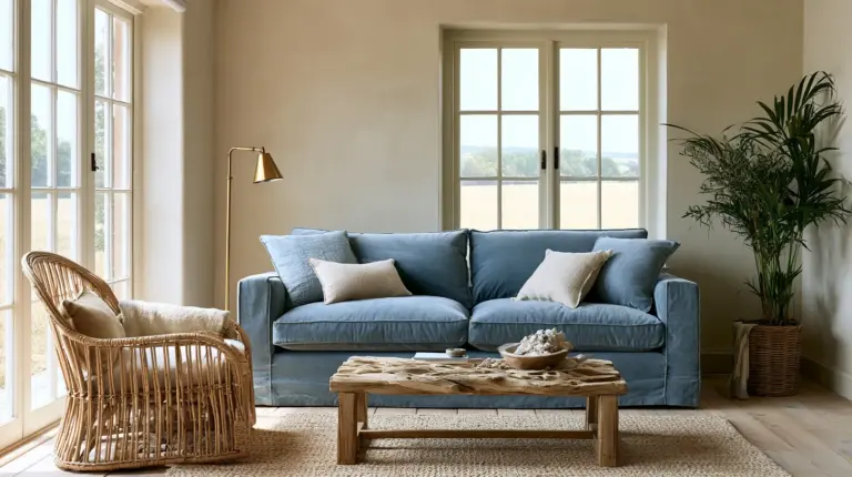
Coastal palettes stay breezy with seafoam, soft aqua, and sandy beige. Natural fiber rugs and linen drapery reinforce the relaxed, sun-bleached feeling.
Small Living Room
Small rooms need airiness above all else. Stick to two closely related light tones — like pale blue and soft sage — with a single deeper accent used sparingly, so the walls feel like they’re expanding rather than closing in.
The Undertone Mistake That Ruins Most Palettes
Here’s the real reason analogous schemes fail in practice: undertones. Two colors can look related on a paint chip and clash entirely once they hit your walls.
A “warm” olive and a “cool” sage might both read as green in a store, but under your living room’s natural light, one may pull yellow while the other pulls grey — and suddenly your palette feels off without an obvious explanation. Always test large swatches in your actual room, at different times of day, before committing.
The fix: choose all three of your analogous colors from the same undertone family — all warm, or all cool — even if they sit at different points on the wheel.
Paint vs. Decor: Two Ways to Commit
You don’t need to repaint to enjoy an analogous scheme, especially if you’re renting or working with a smaller budget.
Full paint version: Apply your dominant color to the walls, secondary to a large upholstered piece, and accent through smaller objects. This creates the most immersive, cohesive result.
Decor-only version: Keep walls neutral and build your analogous story through a rug, throw pillows, art, and ceramics. It’s fully reversible and ideal for lighting ideas and accessory swaps as seasons change.
Materials That Make Analogous Colors Sing
Color alone isn’t enough — texture is what makes a palette feel expensive rather than accidental.
- Boucle and wool soften cooler analogous blues and greens
- Linen and cotton keep warm palettes feeling airy, not heavy
- Raw oak and walnut ground any analogous scheme in warmth
- Brushed brass or matte black metal add quiet contrast without breaking the harmony
- Stone and matte ceramic bring texture to neutral-heavy rooms
Mistakes to Avoid
Even a lovely palette can go wrong in execution. Watch for these common missteps.
- Using too many hues at once, which erases the calm an analogous scheme is meant to create
- Mixing warm and cool undertones within the same “family” of color
- Over-saturating every surface instead of following the 70/20/10 rule
- Ignoring your flooring color when choosing wall and furniture tones
- Skipping a neutral backdrop, which analogous schemes need to stay grounded
Quick Shopping Guide
Use this as a starting checklist when sourcing pieces to support your palette.
- Rug: choose your secondary color at a muted saturation
- Sofa: dominant or secondary color, in a natural fabric like linen or boucle
- Curtains: a soft version of your dominant wall color for continuity
- Art: one piece that pulls all three palette colors together
- Cushions: your accent color, used in small, confident doses
Summary: Key Takeaways
- Analogous schemes use three to five neighboring hues for a calm, cohesive look
- Follow the 70/20/10 rule for dominant, secondary, and accent colors
- Match your palette’s warmth to your room’s natural light exposure
- Choose colors from the same undertone family to avoid clashing
- Small rooms benefit from tighter, lighter analogous pairings
- Texture and material matter as much as the colors themselves
A Soft Place to Land
A living room built on analogous color doesn’t shout for attention. It simply feels right — the way a favorite sweater feels right, or the way afternoon light falls just so across a linen sofa.
That’s the quiet gift of this approach: harmony that doesn’t try too hard, in a room built for exactly the way you live.
FAQs
What is an analogous color scheme?
It’s a palette built from three to five colors that sit next to each other on the color wheel, sharing a hue family for a naturally cohesive look.
What colors are analogous to each other?
Any group of neighboring wheel colors works — blue, blue-green, and green, or yellow, orange, and red-orange are classic examples.
How do you use analogous colors in a living room?
Apply the 70/20/10 rule: one dominant color for walls and large surfaces, a secondary tone for major furniture, and an accent color in small doses.
Are analogous colors good for small living rooms?
Yes, especially when you keep the palette to two closely related light tones with a single deeper accent, which helps the space feel open rather than closed in.
What is the difference between analogous and complementary colors?
Analogous colors sit near each other on the wheel for a calm, blended effect, while complementary colors sit opposite each other for bold, high-contrast energy.