Table of Contents
There’s a quietness that settles over a room when the colors are just right. Not the silence of emptiness, but the hush of harmony, where every shade whispers to the next in perfect understanding. This is the essence of Japandi design, a marriage of Japanese minimalism and Scandinavian warmth that has captured the hearts of those seeking refuge from our overstimulated world.
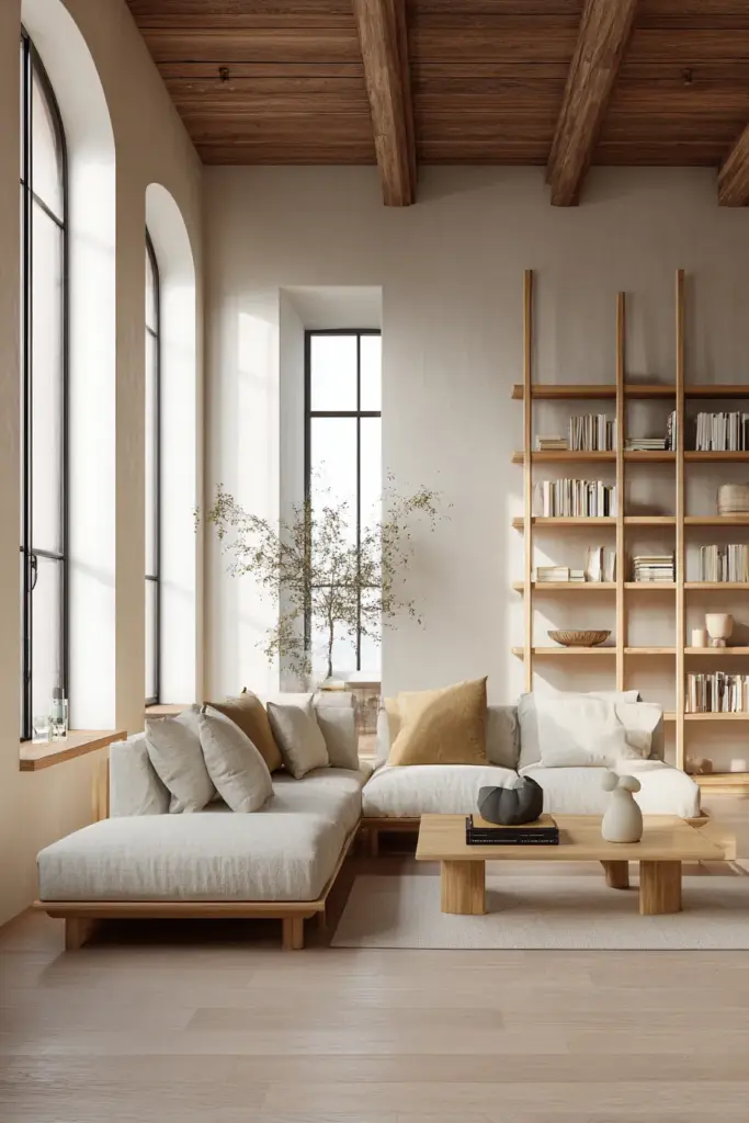
The beauty of Japandi living room colors lies not in boldness, but in restraint. These are hues that breathe, that allow space for thought and conversation, for morning coffee and evening contemplation. They create rooms that feel both grounded and lifted, anchored by earth yet touched by light.
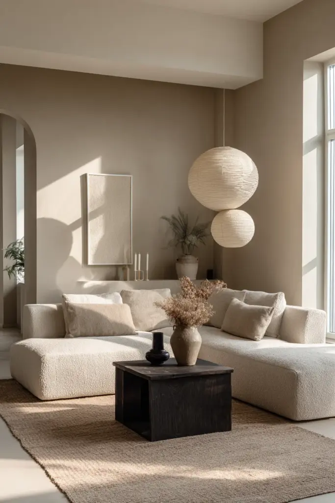
In this comprehensive guide, we’ll journey through the philosophy and practice of Japandi color selection. You’ll discover how to layer neutrals with intention, when to introduce subtle accent shades, and how lighting transforms every choice you make. Whether you’re starting fresh or refining an existing space, understanding the relationship between calm, cozy Japandi colors and their application will transform not just your living room, but how you experience home itself.
We’ll explore the foundational palettes that define this aesthetic, examine how natural materials influence color perception, and share professional techniques for achieving that elusive balance between minimalism and warmth. From the psychology behind these carefully chosen shades to practical application methods, this guide offers everything you need to create a living room that feels like a gentle exhale at the end of a long day.
Understanding the Japandi Color Philosophy
Japandi color theory begins with a simple truth: less is more, but warmth is essential. This philosophy emerged from the intersection of two distinct design traditions, each with its own relationship to color and light. Japanese aesthetics prize simplicity, imperfection, and the beauty of natural aging, while Scandinavian design celebrates functionality, coziness, and the manipulation of light in darker climates.
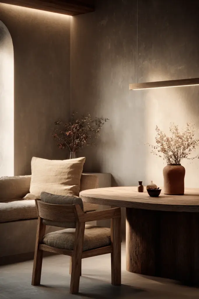
The result is a palette that honors both traditions without compromising either. Neutral Japandi living room colors form the foundation, creating a canvas that feels both spacious and intimate. These aren’t stark whites or cold grays, but living, breathing shades that shift with the day’s light.
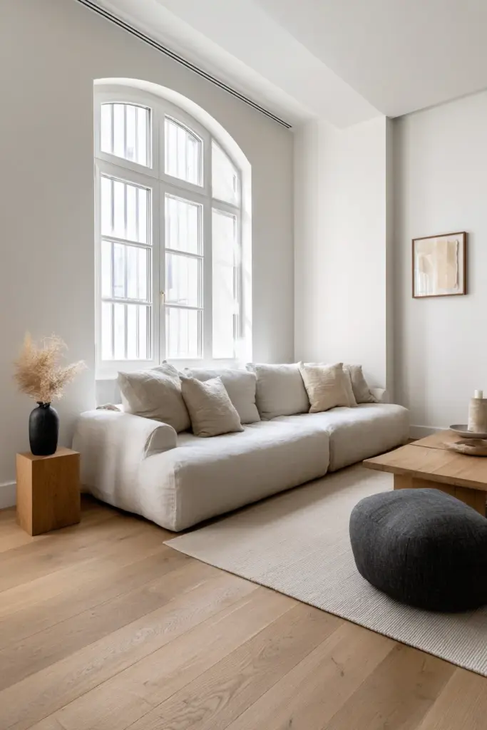
At its core, Japandi embraces what the Japanese call “ma,” the concept of negative space, and what Scandinavians call “hygge,” the feeling of warmth and contentment. Color choices must serve both masters. This means selecting hues that recede gently rather than demand attention, that complement natural materials rather than compete with them, and that create visual rest rather than stimulation.
The Balance Between Warm and Cool
One of the most nuanced aspects of Japandi color selection involves understanding the dance between Japandi warm and cool tones. This isn’t about choosing one temperature over another, but rather orchestrating a conversation between them. Cool grays might anchor a space, while warm beiges soften edges and invite touch.
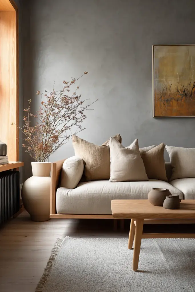
The interplay creates depth without contrast, variation without discord. A room painted entirely in cool tones can feel austere, while one dominated by warm shades might lose the clean clarity that defines Japandi style. The magic happens in the middle ground, where a cool taupe wall meets warm oak flooring, where steel gray linen cushions rest against a cream sofa.
This temperature balance also responds to your room’s orientation and natural light. Spaces that receive abundant sunlight can handle cooler tones without feeling sterile, while rooms with limited natural light benefit from the gentle embrace of warmer neutrals that reflect and amplify whatever light enters.
Nature as the Ultimate Guide
Every successful Japandi palette draws inspiration from the natural world. Think of colors you’d encounter on a quiet walk through a forest at dawn: the soft gray of morning mist, the warm beige of dried grasses, the muted green of moss on stone, the gentle brown of weathered wood. These Japandi nature inspired colors create an instinctive sense of calm because they’re hardwired into our evolutionary memory.
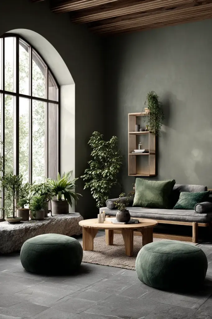
This nature-based approach extends beyond simple earth tones. Consider the pale blue of a winter sky, the subtle pink of cherry blossoms at dusk, the deep charcoal of river stones. Each color tells a story of the natural world, and together they create a living room that feels like an extension of the landscape rather than a shelter from it.
The Essential Japandi Color Palette
Building a Japandi living room begins with understanding the essential palette, a collection of foundational colors that work together with effortless grace. These aren’t trendy shades that will date your space in five years, but timeless hues that have graced beautiful homes for generations.
The base layer consists of whites and off-whites, but not the brilliant, bleached whites of modern minimalism. Instead, Japandi off-white colors carry subtle undertones of cream, gray, or even the faintest whisper of pink. These are the colors of natural linen, unbleached cotton, and aged plaster. They create a sense of cleanliness and space without the clinical feel of pure white.
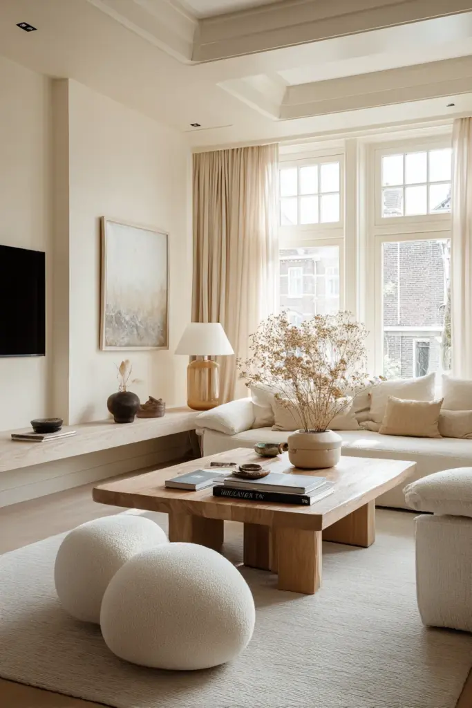
Layered over this foundation comes a range of neutrals: warm taupes, cool grays, soft beiges, and gentle browns. These mid-tones provide depth and definition, creating visual interest through subtle variation rather than dramatic contrast. The key is selecting shades that share an underlying harmony, colors that feel like they belong to the same family even when they’re technically different hues.
Earth Tones That Ground the Space
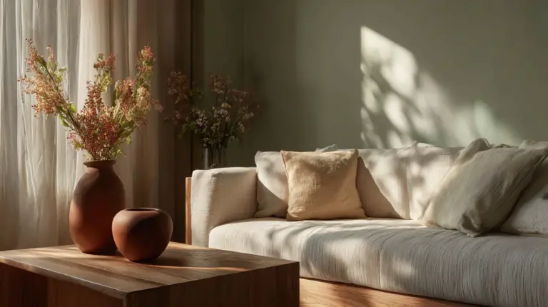
The grounding force in any Japandi palette comes from earth tones in Japandi living rooms. These are the colors that anchor your space to something solid and real, preventing the neutral palette from floating away into blandness. Think of the rich brown of walnut wood, the warm terracotta of clay pottery, the deep taupe of natural stone.
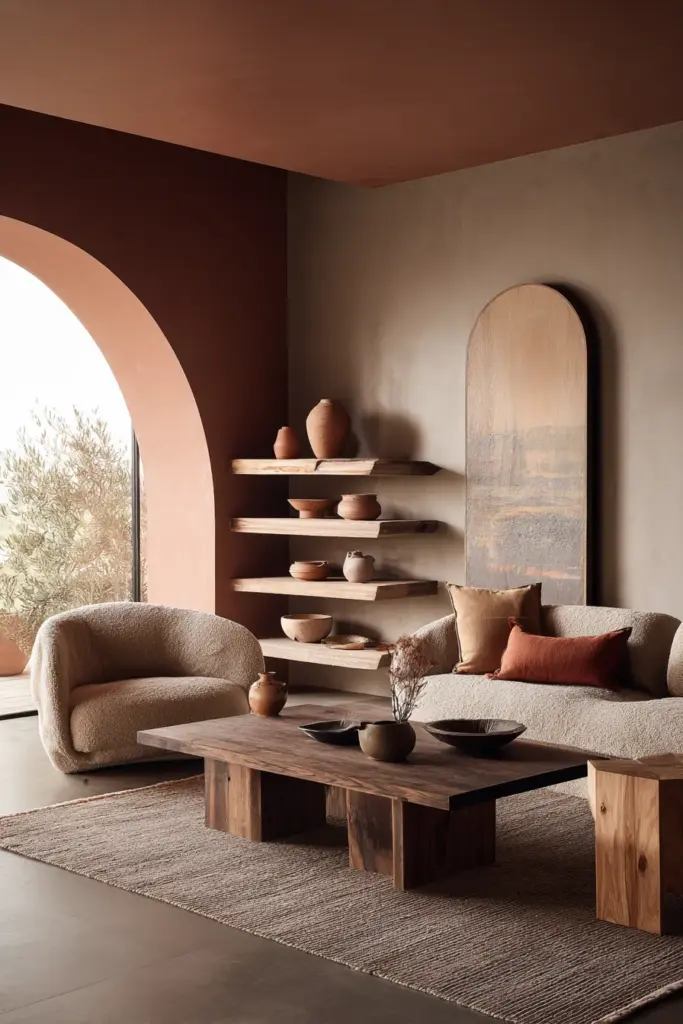
These earth tones typically enter the room through furniture and accessories rather than wall color. A solid wood coffee table, a clay vase, a wool throw in camel or chocolate brown. They provide weight and substance, creating visual anchors that help the eye navigate the space with ease.
The beauty of earth tones in Japandi design is their versatility. They pair effortlessly with cooler grays and warmer creams, bridging temperature divides and creating cohesion. A single piece of furniture in a rich, earthy brown can tie together an entire room’s palette, connecting disparate elements into a unified whole.
Wood Tones as Color Elements
Perhaps the most important color consideration in Japandi design isn’t paint at all, but wood. The careful selection and combination of wood tones in Japandi living room colors can make or break your entire aesthetic. Wood brings warmth, texture, and a living quality that painted surfaces simply cannot match.
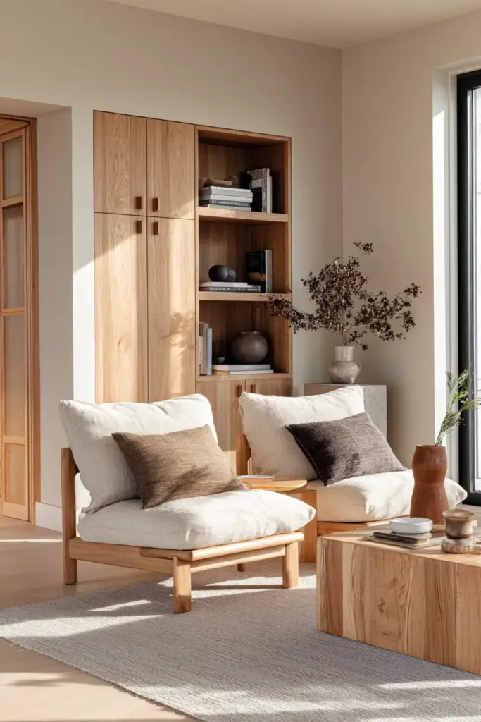
The traditional Japandi approach favors lighter to medium wood tones: white oak, ash, maple, and light walnut. These woods complement the neutral palette without overwhelming it, their natural grain patterns adding visual interest in a way that feels organic rather than decorative. The key is consistency. mixing too many different wood tones can create visual chaos, while committing to a limited range creates harmony.
Consider wood tone as you would any other color in your palette. If your flooring is a cool-toned gray oak, your furniture pieces should echo that temperature. If you’ve chosen warm honey-colored wood for your shelving, your coffee table and side tables should share that warmth. This doesn’t mean everything must match exactly, but rather that the woods should feel like variations on a theme rather than competing statements.
Accent Colors and Subtle Statements
While Japandi design celebrates restraint, it’s not about creating a colorless void. The art lies in knowing when and how to introduce Japandi living room accent colors that enhance rather than overwhelm. These carefully chosen pops of color add personality and warmth while maintaining the overall sense of calm.
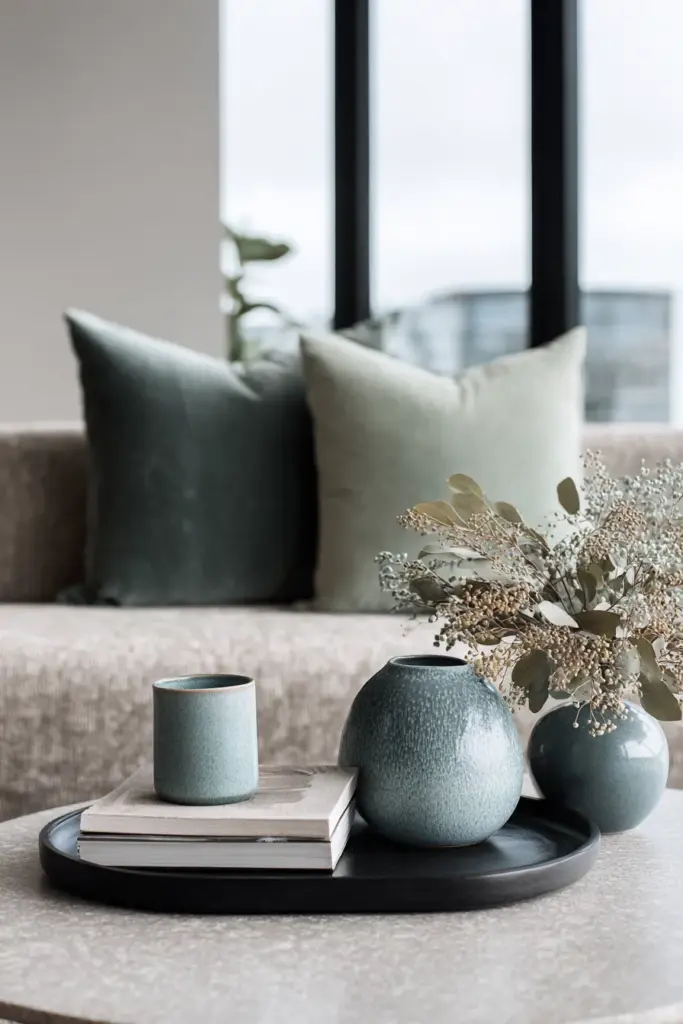
Accent colors in Japandi spaces come from nature’s more saturated moments: the deep green of forest shade, the muted blue of distant mountains, the warm rust of autumn leaves, the soft pink of dawn light. These aren’t bright, demanding shades but rather colors that have been softened and subdued, as if viewed through morning mist.
The introduction of accent colors should feel intentional but not forced. A single throw pillow in sage green, a ceramic bowl in dusty blue, a wall hanging in terracotta, these small touches bring life and interest without disrupting the peaceful foundation. The rule of thumb is to use accent colors sparingly, allowing each instance to feel special rather than scattering them throughout the space indiscriminately.
The Sophisticated Use of Black Accents
One of the most striking elements in Japandi design is the strategic use of Japandi living room black accents. In a palette dominated by soft neutrals, black provides definition and grounding without aggression. It’s the calligraphy stroke on parchment, the iron handle on a wooden door, the thin line that gives everything else context.
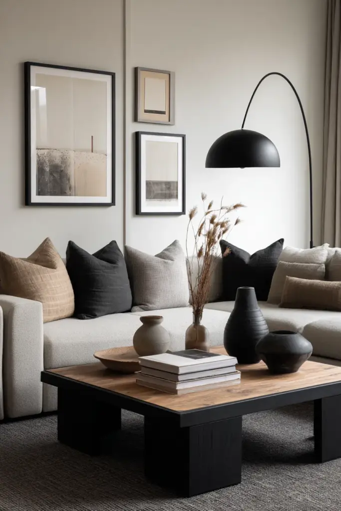
Black accents work best when used with precision. A matte black picture frame, the legs of a coffee table, a minimalist floor lamp, hardware on cabinets or drawers. These touches create visual anchors and add a sense of intentionality to the design. The key is choosing the right finish, matte black reads as sophisticated and soft, while glossy black can feel too harsh for the Japandi aesthetic.
The amount of black matters as much as its placement. Too little and the space lacks definition, too much and you lose the lightness that makes Japandi so appealing. Aim for black to occupy roughly five to ten percent of your visual field, just enough to create contrast and structure without dominating the palette.
Green Hues That Bring Life Indoors
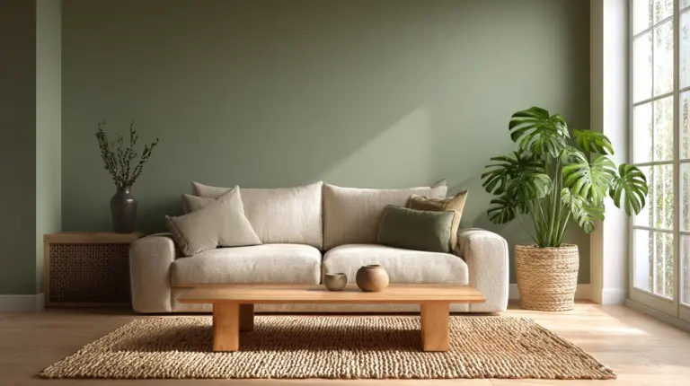
Of all the accent colors in the Japandi palette, green holds a special place. These Japandi living room green hues create an immediate connection to nature, bringing the vitality of plants and growth into your space. But we’re not talking about bright, tropical greens, rather the muted, sophisticated shades of moss, sage, olive, and eucalyptus.
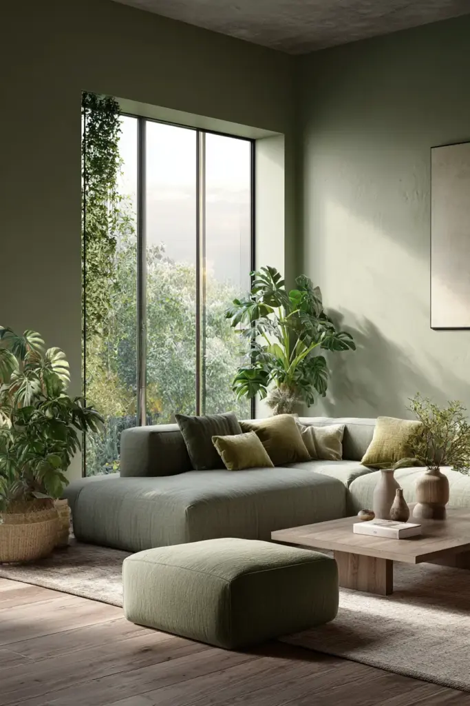
Green in Japandi design often arrives through living plants, which serve double duty as both decor and air purifiers. The deep green of a fiddle leaf fig, the silvery green of eucalyptus, the rich green of a monstera, these natural elements introduce color in the most organic way possible. When you incorporate green through textiles or accessories, choose dusty, desaturated shades that echo these natural tones.
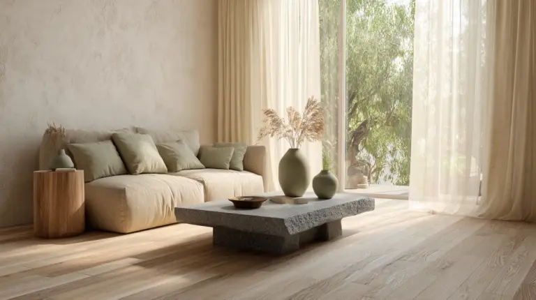
The beauty of green accents is their versatility. They pair beautifully with both warm and cool neutrals, bridging temperature divides and adding freshness without feeling juvenile or overly casual. A sage green throw blanket or a pair of olive cushions can transform a neutral sofa, adding depth and interest while maintaining the room’s peaceful character.
Blue: The Color of Tranquility
Blue makes its appearance in Japandi spaces as a whisper rather than a shout. The Japandi living room blue colors you’ll want to explore are the softest iterations: powder blue, dusty denim, slate, and the palest sky tones. These blues bring a sense of calm and spaciousness, evoking water, sky, and the meditative quality of Japanese aesthetics.
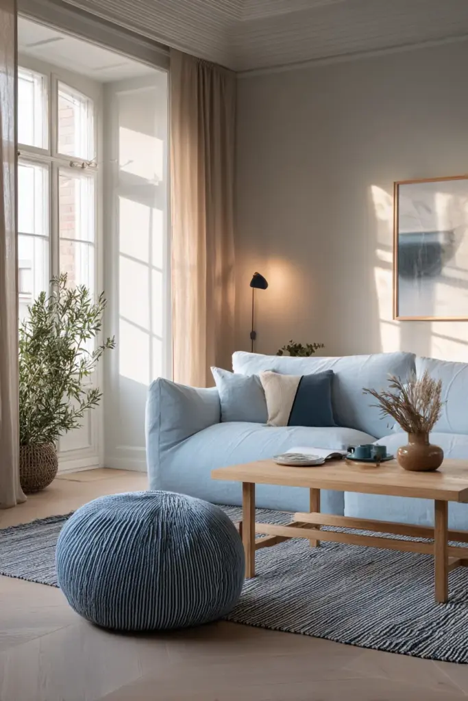
Blue works particularly well in living rooms that receive ample natural light, where its cool temperature feels refreshing rather than cold. It pairs beautifully with warm wood tones, creating a pleasing contrast that feels natural rather than contrived. Consider introducing blue through ceramic pieces, textiles, or artwork rather than large furniture pieces, allowing it to accent rather than dominate.
The psychological impact of blue in Japandi spaces shouldn’t be underestimated. Understanding the Japandi living room color psychology behind your choices helps you create not just a beautiful space, but one that actively supports your wellbeing. Blue reduces stress, promotes calm, and creates a sense of expansiveness, all qualities that enhance the Japandi philosophy of peaceful, mindful living.
Metallic Accents and Reflective Surfaces
The introduction of metal into a Japandi living room requires careful consideration. These Japandi living room metallic accents should enhance the space’s luminosity without adding glitz or glamour. The goal is subtle reflection, not shine.
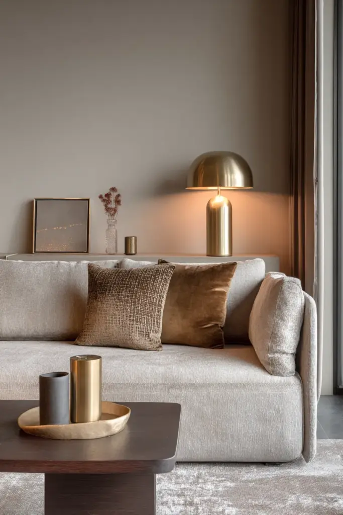
Brushed brass, aged copper, matte gold, and blackened steel are the metals of choice. These finishes have a softness to them, a muted quality that complements rather than competes with the neutral palette. Think of a brass planter, copper pendant light, or steel-framed mirror. Each piece catches light in a gentle way, adding warmth and depth without disrupting the room’s tranquil character.
The placement of metallic elements follows the same principles as other accents: strategic and sparse. A single brass floor lamp can provide all the metallic interest a living room needs, its warm glow catching evening light and adding a touch of elegance. Too many metallic pieces create visual noise, while thoughtfully placed singles become beautiful focal points.
The Role of Reflective Surfaces
Beyond metal, other reflective surfaces play important roles in Japandi color schemes. Glass, polished stone, and lacquered wood catch and bounce light, making colors appear more dynamic and alive. A glass coffee table allows the eye to travel through the space uninterrupted, while a polished concrete floor reflects the room’s neutral tones, amplifying their subtle variations.
These reflective surfaces work particularly well in smaller spaces or rooms with limited natural light. They multiply whatever light is available, making colors appear brighter and more vibrant without actually changing the palette. The effect is subtle but significant, transforming a potentially dark or cramped space into one that feels open and airy.
Adapting Colors to Your Space
Not all living rooms are created equal, and the Japandi palette must adapt to the specific conditions of your space. Room size, natural light, orientation, and existing architectural features all influence how colors appear and function. Understanding these variables helps you make informed decisions that honor both the Japandi aesthetic and your room’s unique character.
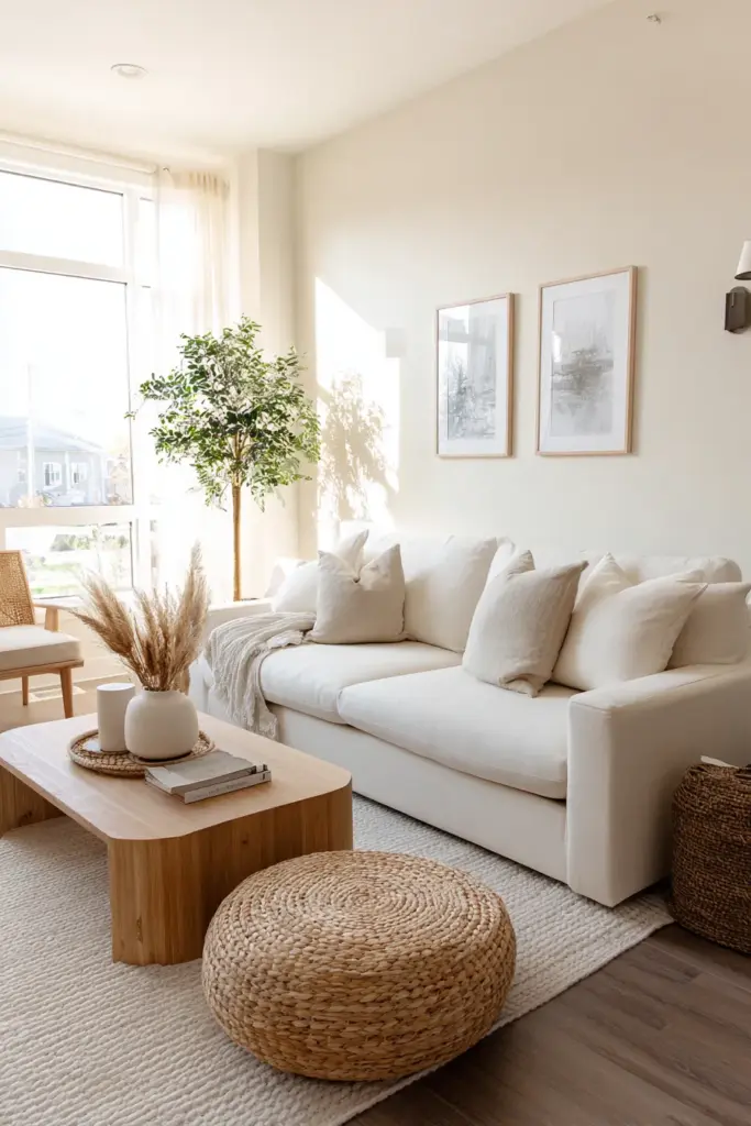
For those working with limited square footage, learning how to apply Japandi colors in small living rooms becomes essential. The general principle is to favor lighter shades that reflect rather than absorb light, creating an illusion of spaciousness. Whites, pale grays, and soft creams work beautifully in compact spaces, their brightness making walls seem to recede.
However, small doesn’t mean you must avoid all depth and contrast. Strategic use of darker tones on a single accent wall or through furniture pieces can actually make a small room feel more intentional and designed rather than simply tiny. The key is balance: predominantly light with carefully placed moments of depth.
Color Choices for Modern Apartments
Urban dwellers face unique challenges when implementing Japandi design, from artificial lighting to limited windows and architectural constraints. Selecting Japandi colors for modern apartments requires extra attention to how colors perform under various lighting conditions and how they interact with existing finishes you cannot change.
Many modern apartments come with cool-toned finishes: gray flooring, white walls, chrome fixtures. Rather than fighting these elements, embrace them as your cool anchors and introduce warmth through furniture, textiles, and accessories. A warm beige sofa, camel leather chairs, or honey-toned wood pieces will create the temperature balance Japandi design requires.
Apartments often mean working with landlord-white walls, but this limitation can be an advantage. These neutral walls become the perfect backdrop for creating a Japandi aesthetic through furniture and decor. Focus your color efforts on changeable elements: rugs, curtains, cushions, throws, and artwork. This approach also makes it easier to take your carefully curated aesthetic with you when you move.
North-Facing Rooms and Light Challenges
Rooms that never receive direct sunlight present specific color challenges. Understanding Japandi colors for north-facing rooms helps you combat the cool, flat light these spaces receive. The tendency is to reach for warm colors to compensate, but this can backfire, making the room feel dingy rather than cozy.
Instead, embrace colors with warm undertones but maintain relatively light values. Greige (a gray-beige hybrid) works beautifully in north-facing rooms, as does warm taupe or mushroom. These colors have enough warmth to counter the cool light without going muddy. Pair them with plenty of warm wood tones and soft, warm-white lighting to create the illusion of natural warmth.
The interplay between natural and artificial light becomes crucial in these spaces. Layer your lighting with warm-toned bulbs (2700-3000K) placed at different heights to create depth and warmth after dark. This lighting strategy allows your color choices to shine regardless of the natural light conditions outside.
Working with Light and Shadow
Perhaps no single element influences color more profoundly than light. The relationship between lighting and Japandi living room colors determines whether your carefully selected palette sings or falls flat. Light transforms colors throughout the day, making a single paint shade appear as multiple different hues depending on the hour and weather.
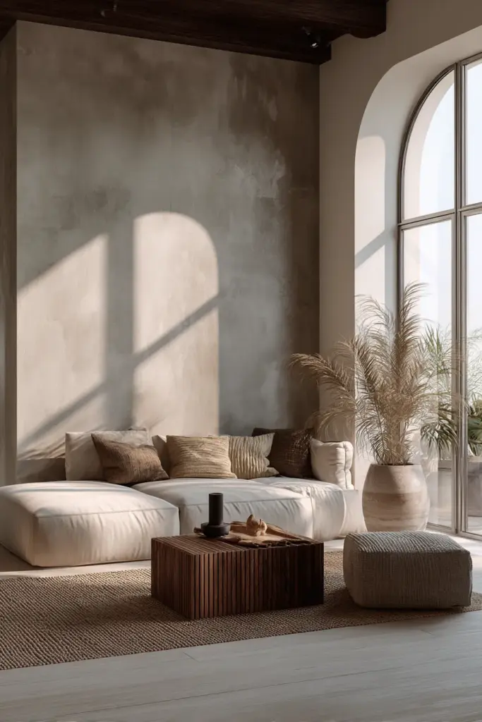
Natural light is the gold standard in Japandi design. Large windows, minimal window treatments, and strategic mirror placement all work to maximize whatever daylight enters your space. This natural light brings out the subtle complexity of neutral colors, revealing undertones and variations that artificial light cannot match. A warm beige wall might appear almost pink in morning light, shift to golden at midday, and take on grayish tones in the evening.
This color-shifting quality isn’t a problem to solve but rather a feature to embrace. It’s part of the living, breathing quality that makes Japandi spaces feel so alive and connected to the natural world. When selecting colors, observe how they appear at different times of day and in different weather conditions. A color that looks perfect on a sunny afternoon might feel all wrong on a cloudy morning.
Artificial Lighting Strategies
Once the sun sets, your artificial lighting takes over the responsibility of bringing your colors to life. The temperature of your light bulbs significantly impacts how colors read. Warm white bulbs (2700-3000K) enhance the warmth in your palette, making beiges more golden and whites more creamy. Cool white bulbs (4000K+) bring out cooler undertones, emphasizing grays and making the space feel more crisp and modern.
For Japandi spaces, warm white lighting generally works best, creating the cozy, welcoming atmosphere that defines hygge while maintaining the clean aesthetic of Japanese minimalism. However, this doesn’t mean every light source should be the same temperature. Layering different light temperatures can create depth and interest, with cooler task lighting balanced by warmer ambient sources.
Consider also the quality of light your fixtures provide. Diffused, soft light through paper or linen shades honors the Japanese aesthetic while creating gentle shadows that add dimension to your neutral palette. Avoid harsh, direct lighting that flattens colors and creates unflattering shadows. Multiple light sources at different heights create a more dynamic, lived-in feeling than a single overhead fixture ever could.
The Interplay of Light and Dark
Japandi design finds beauty in the relationship between light and dark Japandi living room colors. This isn’t about dramatic black-and-white contrast, but rather the subtle gradations between pale and deep tones that create visual interest and depth. Think of it as composing with value rather than hue, creating a tonal landscape that guides the eye through the space.
A primarily light room benefits from strategic dark accents that ground the space and prevent it from feeling too ethereal. Conversely, deeper tones on walls or larger furniture pieces can be lifted and brightened by pale textiles, light wood tones, and abundant white or cream accents. The key is intentionality, each light and dark element should feel purposeful rather than random.
Texture and Color Perception
In a palette limited to neutrals and subtle accents, texture becomes a crucial color tool. The same beige appears entirely different on smooth linen versus chunky wool, on matte paint versus glossy ceramic. Understanding the relationship between Japandi color and texture pairing allows you to create visual richness without introducing additional hues.
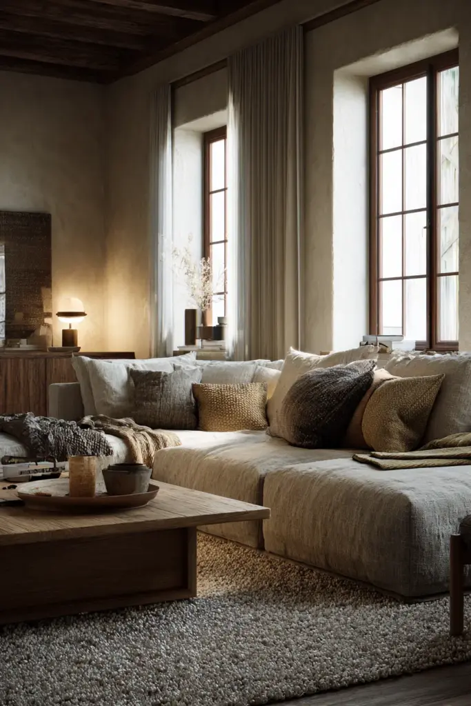
Texture affects how light interacts with color. A matte surface absorbs light, making colors appear deeper and more muted. A glossy or polished surface reflects light, making the same color seem brighter and more vibrant. Rough textures create tiny shadows that add visual depth, while smooth textures present color in its purest form. This interplay becomes especially important in monochromatic or near-monochromatic schemes.
Layer different textures in similar colors to create a rich, tactile environment. A cream sofa in smooth linen, cream wool throw pillows with visible weave, a cream ceramic vase with a matte finish, and a cream wool rug with a high pile. Each piece is essentially the same color, but the varied textures make the space feel dynamic and interesting rather than flat and monotonous.
Natural Textures as Color Enhancers
The integration of natural textures with Japandi colors creates authentic, grounded spaces. Natural materials bring their own inherent color variations: wood grain, stone veining, linen slubs, wool texture. These organic irregularities add visual interest that solid, uniform colors cannot match.
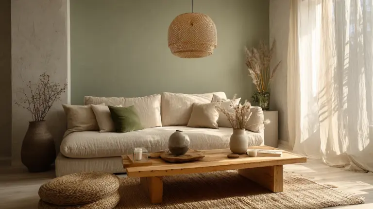
Consider how different natural materials read as color in your space. A jute rug introduces warm, sandy tones along with its distinctive texture. Linen curtains in white still carry subtle variations and the characteristic texture of the fabric. A raw wood coffee table brings not just brown tones but also the pattern of grain and the variation of natural wood coloring. These textural elements work as color without adding to your palette’s complexity.
The beauty of relying on natural textures for color interest is their timeless quality. These materials have been used in homes for centuries and will continue to feel relevant for centuries more. They age beautifully, developing patina and character that adds to rather than detracts from their appeal. A well-worn leather chair or a piece of wood furniture that’s darkened with age tells a story that fresh paint never could.
Color Matching and Coordination
One of the most practical challenges in creating a Japandi living room is ensuring that all your color choices work together harmoniously. The skill of Japandi color furniture matching extends beyond simply buying everything in beige. It requires understanding undertones, value relationships, and how different materials interact visually.
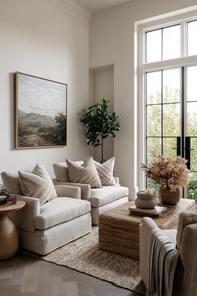
Every neutral color has an undertone, a subtle hint of another color that influences how it appears and what it pairs with successfully. A gray might have blue, green, or purple undertones. A beige might lean pink, yellow, or gray. When your neutrals share compatible undertones, they create harmony. When they clash, even an all-neutral room can feel discordant and uncomfortable.
To identify undertones, place your color samples (paint chips, fabric swatches, wood samples) against pure white. The undertone will become more apparent in contrast. Then, ensure that your selections share a general temperature family. If your walls have cool gray undertones, your furniture and textiles should also lean cool. If you’ve chosen warm, creamy tones for your walls, continue that warmth throughout your selections.
Testing Colors Before Committing
The importance of Japandi color palette testing cannot be overstated. Colors behave differently in different spaces, and what looks perfect in a showroom or on a screen might appear completely wrong in your actual living room. Professional designers test extensively before committing, and you should too.
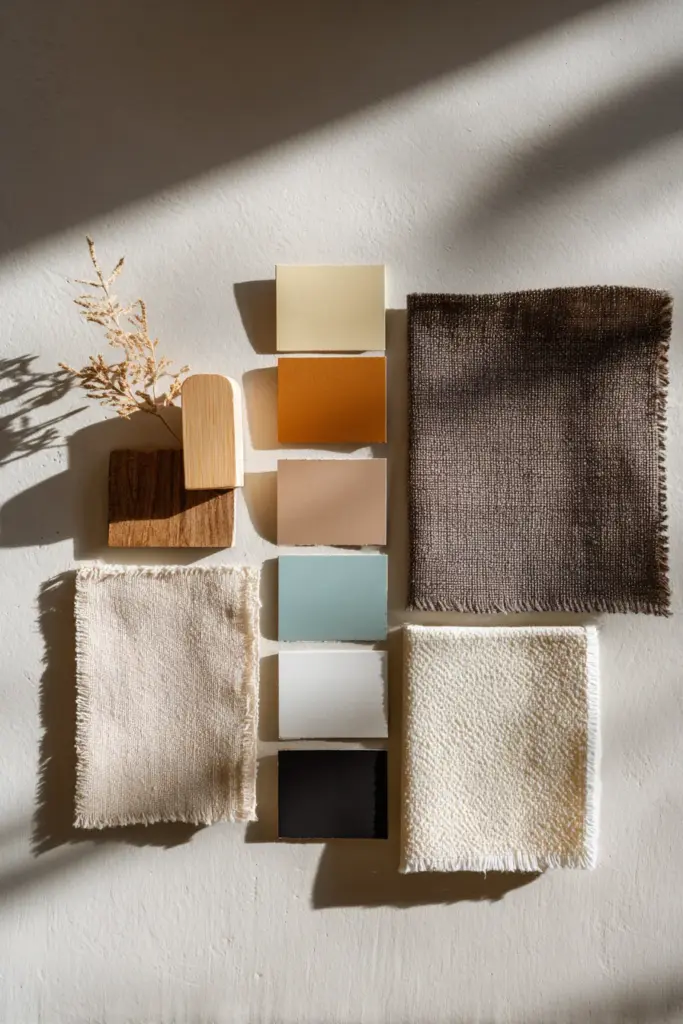
For paint colors, purchase sample pots and paint large swatches (at least 2×2 feet) on different walls in your room. Observe these samples at various times of day and under different lighting conditions. Notice how they appear in morning light versus afternoon, on sunny days versus cloudy, with artificial lighting at night. A color might look perfect at noon but terrible at 8 PM when you actually use your living room.
For furniture and textiles, request swatches or samples whenever possible. Drape fabric samples over your existing sofa, place wood samples next to your flooring, hold paint chips up to your curtains. See how everything interacts in your actual space with your actual light. This extra effort saves you from costly mistakes and ensures that your final result lives up to your vision.
Seasonal Color Adjustments
While Japandi design emphasizes timeless, unchanging quality, there’s room for subtle seasonal shifts that keep your living room feeling fresh and connected to the natural rhythms outside your windows. These seasonal Japandi living room color adjustments are never dramatic, but rather gentle nods to the changing year.
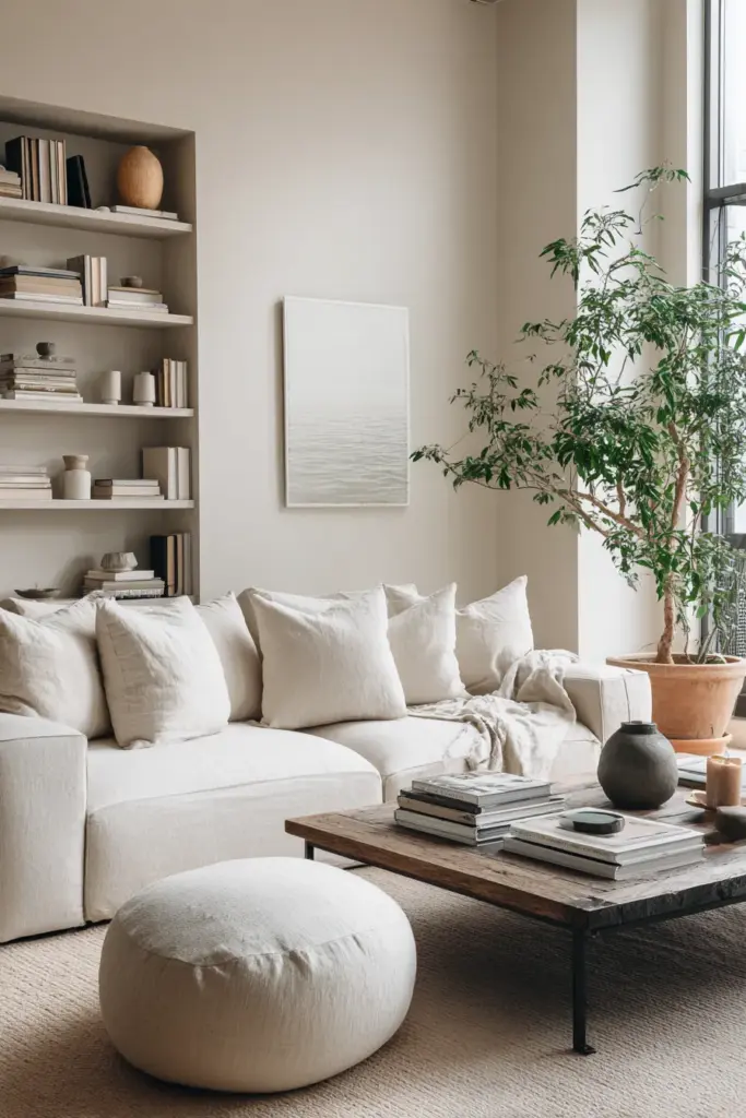
In spring and summer, lighten your space by swapping heavier textiles for lighter ones. Replace wool throws with linen, exchange velvet cushions for cotton. The colors remain within your established palette, but the lighter materials reflect more light and create an airier feeling. You might also introduce fresh greenery or botanical prints that echo the growth happening outdoors.
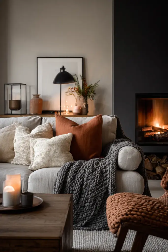
As autumn arrives and winter approaches, layer in additional warmth. Bring out those wool throws, add an extra cushion in a slightly deeper tone, perhaps introduce a warmer-toned throw blanket in camel or rust. These additions don’t change your fundamental color scheme but rather shift the balance slightly toward coziness. The goal is to make your living room feel appropriately responsive to the season while maintaining its core Japandi character.
Holiday Considerations
Even holidays can be celebrated within a Japandi color framework. Rather than introducing traditional holiday colors that clash with your carefully curated palette, look for ways to mark occasions using neutral and natural materials. White or cream ceramics for special table settings, natural greenery instead of colored decorations, wood or paper ornaments rather than plastic and glitter.
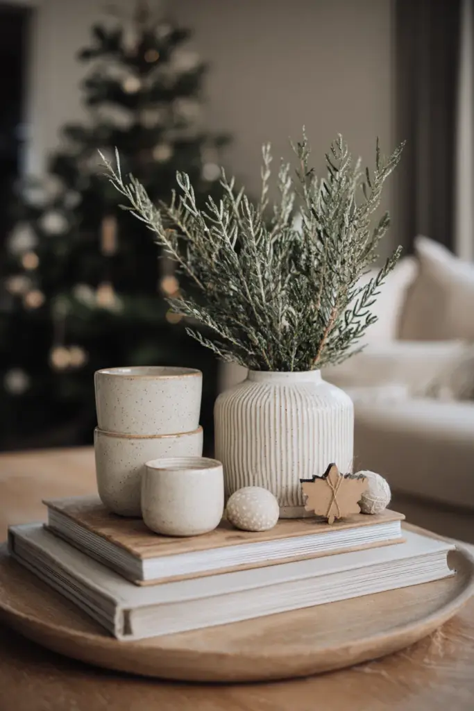
This restrained approach to seasonal and holiday decorating might feel limiting at first, but it often proves more satisfying. Your space remains cohesive and calm even during festive periods, and you avoid the jarring transition back to everyday decor once celebrations end. The Japandi approach teaches us that celebration doesn’t require chaos, that joy can be expressed through simplicity and thoughtfulness.
Monochromatic Mastery
For those drawn to ultimate simplicity, exploring a monochromatic Japandi living room offers a sophisticated challenge. This approach takes a single color family and explores its full range of values and textures, creating a space that’s unified yet far from boring.
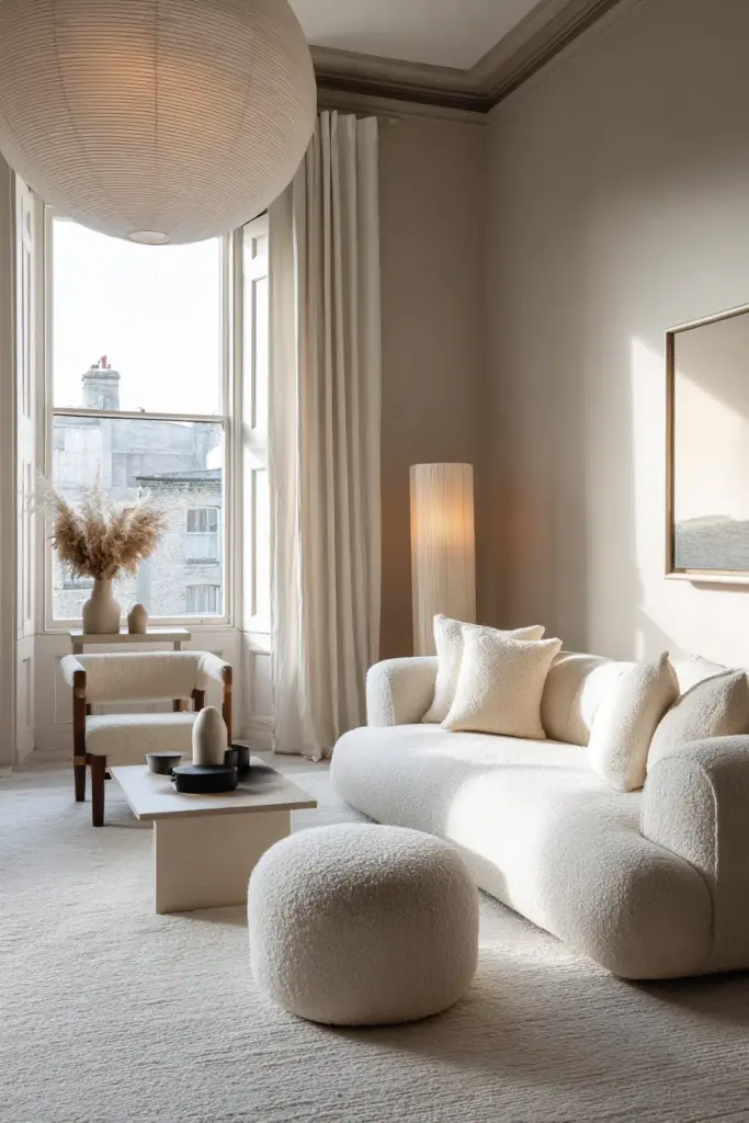
A monochromatic scheme might work entirely within shades of gray, from the palest dove to deep charcoal. Or perhaps within the beige family, from cream to taupe to chocolate. The success of this approach depends entirely on introducing sufficient variety in value (lightness and darkness) and texture. Without these variations, monochromatic becomes monotonous.
Start with your lightest value on walls, creating a bright, expansive backdrop. Move to mid-tones for larger furniture pieces, providing visual weight without heaviness. Introduce your darkest values as accents: picture frames, lamp bases, throw pillows. This progression from light to dark creates natural depth and guides the eye through the space with intention.
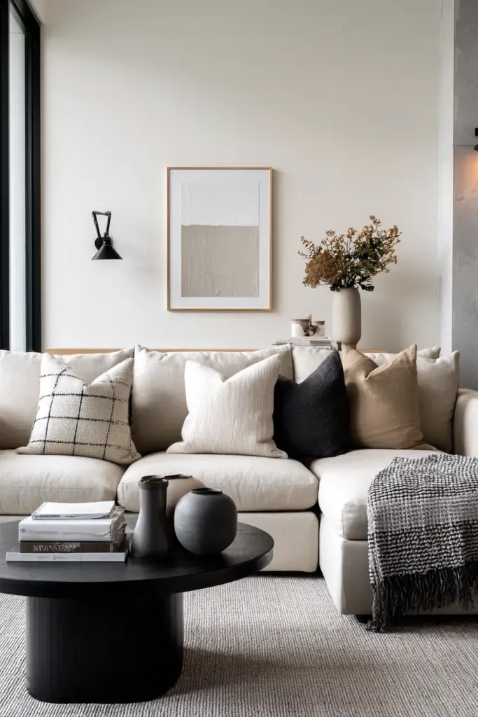
Texture in Monochromatic Spaces
In monochromatic Japandi rooms, texture does the work that color variety would typically handle. A room where everything is variations of gray needs the visual interest of different materials: smooth leather, nubby linen, soft wool, rough jute, polished concrete, matte ceramics. Each texture catches light differently, creating shadow and highlight that prevent the space from reading as flat.
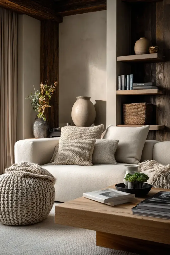
Layer these textures with the same thoughtfulness you’d apply to layering colors. Place smooth against rough, matte against glossy, soft against hard. A smooth leather sofa gains interest from a chunky knit throw. A polished concrete floor becomes more inviting with a soft wool rug. These textural contrasts create the visual richness that makes monochromatic spaces successful.
Common Color Mistakes and How to Avoid Them
Even with the best intentions, certain pitfalls await those attempting Japandi design. Being aware of Japandi living room color mistakes helps you navigate around them, saving time, money, and frustration.
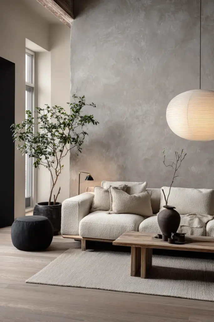
The most common mistake is choosing colors that are too cool or too stark. In an effort to achieve minimalism, people sometimes create spaces that feel cold and unwelcoming. Remember that Japandi combines Japanese minimalism with Scandinavian warmth. If your room feels like a dentist’s office rather than a cozy retreat, you’ve gone too far in the cool direction. The solution is introducing warmer elements: wood tones, warm-toned textiles, and adjusting your lighting to warmer temperatures.
Another frequent error is neglecting undertones, assuming that all beiges or all grays will work together. As discussed earlier, undertones matter enormously. When your neutrals fight each other, the whole room feels uncomfortable even if you can’t immediately identify why. Take time to understand the undertones in your selections and ensure they’re compatible.
Over-Matching and Under-Layering
Some people approach Japandi design by buying a matching furniture set, all in the same wood tone and finish. While this ensures nothing clashes, it also creates a flat, showroom-like quality that lacks personality. Japandi spaces should feel collected and curated, not purchased all at once from a single store.
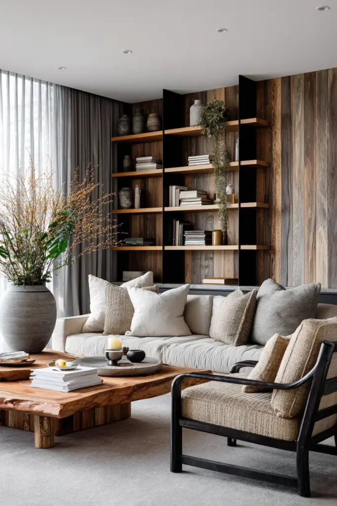
Mix your wood tones slightly (within the same temperature family), vary your neutral shades, combine different textures and materials. A living room with oak flooring, walnut furniture, and ash shelving tells a richer story than one where every piece of wood matches exactly. The key is variation within harmony, not perfect uniformity.
Conversely, some enthusiasts under-layer their spaces, keeping things so minimal that the room feels sparse and unwelcoming. Japandi isn’t about empty rooms, it’s about intentional ones. Every element should serve a purpose and bring beauty, but there should be enough elements to create comfort and livability. Don’t be afraid to add that extra throw pillow or another plant if the space needs it.
Application Methods: Paint and Wallpaper
The physical application of your chosen colors requires its own set of considerations. Whether you’re deciding between Japandi living room paint or wallpaper, understanding the practical implications helps you achieve professional-looking results.
Paint offers flexibility and ease of change, making it ideal for renters or those who like to update their spaces regularly. For Japandi aesthetics, choose paint finishes carefully. Matte or eggshell finishes work best on walls, their low sheen creating a soft, velvety appearance that doesn’t distract. Avoid high-gloss finishes except on trim or in very specific accent applications, as they feel too contemporary and slick for the Japandi aesthetic.
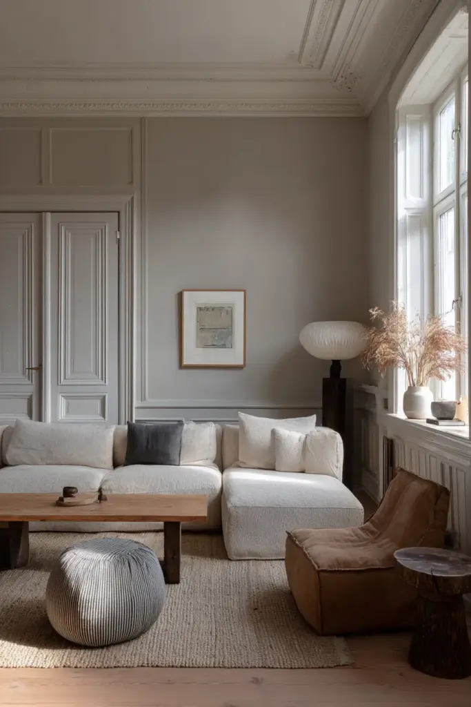
When painting, pay attention to proper surface preparation. Neutral colors, especially lighter ones, show every imperfection. Fill holes, sand smooth, and prime properly. These extra steps might feel tedious, but they’re what separate professional-looking results from amateur ones. In Japandi design, where simplicity reigns, quality of execution matters more than in busier, more forgiving styles.
Wallpaper Considerations
Wallpaper in Japandi spaces should be subtle and textural rather than patterned or bold. Think grasscloth, linen-textured papers, or very subtle tone-on-tone designs. These wallpapers add depth and interest while maintaining the overall simplicity of the aesthetic. They’re particularly effective on a single accent wall or in a dining area adjacent to your living room.
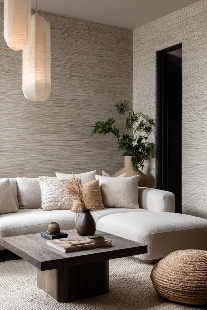
The texture of grasscloth or natural fiber wallpapers introduces organic irregularity that enhances the handcrafted, natural feeling of Japandi design. Each panel is slightly different, with natural variations in color and texture that add authenticity. This imperfection is valued in Japanese aesthetics, representing the concept of wabi-sabi, finding beauty in impermanence and imperfection.
Installation of textured wallpapers requires patience and precision. Seams must be perfectly aligned, and the adhesive must be appropriate for the paper type. If you’re not confident in your skills, this is one area where professional installation pays dividends. A poorly hung wallpaper, no matter how beautiful, will always detract from your space rather than enhance it.
Meditation and Mindful Color Selection
The process of choosing colors for your Japandi living room can itself be a meditative practice. Exploring Japandi meditation colors connects your design decisions to deeper intentions about how you want to feel in your space. This isn’t superficial decoration, it’s the creation of an environment that supports your wellbeing and peace of mind.
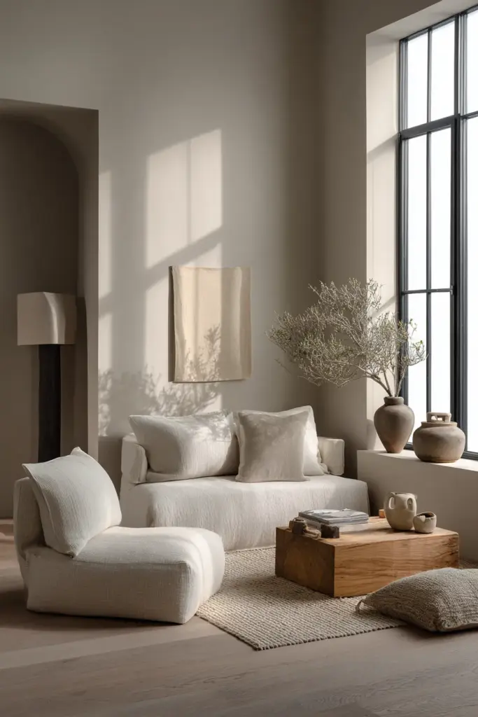
Before making final color decisions, spend time in meditation or quiet reflection about your living room’s purpose. How do you want to feel when you enter this space? What activities will take place here? Who will share this room with you? Your color choices should serve these intentions. If your living room is primarily a space for rest and restoration, lean toward softer, cooler tones. If it’s a gathering place for family and friends, introduce more warmth and subtle energy through your color selections.
Consider also the emotional weight that different colors carry for you personally. While color psychology offers general guidelines, your individual associations matter more. If a particular shade of blue reminds you of a beloved grandmother’s kitchen, it might bring joy even if it’s not technically the “right” Japandi choice. The best designs balance aesthetic principles with personal meaning, creating spaces that honor both tradition and individuality.
Wabi-Sabi and Color Imperfection
The Japanese concept of wabi-sabi celebrates imperfection, impermanence, and incompleteness. Understanding wabi-sabi in Japandi living room colors frees you from the pursuit of perfection that can paralyze decision-making and prevent you from enjoying your space.
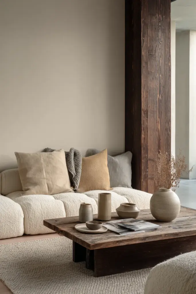
This philosophy suggests that the slight color variation in handmade ceramics is more beautiful than machine-perfect uniformity. That the fading of a favorite textile over time tells a story worth celebrating. That the way paint ages and develops patina adds character rather than requiring immediate refresh. Embracing wabi-sabi means accepting and even celebrating the natural evolution of your color scheme over time.
Apply this mindset to your color selection process. Your room doesn’t need to be Instagram-perfect. If your furniture and walls don’t match exactly, that’s fine. If your carefully curated neutral palette includes one piece that’s slightly off, embrace it as a mark of authenticity. The pursuit of perfection in Japandi design is actually anti-Japandi. The goal is harmony and peace, not flawlessness.
Sustainable Color Choices
Increasingly, thoughtful design includes consideration of environmental impact. Selecting sustainable Japandi living room colors aligns with both the natural philosophy of the aesthetic and responsible living practices. This means thinking about not just what colors you choose, but how they’re delivered and their long-term impact.
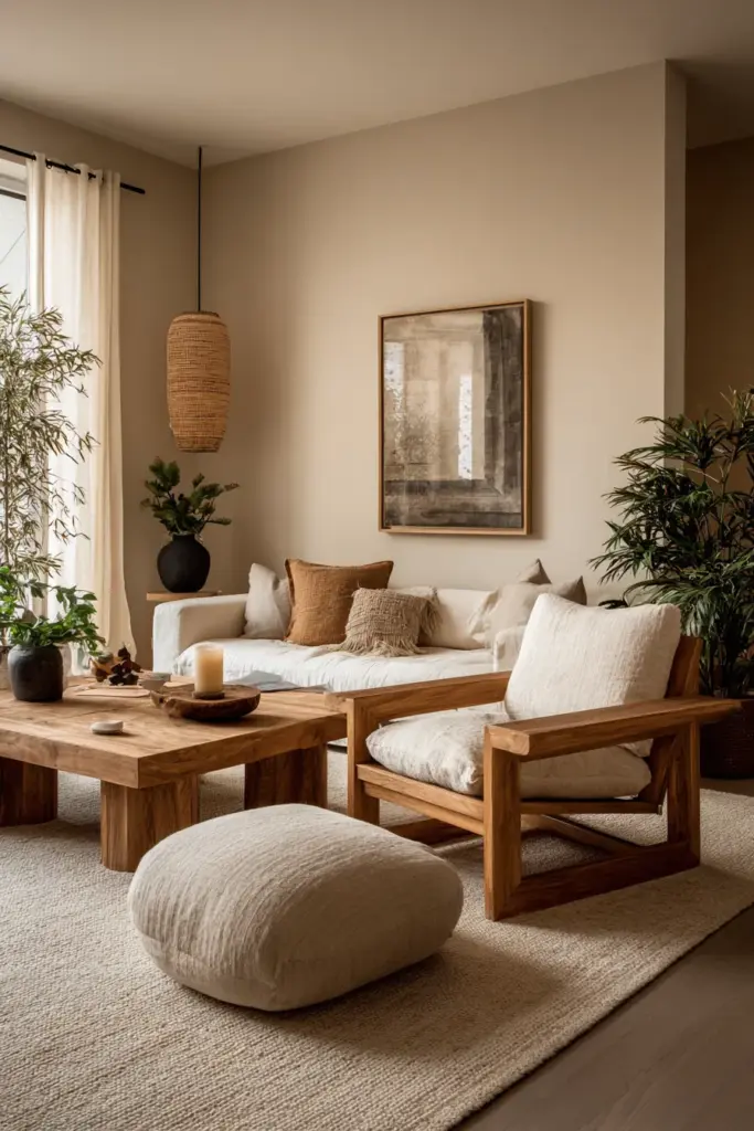
For paint, look for low-VOC or zero-VOC options that don’t release harmful chemicals into your living space. Many manufacturers now offer extensive neutral palettes in eco-friendly formulations. These paints perform as well as traditional options while protecting both your indoor air quality and the environment. Natural paint options using earth pigments and plant-based binders take sustainability even further, though they typically come with higher price tags and more limited color ranges.
Furniture and textile choices impact sustainability significantly. Natural materials like wood, linen, cotton, and wool not only fit the Japandi aesthetic perfectly but also represent more sustainable choices than synthetic alternatives. When possible, choose items made from FSC-certified wood, organic cotton, or recycled materials. These choices feel authentic to the Japandi philosophy of respecting nature and living mindfully.
Longevity as Sustainability
Perhaps the most sustainable color choice you can make is selecting a palette you’ll love for years. Fast decoration, like fast fashion, creates waste and consumes resources. By choosing timeless Japandi colors rather than trendy ones, you create a space you won’t feel compelled to overhaul every few years. This long-term approach saves money, reduces waste, and allows your space to develop the patina and character that comes with time.
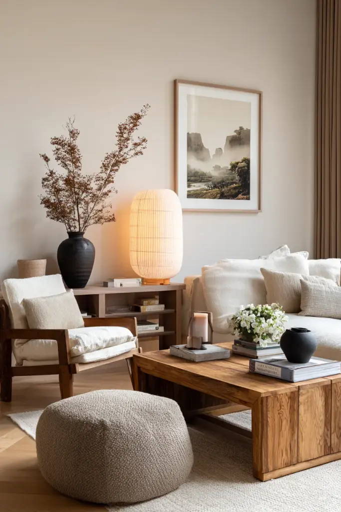
Invest in quality pieces in your core neutral colors. A well-made sofa in a timeless beige or gray will serve you for a decade or more. Cheap furniture in this year’s trendy color will need replacing far sooner, ultimately costing more and creating more environmental impact. The Japandi philosophy of buying less but buying better aligns perfectly with sustainable living practices.
DIY Color Implementation
For those who enjoy hands-on projects, understanding DIY Japandi living room colors empowers you to transform your space with your own hands. This approach not only saves money but also creates a deeper connection to your space through the act of creation.
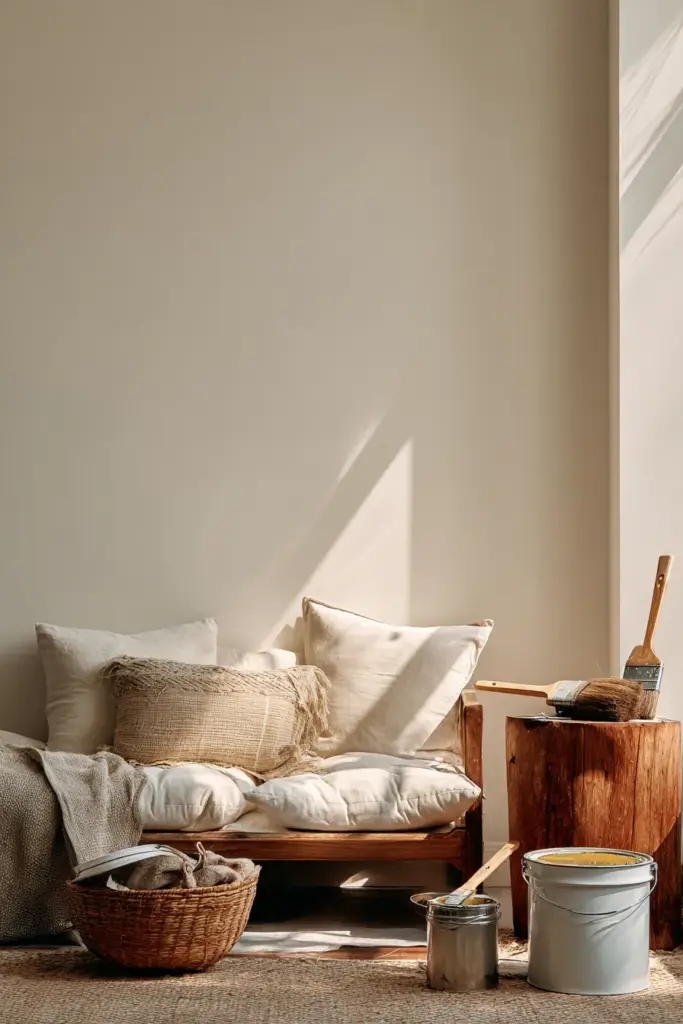
Start with paint, the most accessible DIY color project. Armed with the right tools and preparation, anyone can achieve professional-looking painted walls. Invest in quality brushes and rollers, take your time with cutting in around edges, and apply multiple thin coats rather than one thick one. The meditative quality of painting can itself be rewarding, each stroke bringing you closer to your envisioned result.
Beyond walls, consider DIY approaches to introducing color through textiles and accessories. Sewing simple pillow covers in your chosen neutral fabrics, dyeing white linens with natural dyes to achieve custom colors, or painting plain ceramic pieces to match your palette. These projects allow you to customize items to your exact specifications while imbuing them with personal significance that store-bought items lack.
Creating Custom Colors
Sometimes the perfect Japandi color doesn’t exist in standard paint offerings. Learning to create custom colors through tinting allows you to achieve exactly the shade you envision. Most paint stores offer tinting services, but you can also purchase tints and mix your own, adjusting incrementally until you achieve perfection.
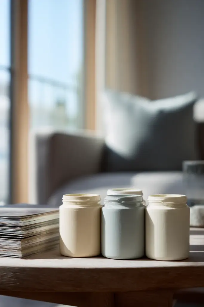
When mixing custom colors, work with small amounts first. Add tints drop by drop, keeping careful notes of proportions so you can replicate your result when you need more. This process teaches you about color relationships and undertones in ways that simply choosing from a paint deck cannot. You develop an intuitive understanding of how colors work together and what small adjustments can achieve.
Expert Tips for Perfect Japandi Colors
After years of creating Japandi spaces, certain principles emerge that consistently produce beautiful results. These expert insights can help you navigate the nuances of color selection and application with confidence.
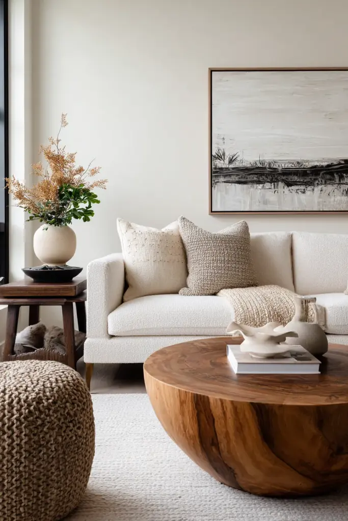
First, always test in your actual space. Colors are chameleons, changing dramatically based on lighting, surrounding colors, and room orientation. What looks perfect in a store or online might disappoint in your home. Order samples, paint large swatches, live with them for at least a week before committing. Notice how they appear at different times of day and under various lighting conditions.
Second, embrace the 60-30-10 rule adapted for Japandi. Let your main neutral color occupy about 60 percent of the space (typically walls and large furniture), a secondary neutral take up 30 percent (smaller furniture, window treatments), and accent colors comprise the final 10 percent (accessories, art, plants). This creates visual balance and prevents either monotony or chaos.
Third, layer your neutrals thoughtfully. A room isn’t just beige or just gray, it’s multiple shades and tones of these colors working together. Your walls might be a pale greige, your sofa a warmer taupe, your rug a cooler gray, and your throw pillows various shades bridging these tones. This layering creates depth and interest within a cohesive palette.
Working with Existing Elements
Few of us have the luxury of starting from scratch. Usually, you’re working around existing elements: flooring you can’t change, built-in features, furniture you’re keeping. Rather than fighting these constraints, use them as your color anchors. If you have honey-toned hardwood floors, build your palette around warm neutrals. If your apartment came with gray carpet, embrace cooler tones throughout.
Existing elements aren’t obstacles, they’re opportunities. They provide built-in direction for your color choices, actually making decisions easier rather than harder. Pull paint chips up to your flooring, hold fabric swatches against your built-ins, ensure everything works together. This integrated approach creates spaces that feel intentional and cohesive rather than assembled from disparate parts.
The Importance of Negative Space
One principle that separates truly successful Japandi spaces from merely neutral ones is the use of negative space. Not every wall needs art, not every surface needs an object, not every corner requires furniture. Empty space itself becomes a design element, allowing the colors you have chosen to breathe and register fully.
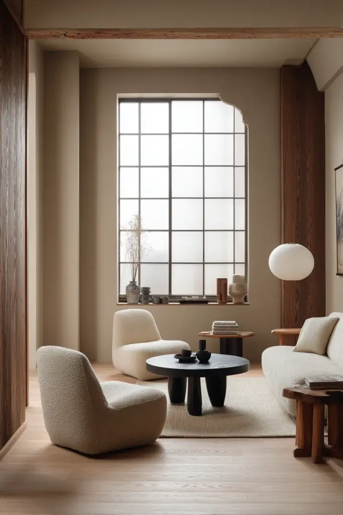
This restraint extends to color application. You don’t need to use every color in your palette in equal measure. Perhaps your living room is predominantly cream and white with just a few touches of sage green and muted rust. That’s not a failure to commit, it’s sophisticated restraint. The colors you do use become more impactful when they’re not competing with a dozen others for attention.
Bringing It All Together
Creating a Japandi living room through thoughtful color selection is a journey of attention and restraint. It asks you to slow down, to observe how light moves through your space, to feel the textures under your fingers, to consider not just what looks good but what feels right. This process itself embodies the mindfulness that Japandi design celebrates.
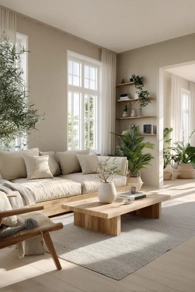
Your color palette tells the story of your space. Soft neutrals speak of calm and clarity. Natural wood tones connect you to the earth. Subtle accents add personality without noise. Together, these elements create a living room that supports your wellbeing, that welcomes you home with the promise of peace and beauty.
Remember that there’s no single perfect Japandi palette. Your room’s unique conditions, your personal preferences, and your lifestyle needs all influence the ideal choices for your space. Trust your instincts, test thoroughly, and embrace the imperfections that make your living room authentically yours. The goal isn’t to replicate a magazine spread but to create a space where you feel genuinely at home.
As you implement these principles, be patient with yourself and the process. Color choices reveal themselves over time, improving as you live with them and adjust based on experience. Your Japandi living room will evolve, developing character and meaning as it becomes part of your daily life. This evolution is part of the beauty, a reflection of the Japanese concept that nothing is ever truly finished, that there’s always room for growth and change.
Continue exploring the nuances of Japandi design through these carefully curated guides:
- Neutral Japandi Living Room Colors for deep insights into building the perfect neutral foundation
- Japandi Living Room Accent Colors to master the art of subtle color introduction
- Lighting and Japandi Living Room Colors for understanding how light transforms your palette
Frequently Asked Questions
What are the main colors used in Japandi living rooms?
Japandi living rooms center on a neutral palette of whites, off-whites, beiges, taupes, and soft grays. These are complemented by natural wood tones, typically in lighter to medium ranges. Accent colors, when used, come from nature: muted greens, dusty blues, warm terracottas, and soft pinks. Black appears sparingly as an accent for definition and contrast.
Can I use bold colors in a Japandi living room?
While Japandi design emphasizes restraint, you can incorporate slightly more saturated colors if they’re muted and nature-inspired. Think sage green rather than lime, dusty terracotta rather than bright orange, slate blue rather than cobalt. These colors should occupy no more than 10 percent of your visual space and feel like natural extensions of your neutral foundation rather than dramatic statements.
How do I keep an all-neutral living room from looking boring?
Layer textures extensively. Use different materials in similar colors: smooth linen, chunky wool, rough jute, polished wood, matte ceramics. Vary the values within your neutral palette, moving from very light to medium to dark tones. Introduce natural elements like plants and wood that bring organic variation. Pay careful attention to lighting, using multiple sources at different heights to create depth and shadow.
What’s the difference between Japandi colors and minimalist colors?
While both aesthetics embrace simplicity, Japandi colors are warmer and more varied than typical minimalism. Minimalism often relies on pure whites, blacks, and cool grays. Japandi incorporates these but adds warmth through beiges, taupes, natural wood tones, and subtle nature-inspired accents. The goal is creating coziness alongside simplicity, not starkness.
Should my Japandi living room walls be white or off-white?
Off-white typically works better than pure white. Look for whites with warm undertones, soft grays with beige influences, or very pale greiges. These colors create the bright, spacious feeling of white while adding warmth that pure white lacks. The specific choice depends on your room’s light and your furniture’s undertones.
How many accent colors can I use in a Japandi living room?
Limit yourself to one or two accent colors beyond your neutral foundation. More than this creates visual complexity that works against the Japandi aesthetic. If you choose green as an accent, use it consistently through plants, textiles, and accessories rather than introducing green, blue, pink, and rust in equal measure. Restraint and repetition create cohesion.
What wood tones work best with Japandi colors?
Light to medium wood tones work best: white oak, ash, maple, light walnut, and blonde woods. These pair beautifully with the neutral palette without overwhelming it. Very dark woods like mahogany or ebony can feel too heavy, while very red woods like cherry can clash with the cool-warm balance. Consistency matters more than the specific wood, keep your tones within the same family throughout the space.
Can I paint different walls different colors in a Japandi living room?
You can, but it requires careful execution. Rather than dramatic accent walls in contrasting colors, consider subtle variations: one wall in a slightly deeper tone of your main color, or a textured wallpaper on a single wall. The different walls should feel like variations on a theme rather than distinct statements. Generally, maintaining one wall color throughout creates more cohesion.
How do I choose between warm and cool neutrals?
Consider your room’s natural light and orientation. Rooms with abundant sunlight can handle cooler neutrals without feeling cold. North-facing rooms or spaces with limited light benefit from warmer neutrals. Also consider your existing fixed elements like flooring. Cool-toned flooring pairs best with cool neutrals, warm wood floors with warm neutrals. Most successful Japandi spaces blend both temperatures in balance.
What’s the biggest color mistake people make with Japandi design?
The most common mistake is going too cool or stark, creating a space that feels sterile rather than serene. Japandi should feel warm and welcoming despite its simplicity. If your room feels like a doctor’s office, you’ve gone too far. The solution is introducing warmth through wood tones, warm-toned textiles, and warmer lighting. Another frequent error is neglecting undertones, assuming all neutrals work together when incompatible undertones create discord.
How often should I update my Japandi living room colors?
The beauty of Japandi design is its timelessness. Your core palette shouldn’t need updating for many years. However, you can refresh the space seasonally by swapping textiles, adjusting the balance of warm and cool elements, or introducing new plants and natural elements. These changes keep the room feeling current without requiring major overhauls. Quality color choices age gracefully rather than looking dated.
Can I mix different neutral tones, or should everything match?
You should absolutely mix neutral tones, this is what creates depth and interest. A room where everything is the exact same beige feels flat and showroom-like. Layer different neutrals: cream walls, taupe sofa, gray rug, warm wood furniture, off-white curtains. The key is ensuring your neutrals share compatible undertones so they harmonize rather than clash. Variation within unity creates sophisticated spaces.